산돌 최초의 배리어블 폰트 『Sandoll Comp 시리즈』
『Sandoll Comp 시리즈』 기획
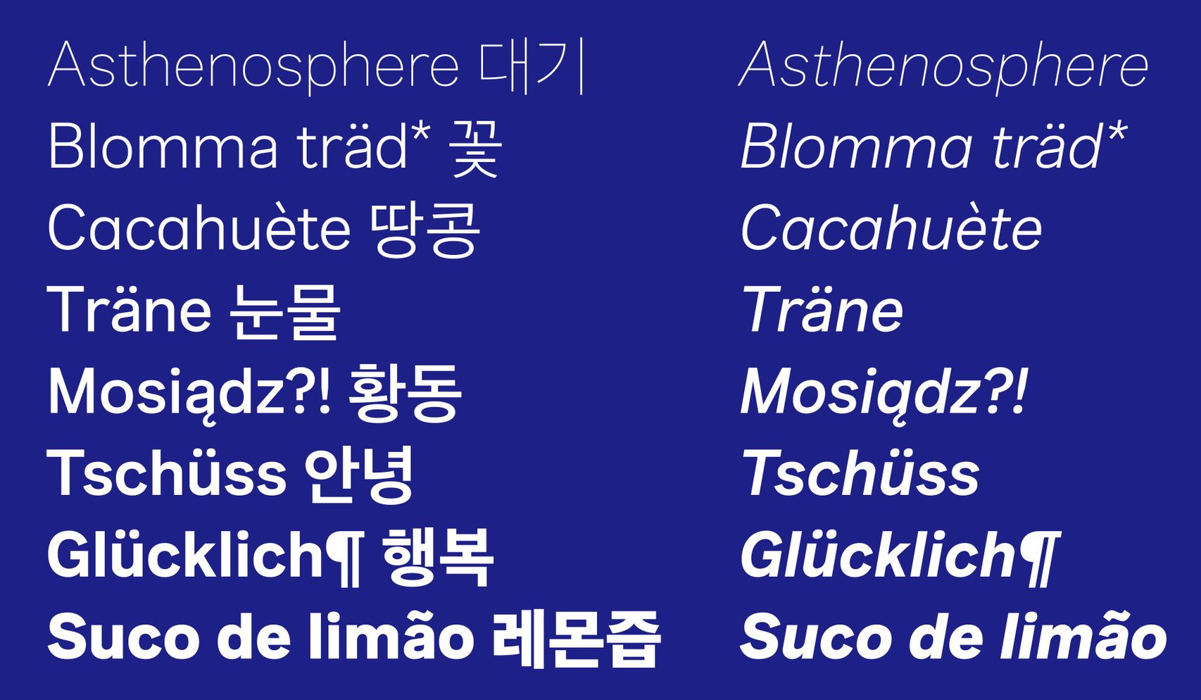
『Sandoll Comp 시리즈』는 한글 폰트와 섞어 짤 용도로 기획된 산돌 최초의 라틴 폰트 프로젝트입니다. 섞어 짠다는 것은 다른 언어권의 문자를 혼용하여 조판하는 것을 일컫습니다. 기본적으로는 『Sandoll 고딕 Neo 시리즈』에 잘 어울리는 무난한 인상을 만드는 것, 더 나아가서는 일반적인 명조나 고딕의 한글 폰트에도 잘 어울리는 인상으로 만드는 것이 프로젝트의 최종 목표였어요. 때문에 기본적인 웨이트는 「Sandoll 고딕 Neo1」, 「Sandoll 명조 Neo1」의 굵기 감에 맞추어 제작되었지만, 다른 한글 폰트와 함께 쓰이는 것을 고려해 다양한 기능을 시도해 본 프로젝트이기도 합니다.
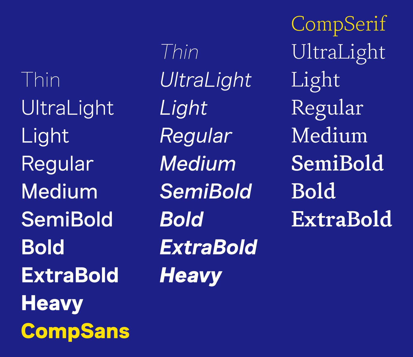
산돌 최초의 배리어블 폰트
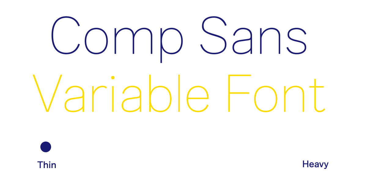
또한 『Sandoll Comp 시리즈』는 산돌에서 최초로 시도한 배리어블 폰트이기도 합니다. 단순히 배리어블의 기능적인 측면을 보여주기 위해서가 아니라, 『Sandoll Neo 시리즈』뿐만 아니라 다양한 한글 폰트와 섞어 짤 수 있도록 하기 위한 명확한 목적으로 배리어블 기능을 활용하기로 하였습니다.
배리어블 폰트는 여러 개의 개별 폰트를 하나의 폰트 파일로 압축한 차세대 폰트 유형입니다. 마이크로소프트(Microsoft), 구글(Google), 애플(Apple), 어도비(Adobe)에서 공동 개발하여 OpenType 1.8 버전으로 발표되었어요. 예를 들어 9종의 굵기로 이루어져 있는 폰트 패밀리를 하나의 파일 사용할 수 있고, 게다가 사용자의 마음대로 9종 사이사이의 굵기까지 미세하게 커스터마이징할 수 있는 놀라운 기능입니다. 굵기뿐만 아니라 다양한 스타일을 축(Axis)으로 설정해 수많은 개별 폰트를 하나의 파일로 사용할 수 있습니다. 이처럼 배리어블 폰트는 경제적이고, 마이크로 타이포그래피까지 가능한 디자이너 친화적인 기술입니다.
*위의 배리어블 폰트에 관한 부분은 링크의 기고글을 참고하여 작성하였습니다.
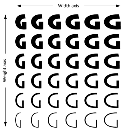
이미지 출처 : MS OpenType Variable Fonts
「Sandoll CompSerif」
「Sandoll CompSerif」는 산돌에서 처음 시도하는 라틴 폰트이자 배리어블 폰트인 만큼 여러 특징들이 있는데요. 하나씩 이야기해 보겠습니다.

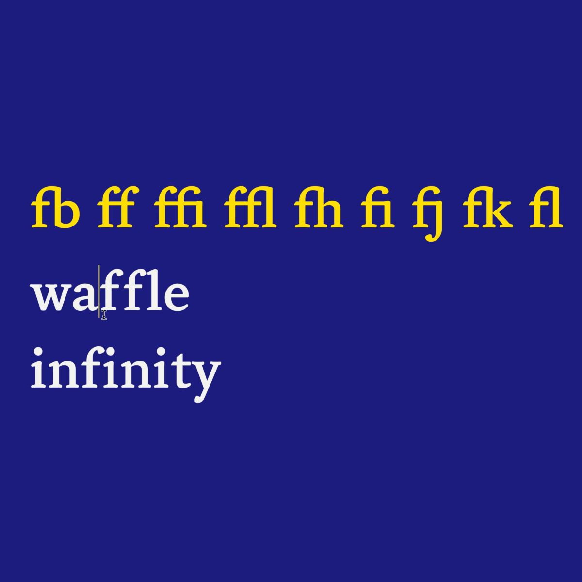
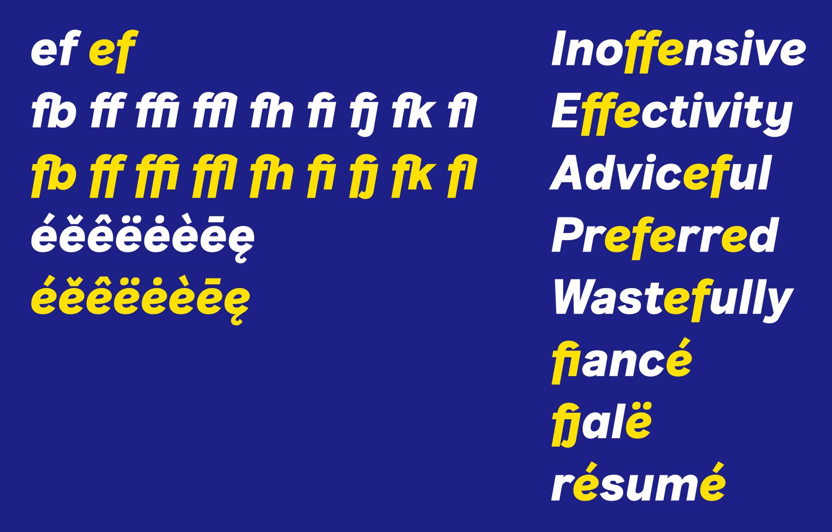
먼저 합자(Ligature) 기능입니다. 합자는 특정한 둘 이상의 글자를 글줄에서 더 자연스럽게 보일 수 있도록 결합한 것을 말하는데요. 소문자 'f'의 우측 끝부분(터미널)과 같이 글자의 한 부분이 돌출된 경우 다음에 오는 글자와 만나면 애매한 사이 공간이 만들어지기 때문에, 이를 해결하기 위해 사용합니다. 「CompSerif」에서는 합자를 더 많이 만들어 고른 글줄로 보일 수 있도록 했어요.
다음으로는 대문자용 문장부호입니다. 「CompSerif」는 대문자 글줄에서도 적합하도록 8개의 추가 문장부호를 제공하고 있어요. 해당 기호는 ‘오픈타입 피쳐’ 기능을 통해 사용할 수 있어서 사용자의 필요에 따라 대문자용 기호를 선택하여 조판할 수 있습니다.
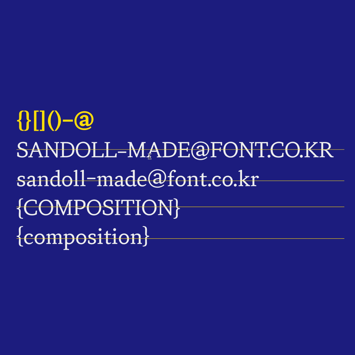
작은 대문자(Small Cap)도 제공합니다. 작은 대문자의 높이는 엑스하이트(X-height, 소문자 x의 높이)보다 살짝 크게 디자인했어요. 대문자가 고른 글줄의 질감을 이루는 데 방해가 될 때 작은 대문자를 사용하면 훨씬 안정적인 질감을 표현할 수 있습니다.

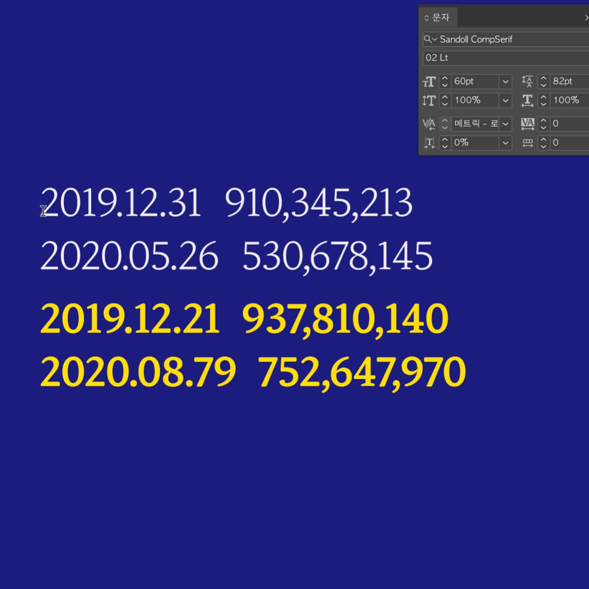
「CompSerif」는 유독 ‘최초’라는 수식어가 많은데요. 「CompSerif」는 모든 숫자 세트를 제공하는 산돌 최초의 폰트이기도 합니다. 고정 폭 라이닝(Tabular Lining), 가변 폭 라이닝(Proportional Lining), 고정 폭 올드 스타일(Tabular Old-Style), 가변 폭 올드 스타일(Proportional Old-Style) 총 네 가지의 숫자 세트로 구성되어 있습니다.
올드 스타일 숫자는 소문자와 비슷한 구조로 되어 있는 숫자 세트입니다. 라틴의 소문자 기준으로 크기감이 정렬되어 있기 때문에 소문자와 같이 썼을 때 도드라지지 않고 글줄 내에서 조화를 이룰 수 있습니다. 고정 폭 숫자는 날짜나 수학 서식 등, 숫자로 이루어진 긴 글줄을 가지런하게 맞추고 싶을 때 사용하기 좋습니다. 0부터 9까지 모든 숫자의 폭이 같아, 열을 모두 같은 폭으로 정렬할 수 있어요.
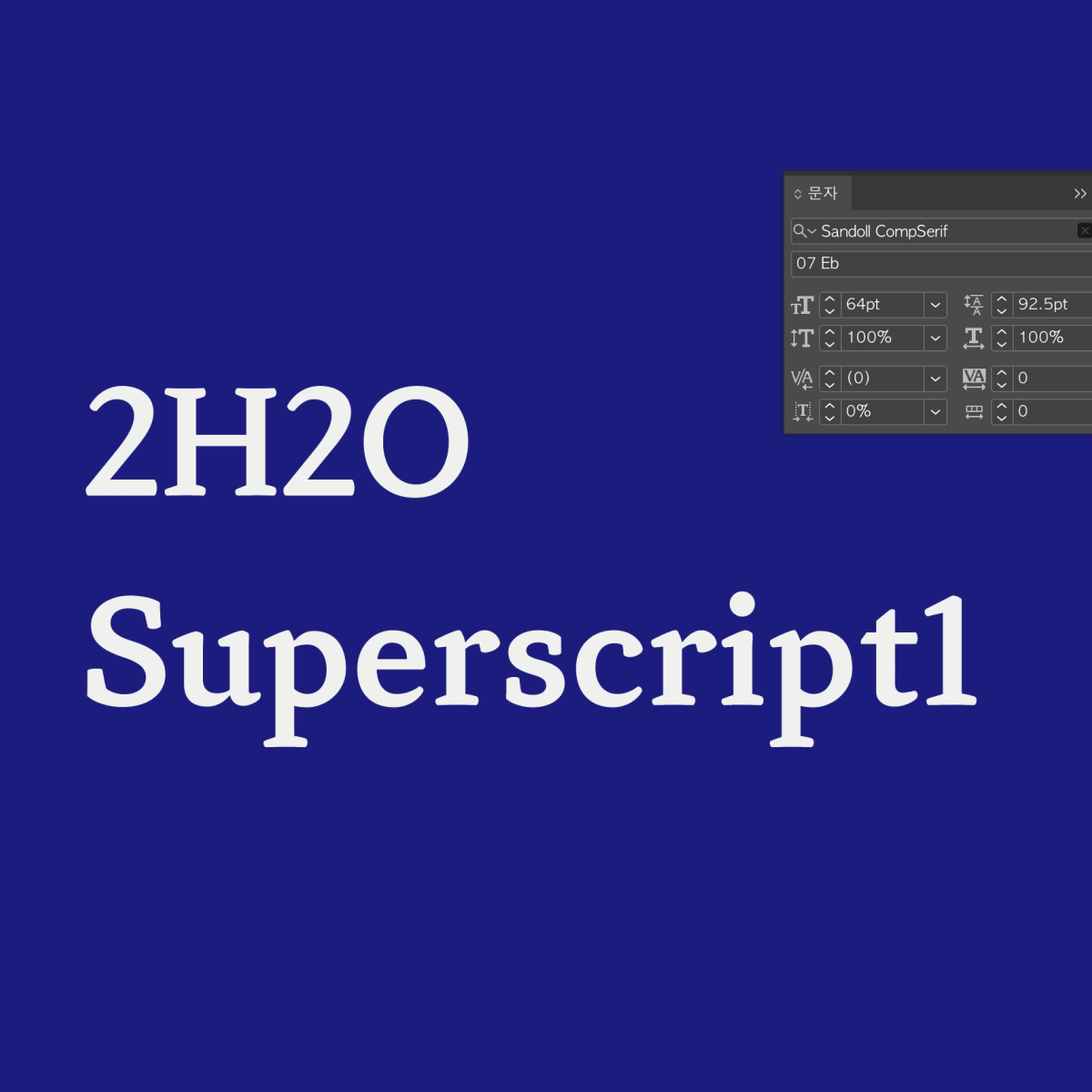
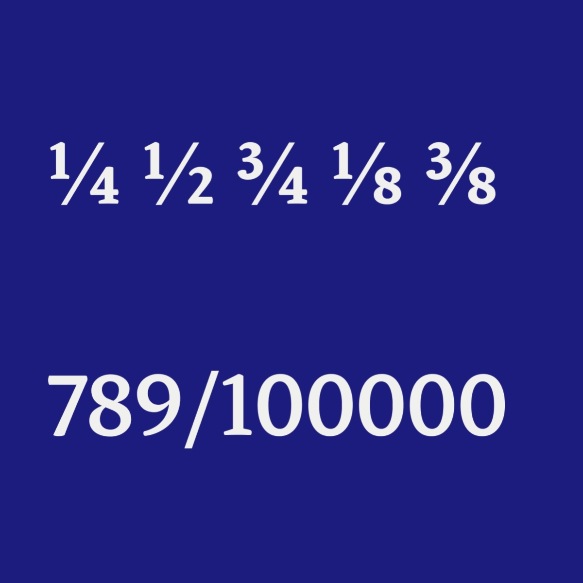
마지막으로는 위 첨자(Superscript), 아래 첨자(Subscript), 분수(Fraction) 글립들인데요. 「CompSerif」는 위 첨자, 아래 첨자를 만들기 위한 숫자 글립을 지원합니다. 위 첨자의 위치는 분자 숫자보다 높고, 아래 첨자의 위치는 분모 숫자보다는 낮습니다. 어도비 프로그램 문자 패널의 오픈타입 목록에서 위 첨자와 아래 첨자를 선택해 사용하면 분수 숫자와 확실히 구분할 수 있습니다. 첨자뿐만 아니라 분모, 분자, 그리고 이 숫자들로 이루어진 분수 옵션을 지원합니다. '오픈타입 피쳐' 기능을 활용해 손쉽게 분수식을 만들어 조판에 활용할 수 있습니다.
「Sandoll CompSans」
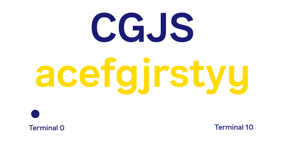
다음으로는 「Sandoll CompSans」입니다. 「CompSans」는 「CompSerif」의 다양한 기능을 포함해 몇 가지의 추가 기능을 제공합니다. 바로 또 다른 배리어블 기능인데요. 「CompSans」는 굵기 축과 더불어 터미널(Terminal) 축, 총 두 가지의 배리어블 기능을 사용할 수 있습니다.
터미널 축은 굵기 축과 마찬가지로 특별히 사용성 확장을 위해 고안된 축인데요. 터미널은 획 끝부분을 일컫는 용어입니다. 이음줄기나 삐침의 끝 등의 획 끝 각도에서 나오는 한글의 인상과 터미널의 각도에 따른 라틴의 인상이 밀접하게 관련이 있다고 판단하였습니다. 사용자는 한글 폰트와 「CompSans」간의 인상을 맞추기 위해 터미널의 각도를 미세하게 조절할 수 있습니다.
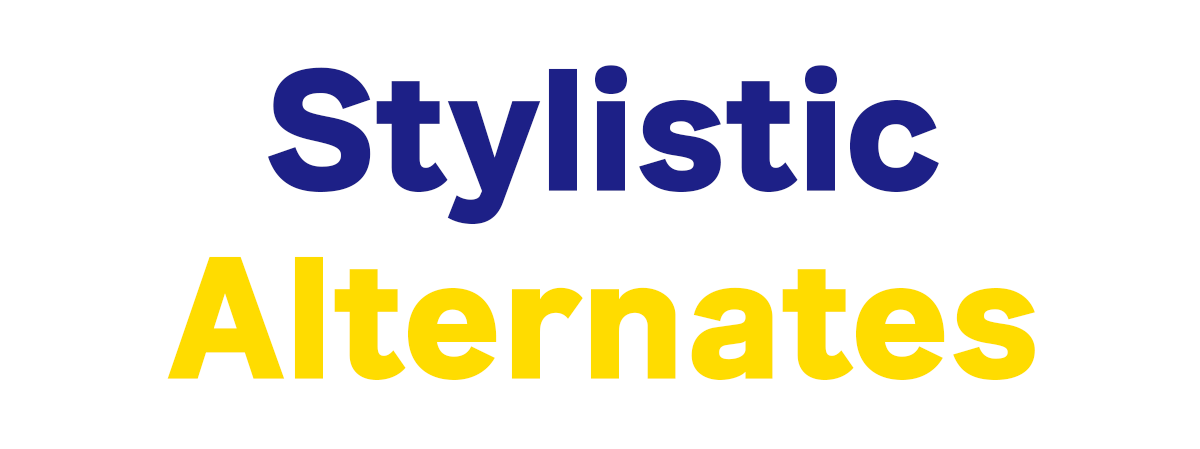
「CompSans」에는 총 23자의 대체 글립이 있습니다. ‘R', ‘a’, ‘g’, 'y’를 기본으로 각각의 라틴 확장까지 제작하여 사용자의 기호에 따라 바꿔서 사용할 수 있도록 하였습니다.
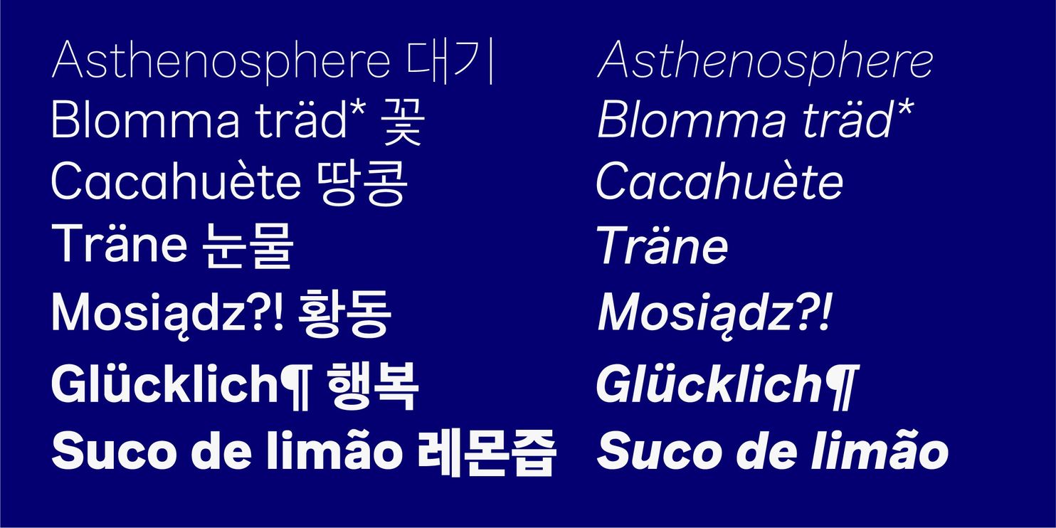
라틴에는 Á와 같은 ‘다이어크리틱’이라는 발음 구별 부호가 붙은 라틴 확장 글립들이 있습니다. Café가 대표적인 예시이죠. 「CompSans」는 기본 라틴 56자(대체 글립 4자 포함)를 바탕으로 202자(대체 글립 19자 포함)의 라틴 확장 글립을 제작하여 사용성을 높였습니다. 「CompSans」의 라틴 확장은 유럽(Pan-European)의 문자를 모두 커버합니다. 무려 206개의 언어이죠.

「CompSans」의 글립 구성은 기존 「CompSerif」의 구성과 동일합니다. 그러나 기존 「CompSerif」를 사용하시는 유저분들의 니즈에 따라 추가 문장부호를 38자 더하였습니다. 물론 「CompSerif」도 「CompSans」 출시와 맞춰서 스펙 업데이트를 진행했죠. 더욱 높아진 사용성을 경험하실 수 있습니다.

「Sandoll CompSans Italic」
마지막으로 따끈따끈한 「Sandoll CompSans Italic」을 소개하겠습니다. 「CompSerif」와 「CompSans」가 출시된 이후에 다양한 사용자분들의 공통된 피드백이 있었습니다. 바로 이탤릭 추가 확장에 관한 것이었는데요. 「CompSans Italic」은 사용자분들의 니즈에 발맞춰 제작된 패밀리입니다. 이탤릭 양식은 오랜 역사로 인해 다양한 목적을 갖고 있지만, 근래에는 업라이트와 함께 조판하여 강조의 목적으로 사용되고 있습니다. 그로 인한 풍부한 조판은 덤이지요.
「CompSans Italic」은 디자이너에게 익숙한 네오 그로테크스(Neo Grotesque), 그로테스크 이탤릭(Grotesque Italic)의 특징을 반영하되, 「Slate Italic」과 「Adelle Sans Italic」이 가진 휴머니스트적인 인상을 과하지 않도록 반영하였습니다. 「CompSans Italic」은 두 폰트에 비해 기울기를 좀 더 가파르게 설정하여 업라이트와 함께 조판하였을 때 확연하게 구분될 수 있도록 하였습니다. 또한 자폭은 업라이트에 비해 전체적으로 미세하게 줄어들어 응집력을 강화하였습니다.
「CompSans Italic」에는 재미난 대체 글립이 있습니다. 바로 ‘e', ‘f’ 대체 글립인데요. ‘e’ 대체 글립은 마치 손으로 쓴 것 같은 인상을 더 강조하였습니다. 또한 'f'의 대체 글립은 디센더가 있는 디자인으로 변형하였죠. 그로 인해 대체 글립으로 조판하였을 때 전체 조판의 인상이 기존보다 훨씬 가볍고 캐쥬얼하게 바뀌는 것을 볼 수 있습니다. 또한 ‘f’의 터미널과 ‘j’, ‘y’의 테일 부분에 이탤릭 폰트에서 두드러지는 특징을 반영하였습니다. ‘j’와 'y’의 테일은 업라이트에 비해 곡률이 적게, 그리고 완만하게 수정하였죠.
이렇게 「CompSans Italic」은 「CompSans」와 함께 섞어 짰을 때 매력이 극대화되는 폰트입니다. 『Sandoll Comp Series』로 사용자분들의 작업물이 보다 풍성해지길 바라 봅니다.
나가며
『Sandoll Comp 시리즈』는 산돌에서 처음으로 시도하는 부분이 참 많은 프로젝트입니다. 그만큼 의미가 깊은 프로젝트이기도 합니다. 디자이너는 서로 다른 한글 폰트와 라틴 폰트를 함께 조판할 때 많은 고민에 빠집니다. 크기 조절, 그로 인한 굵기의 차이, 한글과 라틴의 글줄 위치 설정 등, 사실 이러한 차이점을 활용하면 조판에 그래픽적인 재미를 불어넣을 수도 있는 부분이지만, 때로는 톤온톤 옷을 입은 것처럼 튀지 않고 차분한 인상이 필요할 때도 있는 법이죠. 그럴 때는 『Sandoll Comp』 시리즈』를 찾아주세요.
『Sandoll Comp 시리즈』는 오로지 사용자분들의 편의성을 위해 개발된 패밀리라고 해도 과언이 아닐 것 같습니다. 사용자분들을 위한 산돌의 마음이 전해지길 바라며 글을 마무리해 봅니다.
작성지: 산돌 상품기획팀 김슬기