새로운 시대에 걸맞는 명조체 「Sandoll 제비」
1990년대 초까지 세상은 컴퓨터의 매력에 흠뻑 빠져 있었다. 컴퓨터는 못하는 것이 없는 만능 도구로 여겨졌기 때문이다. 사람들은 그 하드웨어의 놀라운 성능과 문서편집 프로그램과 같은 소프트웨어의 효율에 열광하고 있었다. 마이크로소프트사의 윈도우즈 같은 운영체제가 세상에 존재하는 그 자체만으로도 벅차했다.
당시 윈도우즈의 기본 폰트가 굴림체였다는 것에 대해서 불만을 갖는 사람은 아무도 없었다. 당연히 전통적인 명조체, 고딕체에 대해서는 어떠했을까? 디자이너들 조차 고딕체, 특히 명조체를 바라보며 그 우수함, 형태와 디테일의 우아함에 대해서 감탄했고 ‘숭배’의 대상으로 까지 모셔지는 진풍경이 나타났다. 이러한 시대적인 상황에서 명조체, 특히 최정호 선생의 원도로 확인된 명조체는 어느 누구도 감히 문제를 지적하거나 수정을 가해야 한다는 말조차 꺼낼 수 없는, 활자의 신격화가 이루어지고 있었다.
최정호 명조체 (이미지 출처: 한글 디자이너 최정호전 페이스북)
시대는 급격히 변화되고 세계적인 디자인 트랜드와 사회환경은 첨단을 향해 달려가고 있는데, 이러한 특이한 명조체 숭배현상으로 인해 폰트 디자인 분야는 과거의 환상에 취해 있었다. 알다시피, 명조체를 그린 도구는 붓이다. 붓이라는 필기도구는 우리의 시대에 사용하는 필기 기구가 아니다. 아무리 그 자체가 아름답다하더라고 현 시대를 반영할 수 있는 모양은 아닌 것이 분명하다. 나는 이러한 현상을 목격하면서 왜 우리는 붓의 필감이 남아 있는 기존 명조체에서 한 발자국도 벗어날 수 없는 것일까라는 의구심을 품었다. 그리고 명조체의 구조와 골격은 존중하되 시대의 흐름에 맞는 현대적인 명조체의 출현이 기필코 있어야 하겠다고 판단했다.
어느날 이러한 생각으로 시간을 보내던 중 스케치북에 한동안 고민해 오던, 새로운 시대에 걸맞는 명조체를 가볍게 스케치하게 되었다. 현대적인 명조체에 대해 내가 생각한 디자인의 기준은 몇가지가 있었다.
첫째로, 형태와 골격은 기존 최정호 명조체에 기반을 둔다. 기존의 명조체의 골격은 한글의 매력과 우아함을 물씬 품은 걸작임을 부인할 수는 없었다.
둘째, 현대적인 직선과 곡선으로 표현하여 조선시대의 유산인 붓의 필기감에서 완전히 벗어난다.
세째, ‘ㄱ, ㅅ, ㅈ’과 같은 곡선은 한국 고유의 유려하면서도 기백이 있고 우아한 곡선으로 재 창조한다. 그래서 우리 문화의 심미적 정체성을 분명하게 표현하겠다는 것이었다. 스케치를 보면 알겠지만 기본 스케치에서 내 스스로도 놀라울 정도로 위의 조건들이 예상외로 분명하게 표현이 된 것 같아서 만족스러웠다.
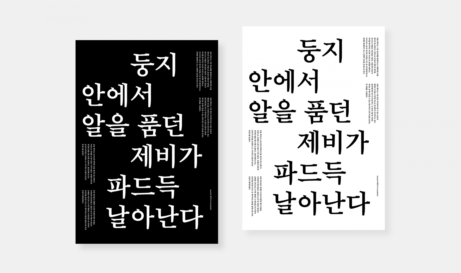
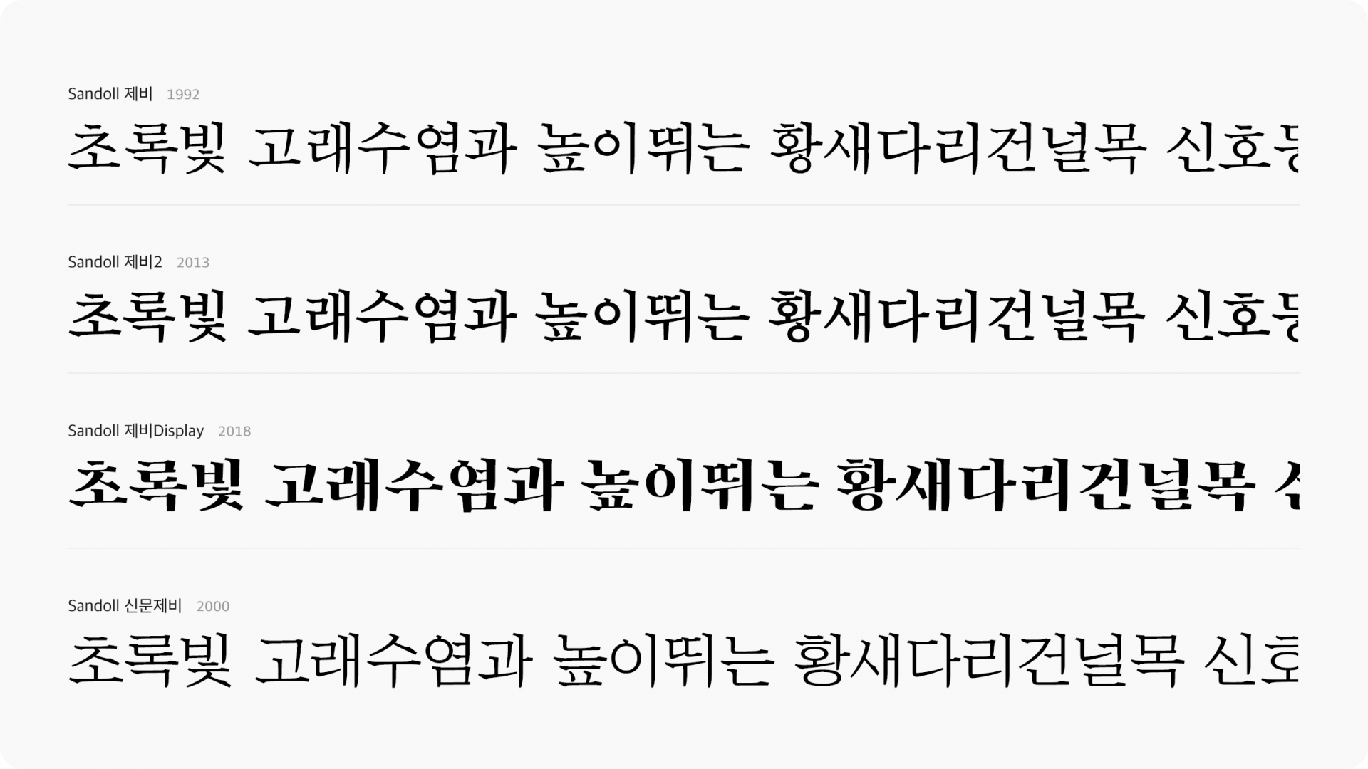
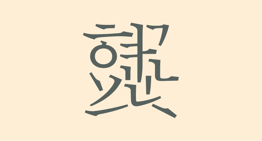
이렇게 해서 「제비」라는 명칭을 가진 현대적인 명조체가 국내 최초로 발표되기에 이르렀다. 그리고 이 제비체는 시대적인 변화 속에서 새로운 디자인을 갈망하던 디자이너들에게 즐거움을 선사했으며, 수많은 매체에 적용되고 스테디셀러로 자리 잡는 행운을 누리게 되었다.

나는 「제비」가 디자이너들에게 오래도록 사랑을 받는 이유를 나름 생각해 보았다.
그 중 하나는 한국적인 곡선의 아름다움과 곡선과 직선이 함께 어우러지면서 표현되는 한글의 우아함에 있다는 생각이 들었다. ‘가’의 'ㄱ'에서 왼쪽으로 흐르는 곡선 빗침은, 아무도 눈치채지 못하겠지만 일본과 중국의 폰트에서 나타나는 곡선과 확실한 차별점이 있다. 위에서도 잠시 언급했지만, 일본이 추구하는 ‘예쁜’ 곡선과 달리 우리 고유의 곡선은 ‘기백’이 있어야 한다. 사선으로 내리 뻗으면서 힘과 속도가 살아 있어야 한다. 섬세하게 살펴 보면 처음 시작부터 2/3부분에 이르기 까지는 거의 직선과 같은 속도 있는 흐름이 유지되다가 갑자기 속도가 느려지면서 부드러운 곡선으로 아련하게 끝을 맺는다. 이러한 우리 고유의 곡선은 ‘우아한 아름다움’으로 다가 오게 되고 그 아름다움은 사람의 마음을 즐거움으로 이끌어 준다.
다른 한가지는 직선과 곡선의 적절한 반복이 가져다 주는 선의 운율과 절도는 현대적인 아름다움을 물씬 풍기게 한다. 기존의 붓의 필감에서 느낄 수 없는 모던한 아름다움으로 디자이너는 ‘오늘을 살아가는 우리 시대’를 자신 있게 표현할 수 있도록 용기를 준다.
이름이 「제비」가 된 이유는 간단하다. 제비는 내 어릴 적 우리 집 처마에 둥지를 틀고 여름을 지났다. 사람과 가장 친밀하게 지내는 길조, 흑백의 명백한 대조가 주는 명쾌함, 몸체에서 드러나는 우아한 곡선의 요소들이 바로 이 새로운 명조체에 그대로 투영된 것 처럼 연상이 되었기 때문이었다.
작성자: 산돌 석금호 의장