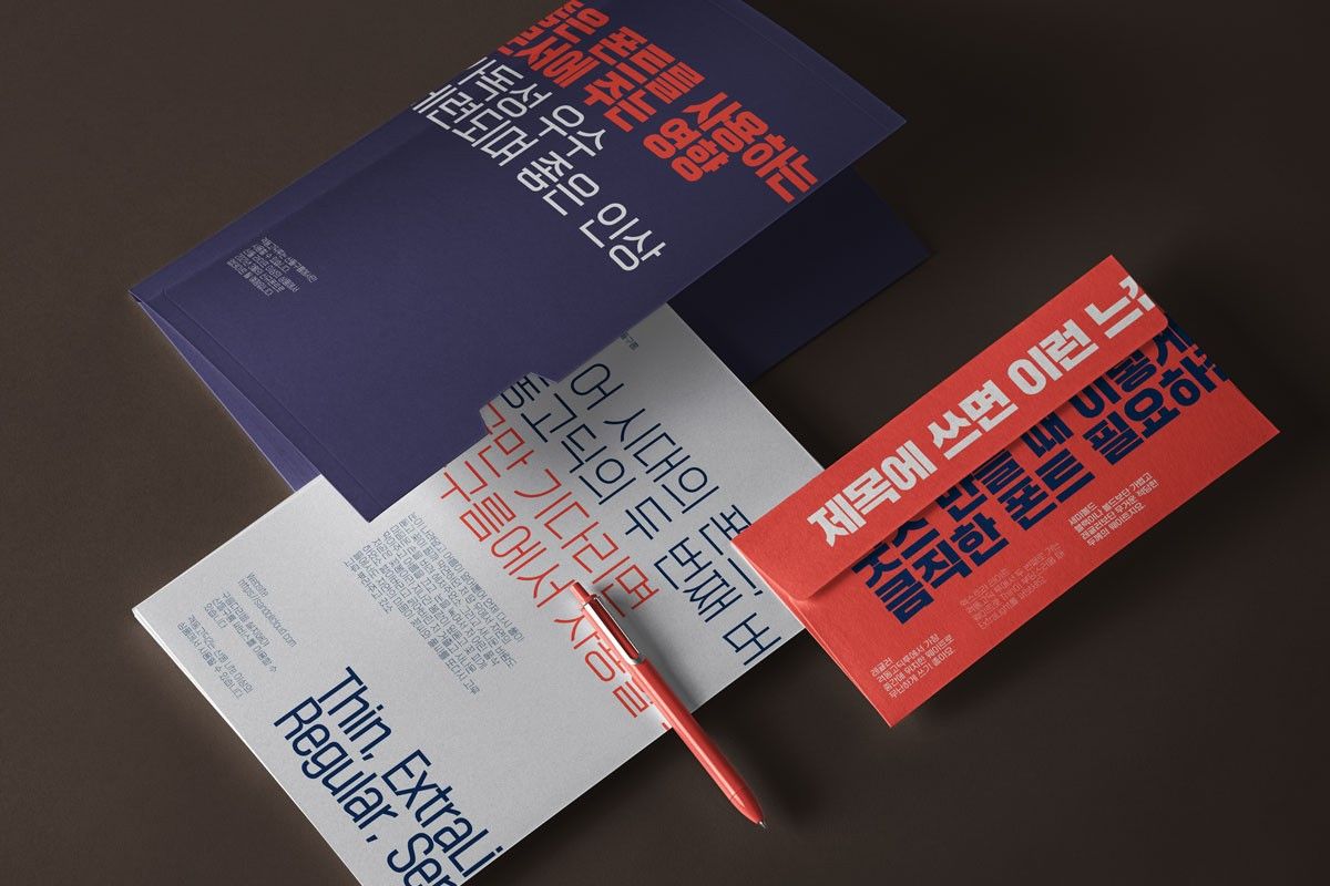
시대의 정신을 담은 『Sandoll 격동 시리즈』
『Sandoll 격동 시리즈』의 시작!
폰트 플랫폼 산돌구름의 명실상부한 베스트셀러! 『Sandoll 격동 시리즈』는 어떻게 시작되었을까요? 『격동 시리즈』의 첫 폰트, 「격동고딕」을 제작한 장수영 디자이너는 단순히 형태적으로만 다른 폰트와 차별화되는 폰트가 아닌 역사적 맥락을 지닌 폰트를 만들길 원했습니다.
폰트가 이렇게 만들어질 수밖에 없는 배경을 사용자에게 소개하고, 그 배경이 충분히 형태에 반영된 폰트를 제작한다면 폰트를 선택하고 사용할 때 도움이 될 것이라 생각했죠. 이러한 의도에 맞게 제작된 「격동고딕」은 대표적인 복고풍 폰트로 자리 잡았고, 같은 컨셉을 가진 「격동굴림」, 「격동명조」, 「격동고딕2」, 「격동굴림2」도 뒤이어 속속 출시되었답니다.
시대 속에서 살아 숨 쉬는 글자를 기반으로 한 리서치
기획 단계에서 리서치를 진행할 때 여기저기를 돌아다니며 참고할 사진을 찍기도 했고 인터넷으로 자료를 모으기도 했습니다. 그중 가장 많은 도움이 되었던 것은 국회도서관에 모인 신문 자료였는데요. 1960년대부터 현재까지의 실제 신문을 모두 열람할 수 있어 단시간에 많은 자료를 얻을 수 있었습니다. 그 외에도 북한 서적의 제호를 탐구하기도 했는데요. 제호에 쓰인 북한 글자는 모티브가 된 1970-80년대의 글자와 형태적으로 유사한 점이 많아 큰 도움이 되었던 서적이었어요.

「Sandoll 격동고딕」
한국의 1970-80년대는 경부고속도로 완공부터 올림픽 개최까지 빠르고 눈부신 성장을 이뤄낸 시기임과 동시에 군부독재와 광주항쟁 등 암울하고 처절한 사건이 일어난 시기입니다. 「격동고딕」은 이렇게 격변하는 당시의 시대상을 시각적으로 표현하려고 노력한 폰트입니다.
이 시대의 한글은 흥미로운 특징을 하나 가지고 있었는데요. 지금과 같이 한글의 조형 원리가 정립되지 않았고, 이를 표현할 기술적 발전도 미비하여 어딘지 모르게 어설프다는 것이었습니다. 생각해 보면 한글이 영문 조형에 간섭을 받지 않고, 독자적으로 다양한 조형에 관한 실험을 가장 활발히 진행했던 때이기도 하고요. 당시의 특징적인 환경 속에서 만들어진 글자를 살펴보면 특유의 강렬한 힘을 느끼실 수 있을 겁니다. 「격동고딕」은 이러한 지점을 잘 살려 1970-80년대 글자의 조형과 구조를 현대적으로 재해석한 폰트입니다.

「Sandoll 격동굴림」
『격동 시리즈』에서 2번째로 출시된 폰트는 바로 「격동굴림」입니다. 장수영 디자이너는 형태나 구조가 달라도 하나의 자족으로 묶을 수 있는 맥락만 있다면 기존의, 웨이트를 다양화하는 것보다 훨씬 재미있는 방식의 폰트 패밀리 구성이 나올 수 있다고 생각했습니다. 폰트 패밀리란 같은 조형적 정체성을 가지고 있는 폰트의 모음을 말해요.
「격동고딕」과 「격동굴림」을 하나로 묶는 맥락은 바로 글자의 모티브가 된 시대적 배경입니다. 단단하고 딱딱한 「격동고딕」이 당시의 정치적인 분위기를 반영하는 폰트라면 「격동굴림」은 당시 상점 간판 등에서 자주 볼 수 있는 글자로 그 시대 살았던 사람들의 생활상을 반영한 폰트라고 볼 수 있어요. 「격동고딕」과 같은 단단한 글자의 뼈대를 공유하고 있으면서도 동글동글한 획의 마감 때문에 부드럽고 밝은 인상을 가지고 있습니다.
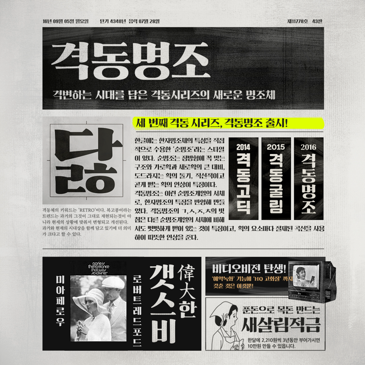
「Sandoll 격동명조」
『격동 시리즈』를 관통하는 컨셉은 1970-80년대의 시대상입니다. 지금도 ‘복고풍’, ‘레트로’ 콘텐츠들이 여전히 많은 사랑을 받고 있는데요. 트렌드 속에서 과거의 것은 그때의 형태 그대로 재현되는 것이 아니라 현재 상황에 맞춰 변형되고 개선됩니다.
『격동 시리즈』 3번째 폰트인 「격동명조」도 이러한 배경 속에서 탄생하였습니다. 한글에는 한자 명조의 특성을 직접적으로 수용한 「순명조」 스타일의 폰트가 있습니다. 「순명조」는 정방향에 꼭 맞는 구조를 가지고 있는데요. 가로획과 세로획의 큰 대비, 삼각형 모양의 돌기, 직선적으로 곧게 뻗는 획도 「순명조」의 특징이지요.
「격동명조」는 이런 「순명조」 계열의 폰트로 한자 명조의 특징을 반영하였습니다. 네모틀에 꽉 차는 격동 고딕과 같은 모듈을 갖고 있으며, 획을 끊어서 들어 올려치는 한자 서예의 특징과 다소 경직된 내릿점으로 납활자의 물성을 표현한 부분이 인상적입니다.
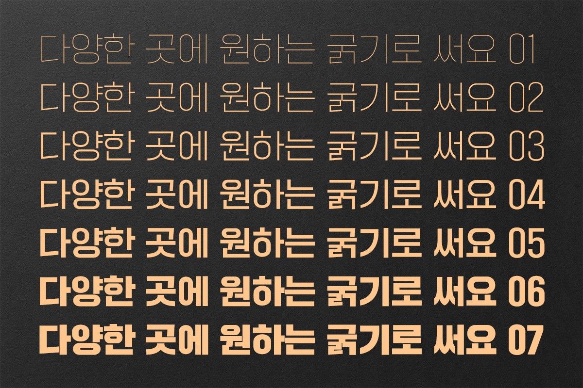
「Sandoll 격동고딕2」, 「Sandoll 격동굴림2」
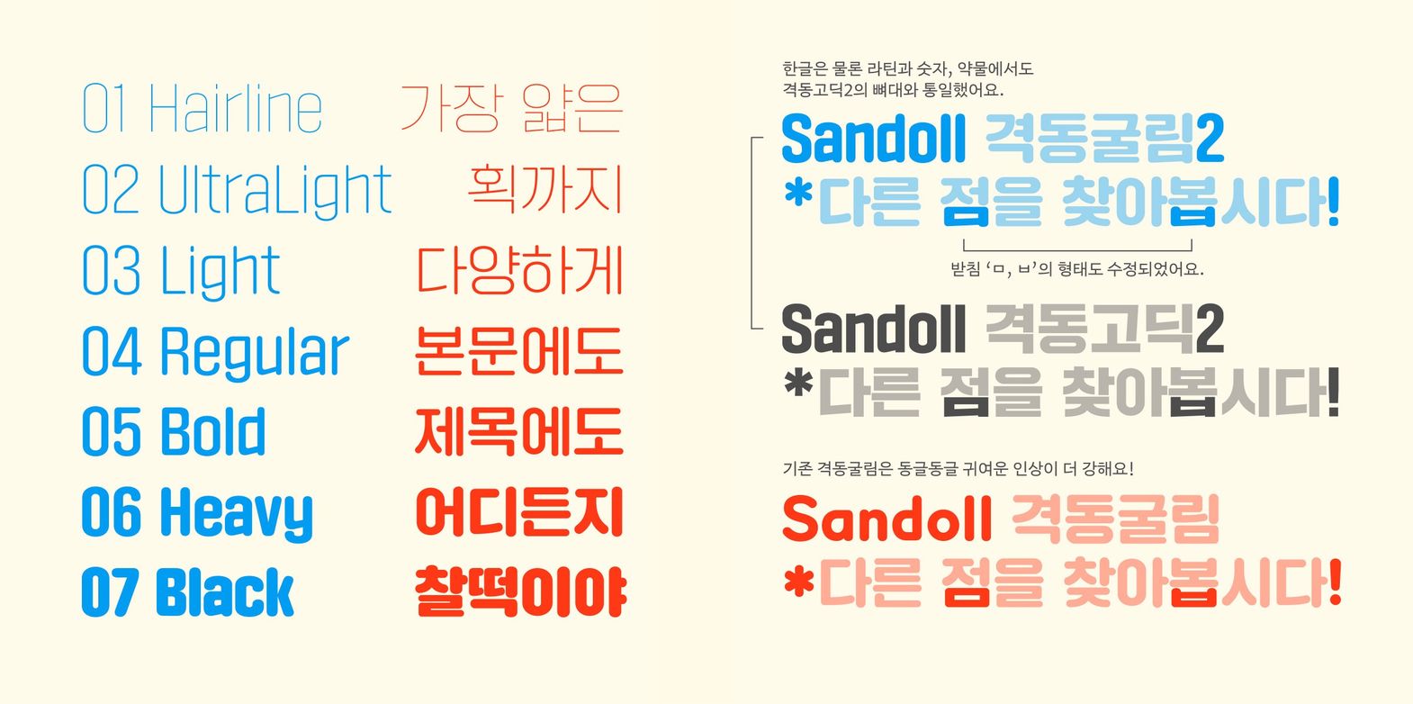
그리고 2021년과 2022년 연달아, 사용자의 많은 사랑을 받았던 「격동고딕」과 「격동굴림」이 총 7개의 웨이트로 확장되어 출시 되었습니다. 2014년에 출시된 「격동고딕」은 네모꼴에 꽉 차는 형태와 두꺼운 획, 단단하고 힘있는 인상과 독보적인 주목성 덕분에 제목용 폰트로서 많은 사랑을 받았죠. 「격동고딕2」와 「격동굴림2」는 이러한 장점을 유지하면서 웨이트를 7종으로 확장하여 사용성을 높였습니다.
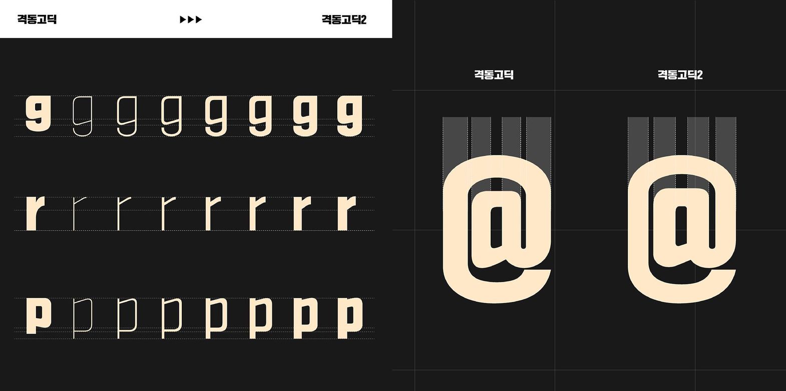
「Sandoll 격동고딕2」, 「Sandoll 격동굴림2」의 개선
「격동고딕2」와 「격동굴림2」가 기존의 「격동고딕」 그리고 「격동굴림」과 무엇이 가장 다른지 물어보신다면!
그것은 라틴과 특수문자의 개선이라고 말씀드릴 수 있겠습니다.
라틴의 경우 그동안 산돌에 축적한 경험과 노하우를 바탕으로 한글의 형태와 구조에 더욱 어울리는 형태로 수정되었습니다. 그 예로 ‘g’를 살펴볼까요? 「격동고딕」의 꽉 찬 구조에 좀 더 어울릴 수 있도록 위쪽의 속공간을 늘려주었습니다. ‘r’,’p'의 경우도 마찬가지예요.
특수문자도 통화 기호를 비롯해 자주 사용하는 기호들을 수정하였습니다. 기호가 가지는 공간, 곡률이 균형적으로 보이도록 미세한 수정을 거듭했어요. ‘@'를 예로 들자면 기존 격동고딕은 안쪽 ‘a'보다 바깥의 원의 두께가 더 두껍게 되어있었지만 개선된 ‘@'에서는 안쪽의 'a’기호가 더 눈에 띄도록 굵기를 수정해 주었습니다.
여러분의 『Sandoll 격동 시리즈』
『격동 시리즈』는 산돌의 대표적인 폰트로 복고적인 맥락 안에서도, 또 그 외의 다양한 사용처에서도 훌륭하게 제 역할을 해내고 있습니다. 『격동 시리즈』를 처음 시작한 장수영 디자이너도 격동 고딕이 복고라는 컨셉에 한정되지 않고 사용자들이 마음껏 사용해 주기를 바랐습니다. 이후 『격동 시리즈』에 참여한 디자이너들도 이와 같은 마음입니다. 어디에 쓰이든 『격동 시리즈』가 사용자의 작업물을 더욱 빛나게 해주길 바라겠습니다.
작성자: 산돌 상품기획팀