토스트가 될 뻔했던 「Sandoll 네모니」의 비하인드 스토리
산돌 폰트를 떠올렸을 때 여러분의 머릿속에 떠오르는 폰트는 무엇인가요? 여러 폰트들이 있겠지만 그 중에서도 많은 분들이 이 이름을 떠올리시지 않을까 싶은데요. 오늘은 「Sandoll 네모니」를 제작한 타입기획팀의 박부미PD님을 만나 「네모니」의 제작 과정과 그 비하인드에 대한 이야기를 들어봤습니다.

Q. 안녕하세요, 부미PD님! 먼저 간단하게 자기소개 부탁드려요.
A. 안녕하세요. 산돌 10년차 타입디자이너 박부미입니다. 산돌 폰트와 다수의 기업 전용폰트를 만들었습니다.
Q. 제가 입사할 때부터 ‘「Sandoll 네모니」와 「Sandoll 호요요」의 어머니’로 PD님을 알게 되었는데요. 산돌 대표 폰트의 제작자로서 산돌에서 제작한 폰트들에 대해 잠깐 자랑해주세요.
A. 「네모니」와 「호요요」 외에도 「Sandoll 광화문」, 「Sandoll 푸른밤」이라는 폰트를 만들었습니다. 산돌 폰트를 제작하지 않을 때는 기업전용폰트를 다수 제작해왔습니다. 어머니로 불리다보니 정말로 폰트들이 저의 자식(ㅎㅎ) 같네요. 나름대로 산돌구름에서 인기 폰트인 것 같아 뿌듯합니다.
Q. 그 중에서도 「네모니」는 2018년 출시된 이후로 현재까지도 꾸준히 사랑을 받고 있는 폰트죠. 당시에는 기존에 없었던 새로운 인상의 폰트로 등장했었는데요. 처음 이런 폰트를 만들어야겠다고 생각하게 된 계기는 무엇이었나요?
A. 「Sandoll 격동고딕」이나 「Sandoll 시네마극장」과 같은, 네모틀 안에 꽉 찬 폰트는 꾸준히 인기를 끌고 있었어요. 다른 회사의 폰트들도 그렇고요. 하지만 앞의 두 폰트는 단단하고 우직한 느낌을 가지고 있다면, 더 부드럽고 귀여운 인상을 줄 수 있으면서도 꽉! 차는 폰트를 만들어야겠다고 생각하게 되었습니다.
Q. 「네모니」라는 이름도 그 매력을 더하는 데 한몫하는 것 같아요. 이 귀여운 이름은 어디서 나온 아이디어였나요? 다른 이름 후보는 없었는지도 궁금하네요.
A. 「네모니」는 제작이 끝날 무렵까지도 이름이 정해지지 않았었는데요. 마음에 드는 이름이 나오지 않아서 마침 옆에 계시던 귀여운 PD님을 붙잡고, “이거 이름 뭘로 지을까요?” 하고 물어봤는데 바로 "네모난 모양이니까... 네모니?" 라고 말씀하셨어요. 아주 즉흥적이면서 찰떡인 이름이 한번에 나왔죠.
하지만 「네모니」라는 이름은 사전에 있는 단어도 아니고, 당시에는 너무 귀엽다(?), 파격적이다(?)라는 이유로 위기가 있었는데요. 출시되기 전 산돌구름 SNS에서 사용자 투표를 받은 결과 다른 이름 후보들을 제치고 당당히! 꼭 맞는 이름을 갖게 되었답니다.
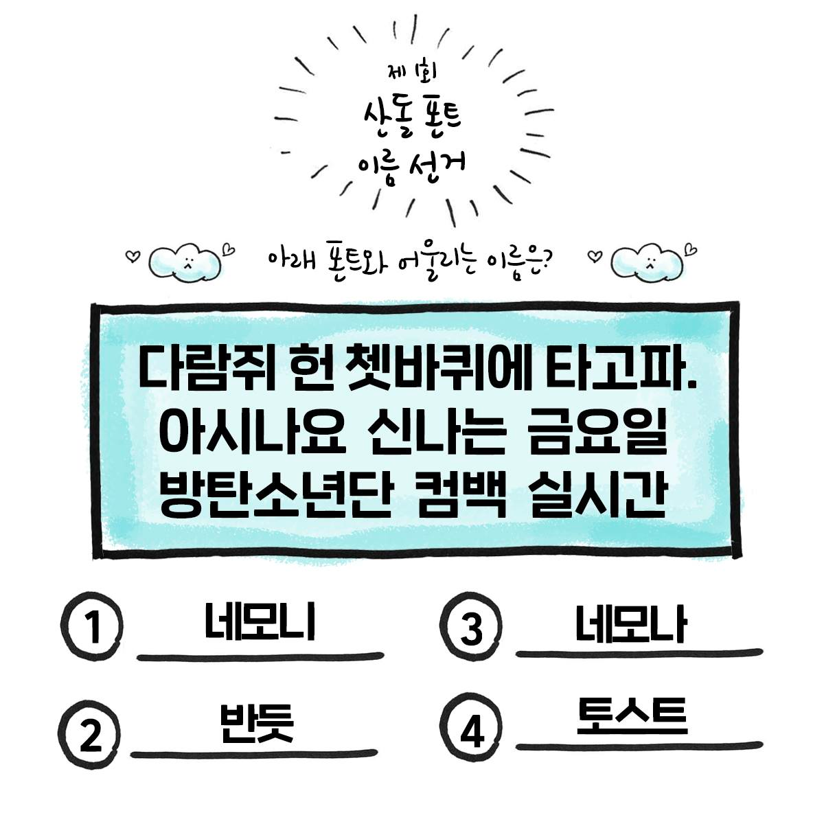 「네모니」 출시 전 폰트 이름 투표 (출처 : 산돌구름 페이스북)
Q. 「네모니」는 꽉 찬 제목용 폰트 중에서도 차별화된 인상을 주는데요. 다른 폰트와 비교했을 때 「네모니」만의 특징은 무엇이고, 그런 부분을 디자인할 때 어려움은 없으셨는지 궁금해요.
A. 일반적으로 제목용 폰트는 강한 주목도를 위해 직선으로 뻗은 획을 주로 사용하는 반면, 「네모니」는 미묘한 곡선을 사용했어요. 빵빵한 획이 주는 귀여운 매력 덕분에 다른 폰트에 비해서는 조금 색다른 인상을 주는 것 같아요.
그래서 처음 스케치할 때, 제목용이지만 너무 과하지 않으면서도, 또 어느 정도는 눈에 띄어야 하는 적당한 정도의 곡선을 찾는 것이 어려웠어요. 게다가 직선으로 그리던 것들을 곡선으로 그린다는 것은 그만큼 용량도, 작업량도 많아진다는 의미인데요. 하지만 그 미묘한 곡선 덕분에 종이에서도, 화면에서도 부드럽게 보이죠!
Q. 「네모니」는 캐주얼하고 귀여운 느낌으로도 많이 쓰이지만, 양감이 느껴지기 때문에 주목도가 필요한 제목에서도 자주 보이는 것 같아요. 제작자로서는 「네모니」를 어떻게 사용했을 때 잘 어울리는 것 같나요?
A. 질문 그대로 캐주얼하고 귀여운 느낌으로 제작했다고 생각했는데, 생각보다 진지하고 무서운(?) 문장에서까지 잘 쓰이더라고요. 그래도 크게 크게 사용될 때가 곡선의 특징이 잘 보여서 좋은 것 같아요. 긴 글이나 책의 본문에 사용하기에는 어려움이 있지만, 반대로 디스플레이용으로 크게 사용했을 때 시선을 확! 사로잡을 수 있답니다.
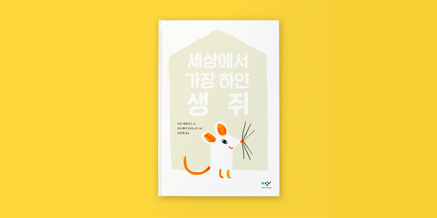 미디어창비, <세상에서 가장 하얀 생쥐>
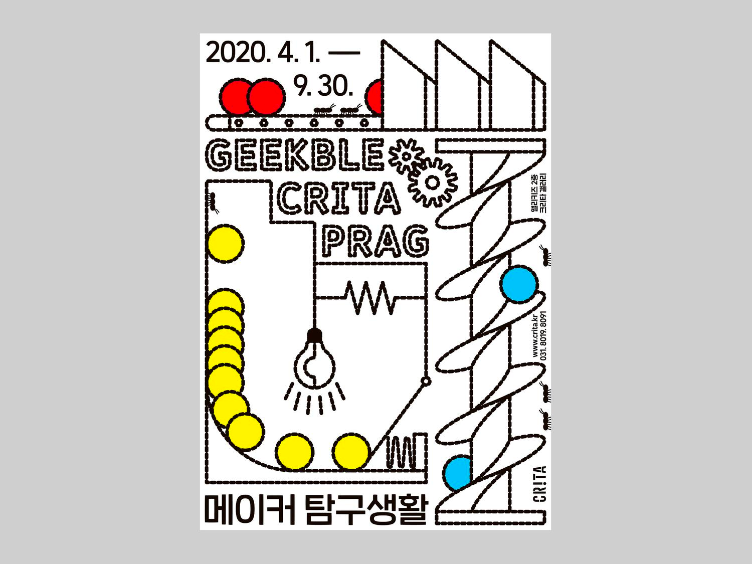 프래그 스튜디오, <메이커 탐구생활>
Q. 「네모니」를 향한 많은 관심과 사랑으로, 출시 후 1년 뒤에는 웨이트를 5종으로 확장한 「Sandoll 네모니2」가 출시되었었죠. 그리고 올해도 「네모니」의 새로운 소식이 들리는 것 같던데요?
A. 네, 오는 8월에 「Sandoll 네모니」가 새롭게 확장되어 출시될 예정인데요. 먼저 현대 한글의 모든 음절을 표현할 수 있도록 2,780자에서 11,172자로 확장되었고요. 기존에는 한국어와 영어만 지원했지만, 프랑스어와 독일어를 비롯한 유럽 국가 대부분의 언어와 러시아어까지 지원할 수 있게 되었습니다~!
Q. 「네모니」가 다양한 언어로 확장되는 점도 흥미로운 지점인 것 같아요.
A. 사실 언어를 확장하게 된 배경은… 평소 즐겨보던 유튜브 채널에서 「네모니」를 자막에 사용해 주셨는데, 외국 지명이나 단어를 쓸 때 그 부분만 다른 폰트로 대체된 것을 보면서 정말 안타까웠답니다. 그런 사례들을 보며 사용자의 니즈가 있다는 것을 분명히 알게 되었고, 확장에 대한 필요성을 느꼈죠. 이제 한국어나 영어 외의 다른 언어까지 사용할 수 있게 되었으니, K-콘텐츠의 해외 팬들을 위한 자막 같은 곳에서 잘 쓰이면 좋겠네요! (하하)

Q. 마지막으로, 「네모니」를 사용해주시는 많은 분들께 한마디 부탁드려요.
A. 「네모니」는 18년 8월에 처음으로 출시되었는데요. 지금까지 꾸준히 사랑받고 있어서 신기하고 감사한 마음입니다. 앞으로의 산돌 폰트들도 기대해 주시고 많이 사용해 주세요! 감사합니다.
작성자: 산돌 기획운영팀 이소윤