썩을 것보다 더 무서운 썩지 않을 것 「Sandoll 정체」 이야기
폰트는 크게 제목용(body type)과 본문용(display type)으로 나눌 수 있다. 본문용은, 제작이 까다롭고 오래 걸리며 한 폰트만 계속 쓰는 경향이 강하기 때문에 새롭게 만들어지는 폰트의 상당수는 제목용이다. 물론 유서 깊은 폰트 파운드리는 완성도 높은 본문용 폰트를 한 종 이상씩 가지고 있다. 잘 만든 본문용 폰트는 해당 파운드리의 역사와 전통을 증명하는, ‘오랫동안 만들어 오랫동안 판매하는 플래그십 모델’을 뜻하기 때문이다.
미뤄오던 일이 드디어 수면 위로
폰트 플랫폼 산돌구름의 유저를 대상으로 한 설문에서 본문용 폰트가 부족하다는 피드백을 받았다. 해야지 해야지 하면서도 적잖은 예산과 인력을 투입해야 하기에 미뤄오던 일이었다. 2017년 봄, 그렇게 누적된 죄책감이 열매를 맺어 TF팀을 꾸렸다. 디렉터는 폰트 디자이너가 아니라 인쇄·출판 경험과 조판 지식을 갖춘 타이포그래퍼가 맡았다. 폰트를 많이 만들어본 사람이 아니라, 많이 써본 사람의 관점에서 접근했기 때문에 본문용 폰트가 갖춰야할 조건에 대해 치밀하게 접근할 수 있었다. 오랜 헤비 유저가 그동안 한글 타이포그래피에 품었던 갈증을 곱씹으며 직접 제작에 나선 셈이다.
낯선 사람과 팀 만들기
프로젝트의 규모가 커지면 담당자의 부담도 커진다. 솔직히 “잘 해야지”보다 “망하면 어쩌지?”를 떠올렸다. 모든 분들이 웃는 얼굴로 부드럽게 대해주셨지만 몹시 부담스러웠다. 한국과 일본의 서예 이론 서적을 닥치는 대로 읽었고 틈틈이 붓글씨를 썼으며 자기 전에는 한중일 서예 유튜브를 살폈다. 그렇게 컨셉을 잡고 나서는 직접 프로토타입 폰트를 만들어 타당성을 따져보았다. 덕분에 베테랑 폰트 디자이너들과 원활히 소통할 수 있었다. 망하면 다시 일어서기 어려울 것 같았다.
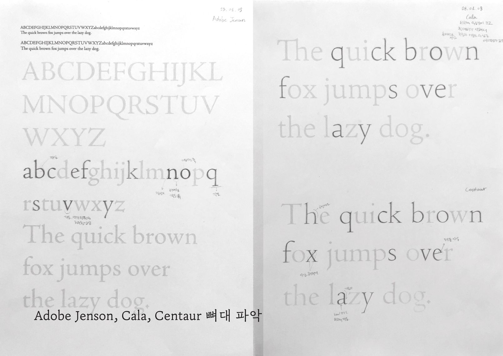
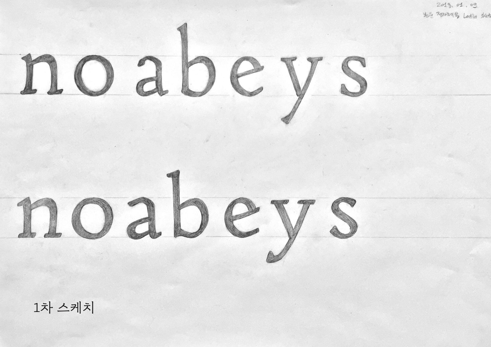
이제 팀을 만들 차례다. 외부 디렉터가 처음 만난 디자이너와 일을 하려면 무얼 먼저 해야 할까. 각자의 머릿속에 있는 것들을 끄집어 내어 공통의 목표와 어휘를 만들기로 했다. 가장 빠르고 쉬운 방법은 몸을 쓰는 (디지털 도구를 피하는) 워크숍이다. 각자 본문용 폰트의 이상적인 뼈대에 대하여 함께 말하고 듣고 쓰고 그려가며 생각의 차이를 발견하고 좁혀갔다. 존경하는 「SM 세명조」의 뼈대를 추출하여 살을 다시 붙여보는 워크숍도 진행했다.

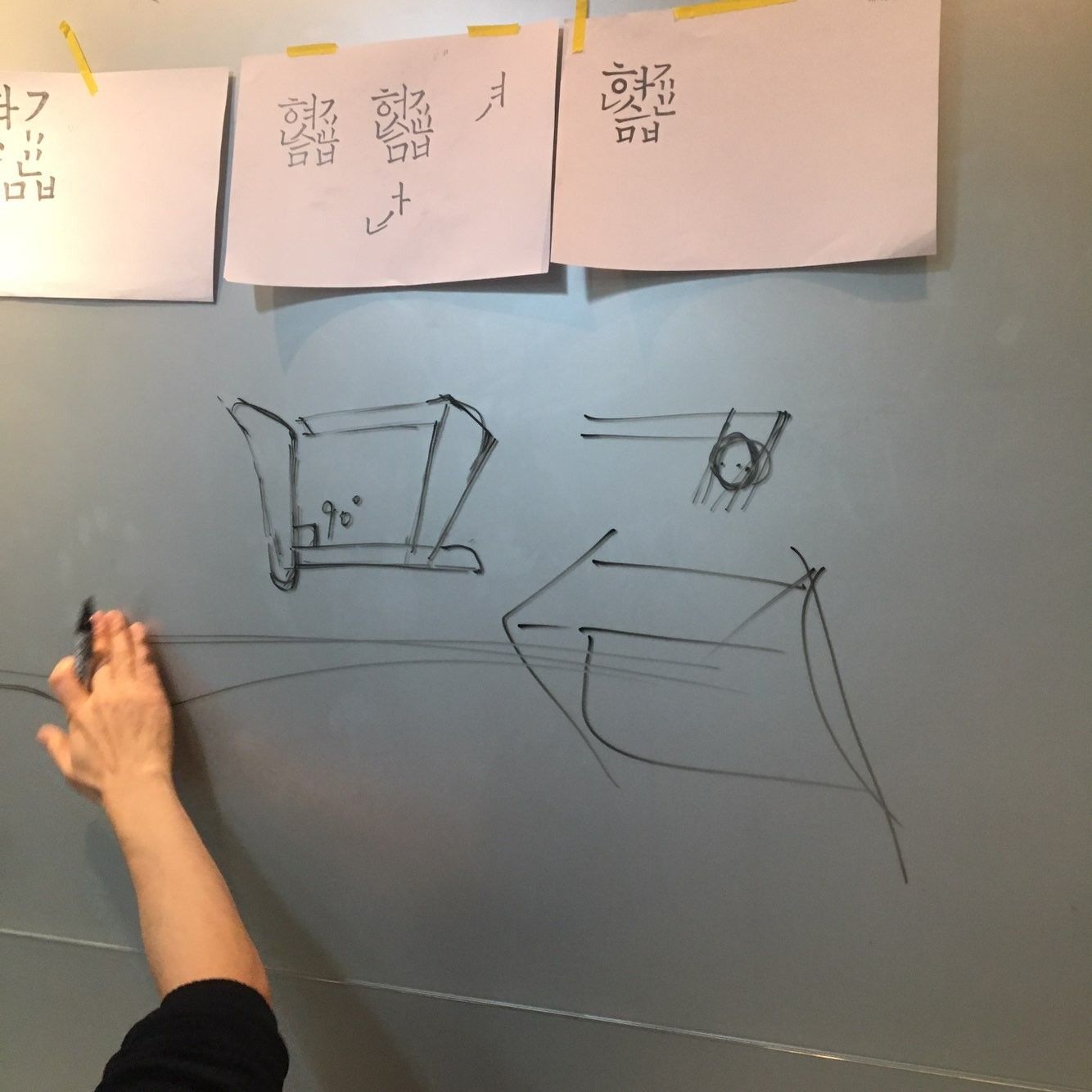


여기서 중요한 것은 결과가 아니라 생각을 다듬는 과정 자체다.
글자의 밀도와 빈도를 찾는 연구
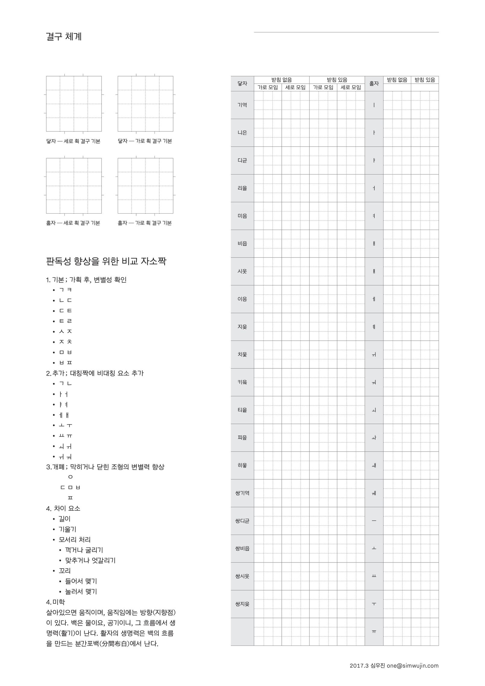
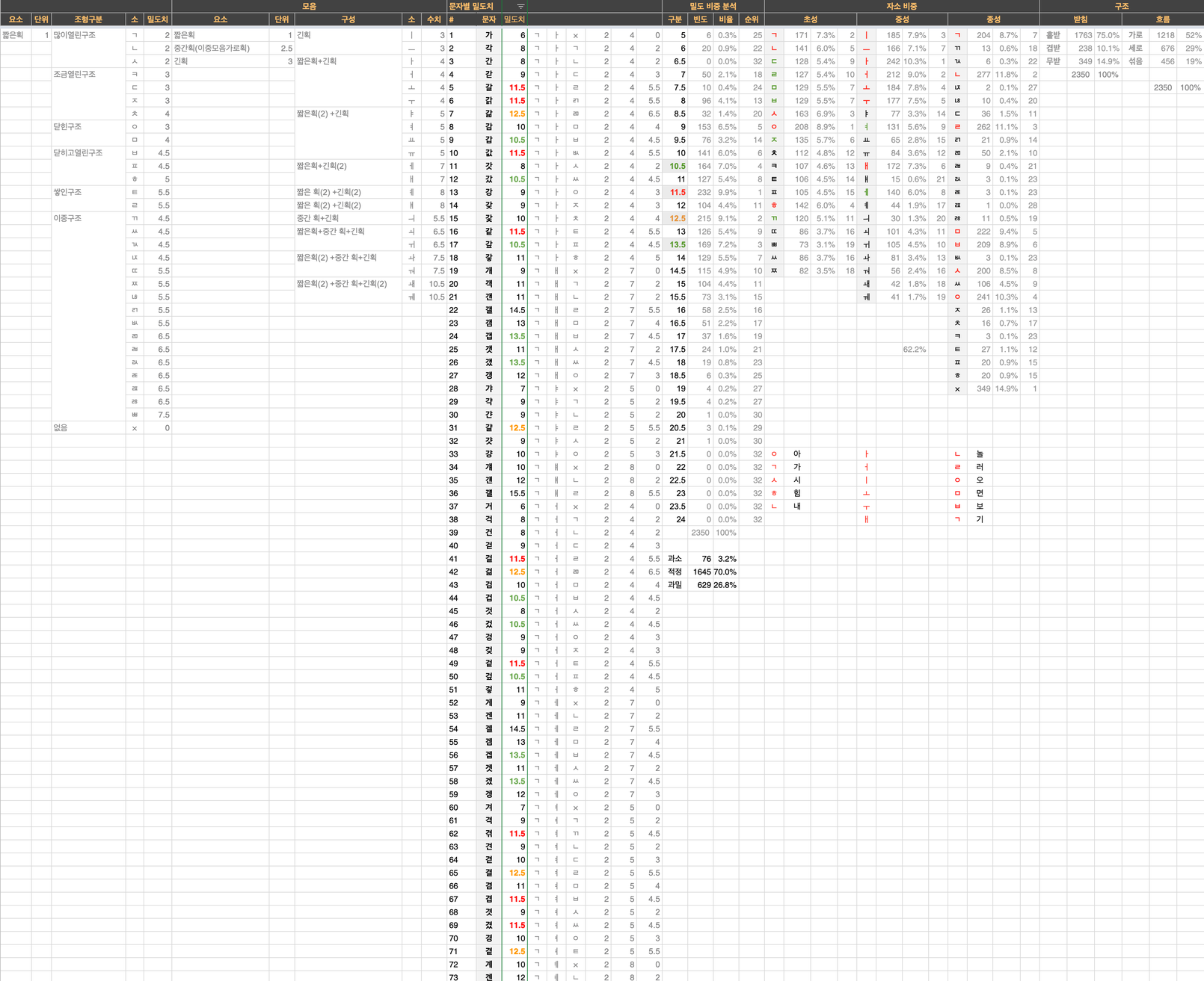
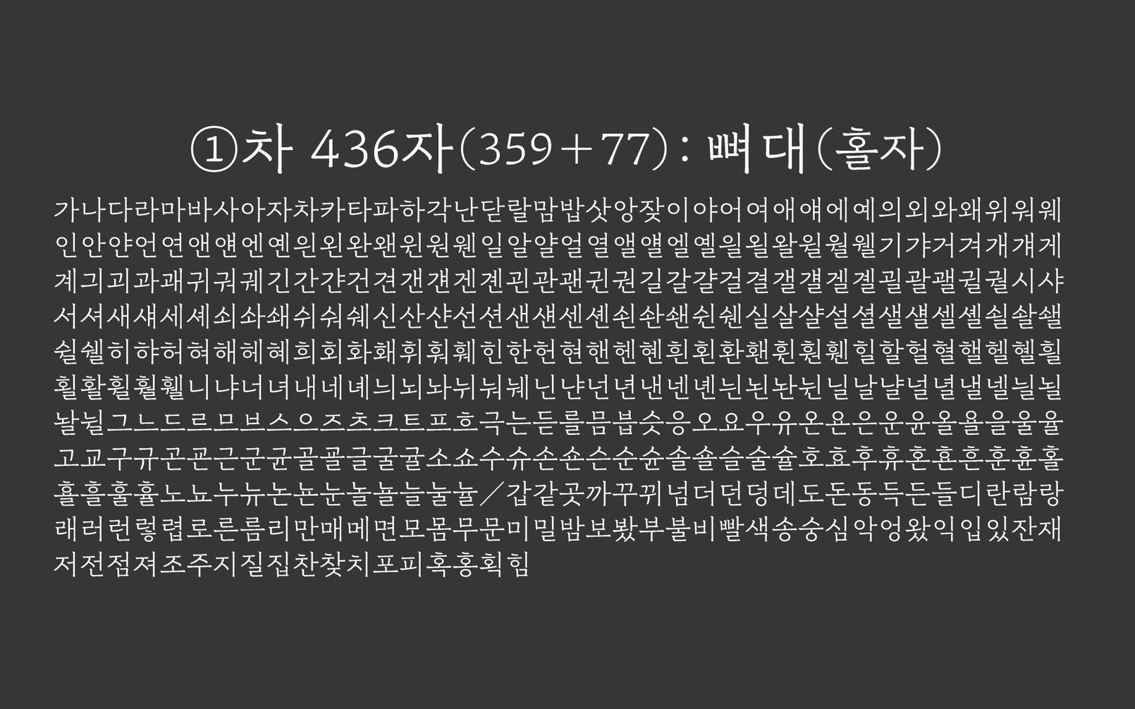
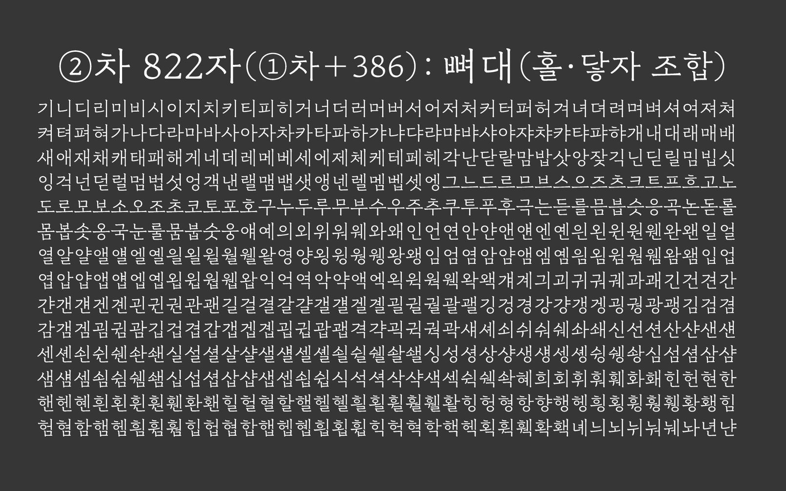
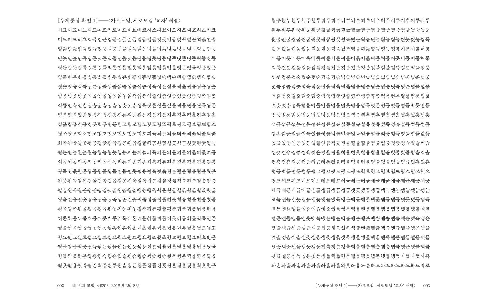
KS규격대로 폰트를 만들려면 2,350자의 한글을 그려야 한다. 이 집단의 정체성을 알아야 뭘 해도 할 수 있을 것 같았다. 그래서 먼저 각 글자의 밀도와 빈도를 구해보고자 했다. 밀도치는 획의 길이에 수치를 부여하여 합산하는 방식으로, 빈도치는 한글 2,350자를 쪽자(자소)로 분해하여 위치별(초성, 중성, 종성) 출현 횟수를 더하는 방식으로 구할 수 있었다. 첫닿자(초성자)는 ‘ㅇㄱㅅㅎㄴ’, 받침닿자(종성자)는 ‘ㄴㄹㅇㅁㅂㄱ’ 순으로 자주 등장했다. 이 연구로 어떤 글자의 먼저 그려야하는지 우선 순위를 매길 수 있었다. 새로운 프로세스를 만들기 위해 반드시 거쳐야 했던 연구였다.

아쉽게도 요즘 사람들이 가장 자주 쓰는 글자가 무엇인지 알 수 없었다.
새로운 프로세스, 짧게 반복하는 힘
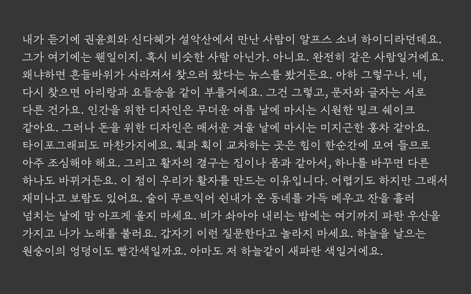
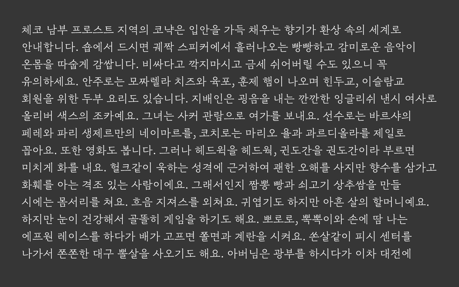
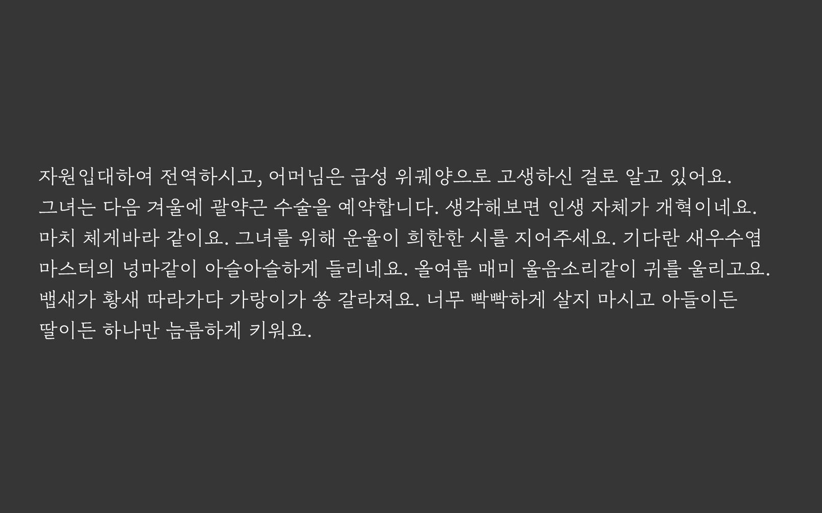
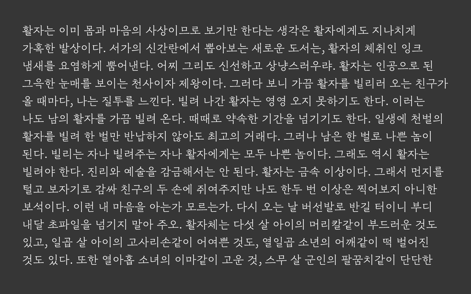
본격적인 개발 프로세스도 만들었다. 새로운 것을 만들려면 새로운 프로세스가 필요하기 때문이다. 나무 한 그루 본 것으로 숲을 그려낼 수는 없듯, 한 글자씩 그려가면 여러 글자가 문장을 이뤘을 때의 모습을 예상하기 어렵다. 따라서 본문용 폰트의 퀄리티는 디자이너가 문장을 흘려보는 시기를 얼마나 앞당기는가에 달려있다. 기존의 프로세스는 상당수의 글자를 그린 이후에 조판 테스트를 했기 때문에 적극적으로 수정 사항을 반영하기 어려웠다. 수정의 양은 글자 수에 비례하기 때문이다. 최소 글자로 이른 시점에 조판 테스트를 하면, 적은 글자를 쉽고 빠르게 수정할 수 있어 민첩하게 만들어 갈 수 있다. 그렇게 하기 위해 키 비주얼을 담당하는 글자에 조사와 어미를 담당할 글자를 더해 460여자를 선별하고 이 글자만으로 글을 썼다. 본문용 폰트의 단골이 문학이었기에 단편 소설의 느낌으로 썼다. 먼저 낱말을 만들고 낱말을 이어 문학적인 맥락을 만들었다. 낱말의 수가 적다보니 4차원 판타지 소설이 되었다.


1차, 2차, 3차 수정
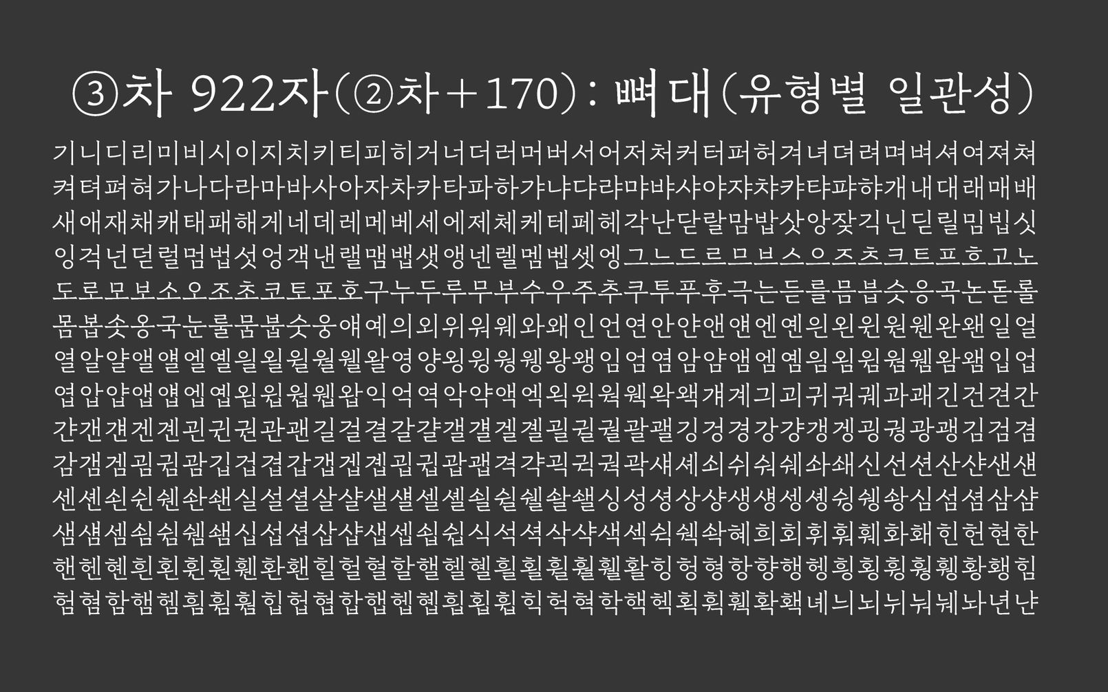
몇 백자를 그리고 조판해서 읽어보고 수정하기를 여러 번 반복하면 폰트가 완성된다. 테스트 주도 개발, 에자일, 이터레이션이라고도 할 수 있다. 몇 백자만으로 구성된 텍스트를 만들었으니 디자인만 하면 된다. 단지 이 단계에서의 글자는 못생길 수 밖에 없으며 그걸 참지 못하고 손을 대는 순간 개발 계획이 틀어져버린다는 점을 명심해야 한다. 
1차 조판 테스트 결과. 예상대로 볼품없었고 다행히 잘 참았다. ‘ㄱ'을 고치면 ‘ㅋ'도 고치고 ‘ㄲ'도 고쳐야 하듯 하나를 제대로 고치려 들면 일이 커지기 마련이다. 한 글자를 완벽히 마무리짓고 다음 글자를 그리는 것이 쉬워 보이지만 여러 글자를 그려서 직접 조판해 보지 않으면 무엇이 최선인지 알기 어렵다. 즉, 확실한 판단 기준이 서지 않는 한 못마땅해도 고치지 않았다. 정확히 말해 고칠 수가 없다. 그래서 처음에는 'ㅣ’나 'ㅡ’처럼 가장 긴 획의 위치를 확정하는 데 집중했다. 'ㄱㄴㄷㄹ’같은 쪽자들은 적당한 크기와 위치에 얹어만 놓았다. 그렇게 총 6차로 나누어 회차별로 주요 체크사항을 지정하여 조금씩 완성도를 올려가는 방식으로 접근했다. 마음에 들지 않아 고치고 싶은 곳이 수두룩해도 이번 차수의 체크 사항이 아니라면 과감하게 무시하고 넘어갔다. 어색함을 발견하면 본능적으로 손이 나가는 디자이너에게는 만만치 않은 프로세스였다. 눅눅한 이불을 덮고 6개월을 사는 느낌이랄까.


2차도 마찬가지다. 아직 멀었다. 하지만 못생김에 현혹되지 말고 닿자(자음자)와 홀자(모음자)의 조합만 보자. 아직은 획의 위치와 길이가 중요하다. 테두리의 모양은 나중에 수정하자.

3차가 가장 힘들다. 30%를 넘는 글자를 그렸으니 기대치도 올라간다. 하지만 여전히 못났다. 고생을 했는데 보상이 따르지 않으니 힘이 빠진다. 그러나 명심하자. 아직 띄어쓰기의 너비도, 문장부호도, 숫자도, 라틴도 그리지 않았다. 여전히 뼈대에 집중하여 뼈대를 수정해야 한다.


4차, 5차, 6차 수정
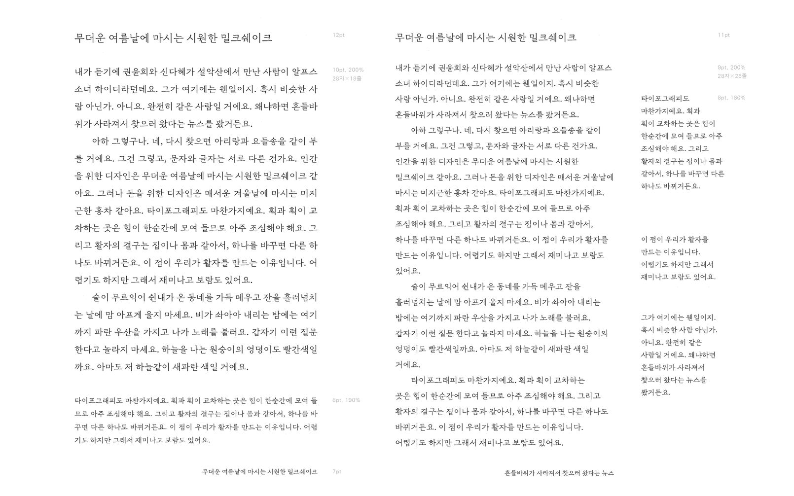
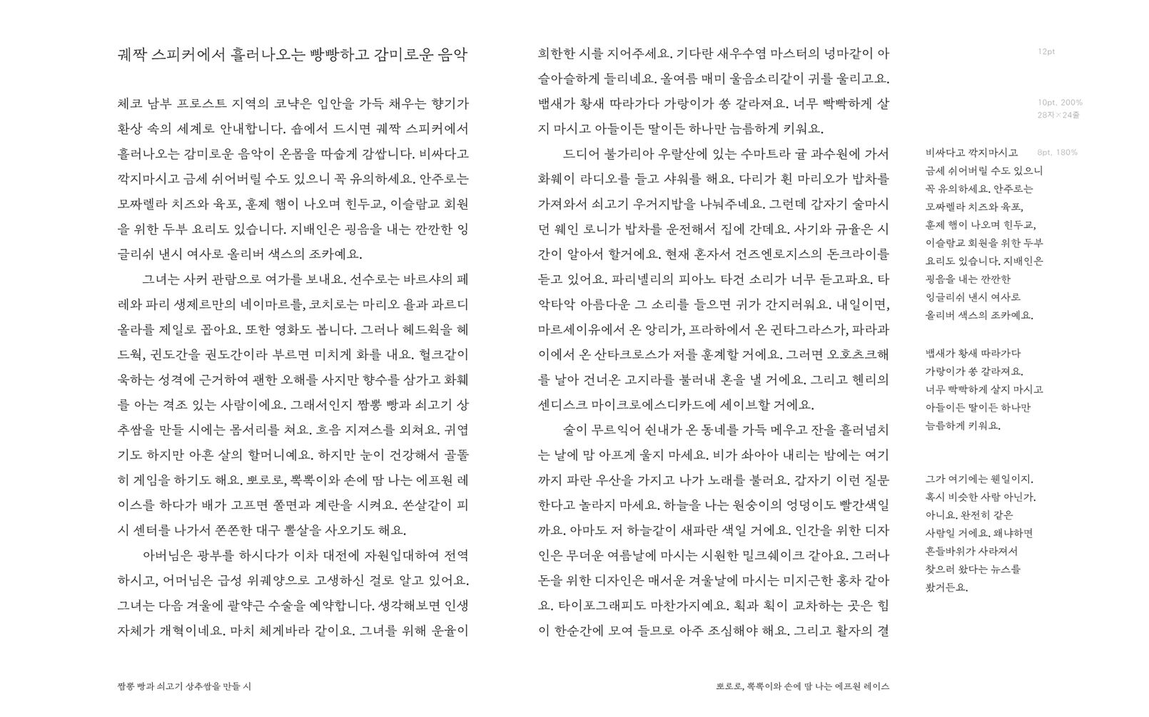
4차가 되자 드디어 그럴듯한 모양새를 드러내기 시작했고, 5차에 문장부호를 추가하니 제법 볼만했다. 오래 기다린 만큼 기뻤다. 뼈대가 자리를 잡았으니 드디어 테두리를 살필 수 있게 되었다. 그러려면 지금까지 문장으로 흘려보며 글줄의 느낌을 살피던 방식에서 벗어나야 했다. 낱말이나 낱자 중심의 검수용 텍스트를 만들었다. 디테일한 작업에는 디자이너의 미감보다 합목적성이 중요하다. 이 바닥에는 끝이란 것이 없기 때문에 여럿이 손잡고 들어가지 않으면 길을 잃기 십상이다. 망망대해로 뛰어드는 스쿠버다이버들처럼 서로의 목숨을 지켜주는 팀워크가 필요하다. 적합한 검수용 텍스트가 그런 역할을 맡아주었다.

숫자와 라틴문자까지 가세하니 욕심이 났다. 라틴 문자의 규모를 올유러피언즈 영역까지 확장했고 이탤릭체까지 넣었으며 장식적인 대문자인 스워시도 넣었다. 문장부호도 한글용과 라틴문자용을 각각 따로 디자인했다. 힘들었지만 끝이 보이기 시작하니 신이 났다. “망하면 어쩌지?”하던 고민은 어느덧 “잘 해야지”로 바뀌었다.
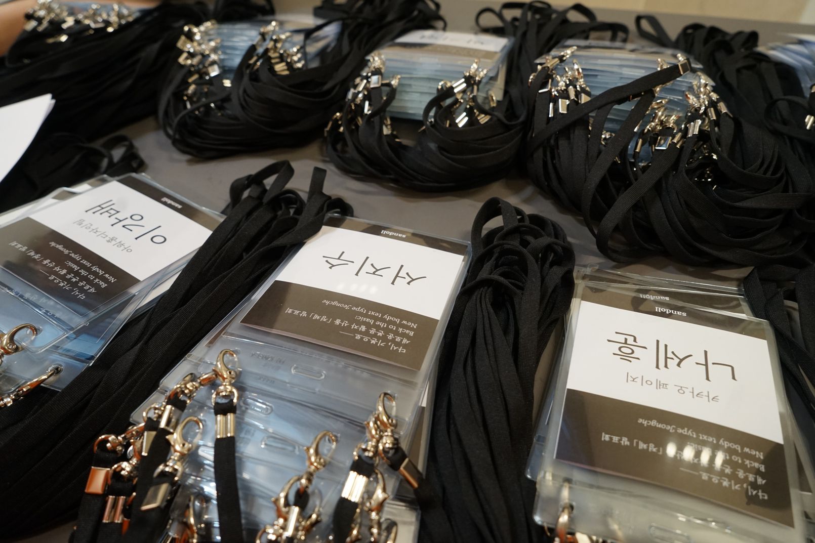
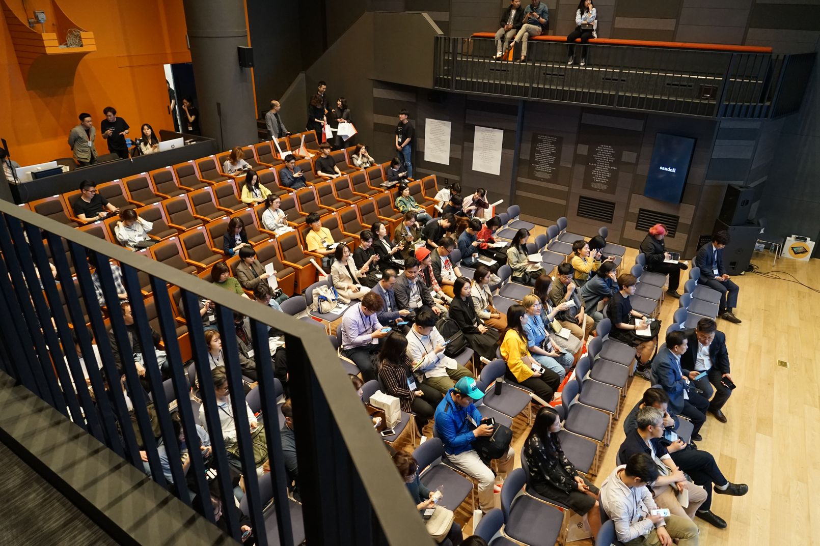
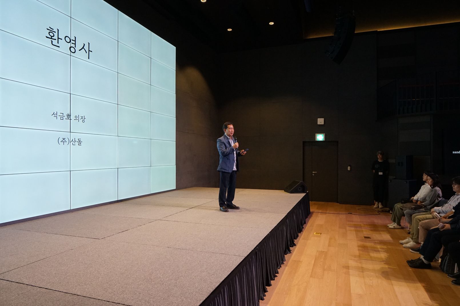
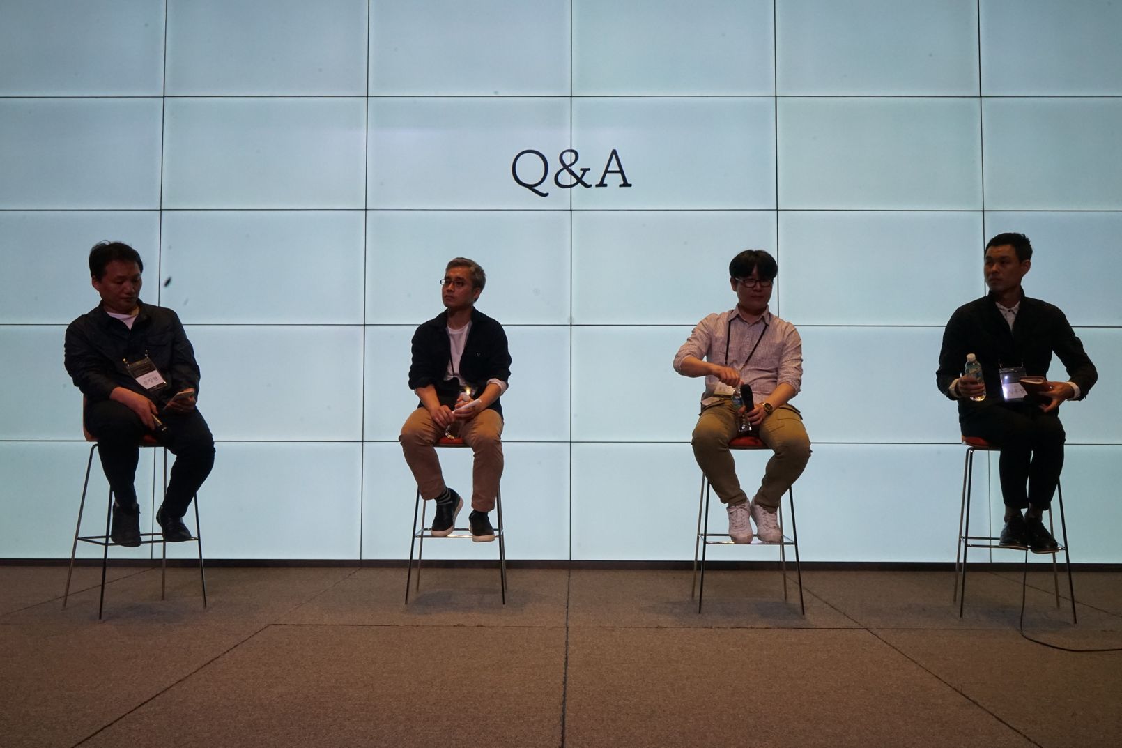
다시, 기본으로—, 새로운 본문 활자 「정체」 발표회
폰트 파운드리의 일은 크게 두 가지다. ①기업의 의뢰로 만들기(커스텀 폰트 개발), ②스스로 만들기(자사 폰트 개발). 스스로 만드는 것은 재미있지만 수익이 늦게 천천히 발생하기 때문에 쉽지 않다. 그러니 발표회까지 여는 것은 무모하리만큼 새로운 도전이며 해외에도 이런 사례는 극히 드물다. 수십 명이 1년을 준비했다. 오셨으면 하는 분들께 정중히 초청을 했고, 적당한 자리의 예약을 받아 혹여 오셨는데 입장을 못하시는 분들이 없도록 살폈으며, 퇴근 후 저녁 식사를 못하실까 봐 샌드위치를 준비했고, 드실 시간이 빠듯할까 봐 나가서 드시는 시간도 넣었다. 빈손으로 보내드리기 싫어 선물과 경품도 준비했고, 정체로 책을 만들어 본 디자이너를 초청하여 토크쇼도 했다. 너무 늦게 끝나면 밤길이 위험할 수 있으니 절대 늦지 않기로 했다. (그러나 발표도, 토크쇼도 시간을 넘겨버리고 말았다)


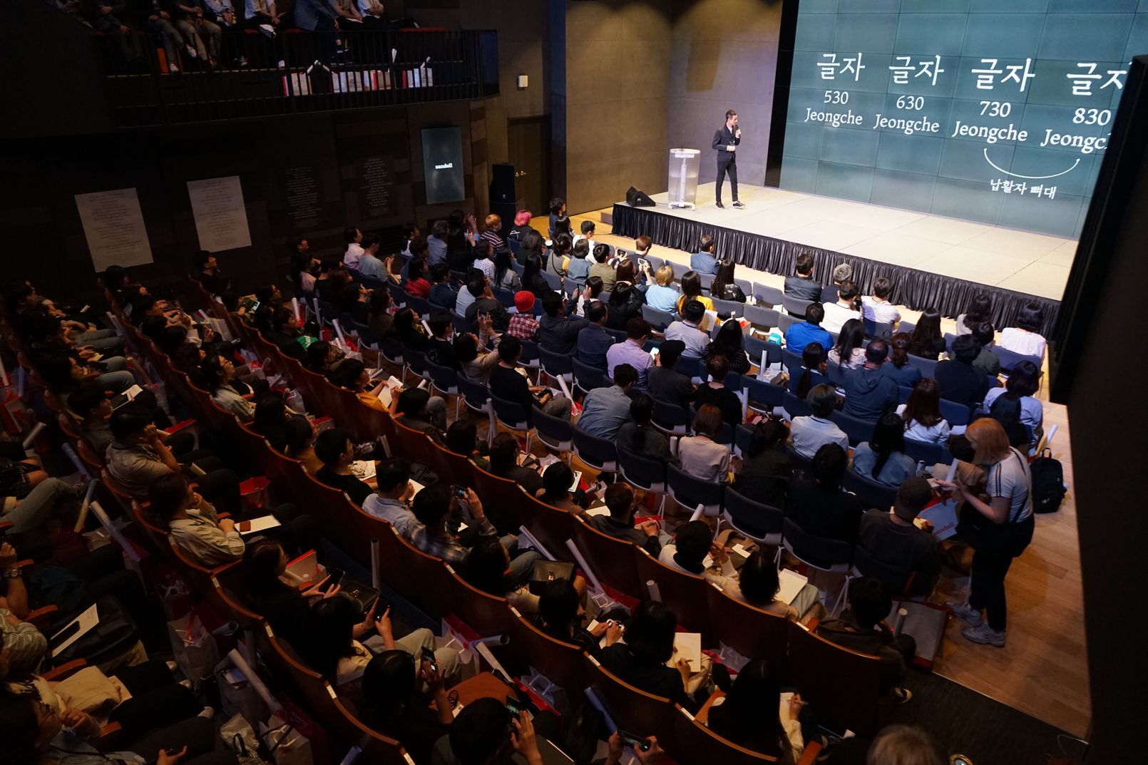
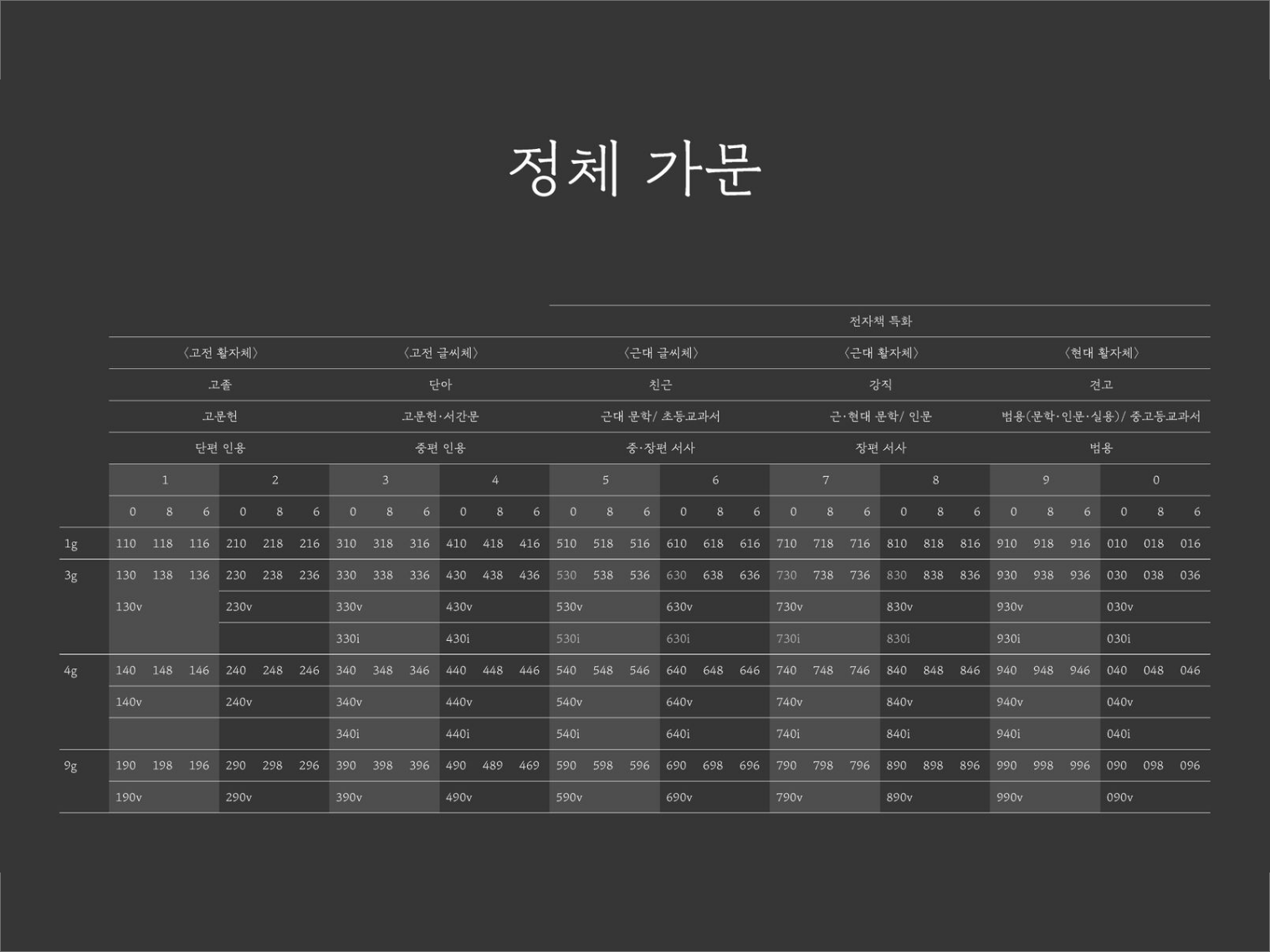
『Sandoll 정체』는 가족이 아닌 가문의 이름이다. 그만큼 규모가 크다. 지금도 개발하고 있다. 그래서 이름도 세 자리 숫자로 되어있다. 첫 번째 숫자는 현대성, 두 번째 숫자는 무게감, 세 번째 숫자는 글자의 너비를 나타낸다. 「정체 930」은 「정체 530」보다 현대적이지만 무게와 너비는 같다. 때때로 라틴문자 한 글자가 접미어로 붙는다. i는 이탤릭을 뜻한다. 「정체 530」은 정자체이고 「정체 530i」는 이탤릭체다.


썩을 것보다 더 무서운 썩지 않을 것
디지털 폰트는 아무리 시간이 흘러도 태어났을 때 그대로다. 이렇게 썩지 않는 것을 불후(不朽)라고 한다. 세상엔 불후의 명작과 망작이 있다. 내가 불사른 무언가가 썩지 않는 망작이 되어 세상을 떠돈다면 이 얼마나 구슬픈 일인가. 그래서 명작을 꿈꾸기 보다는 망작을 피하고픈 마음이 크다. 명작의 명예보다 망작의 불명예가 훨씬 크기 때문이다.
산돌에는 알게 모르게 쌓인, "이 정도는 되어야한다"는 하한선의 불문율이 있다. (상한선은 굳이 정할 필요가 없다)추하지 않음으로 세상을 아름답게 한다는 현실적이고 유연한 사고는 자연스레 철학이 되었다. 폰트가 세상을 아름답게 만들 수 있다는 사실을 38년 동안 아주 조금씩 경험했기 때문이다. 여럿이 꾸준히 하다 보니 다른 분들보다 조금 먼저 느꼈을 뿐이다. 이 달달한 기분을 여러분들과도 나누고 싶다.
작성자: 산돌 연구소 심우진