들쭉날쭉 그 폰트 「Sandoll 호요요」
들어가며
「Sandoll 호요요」는 2018년 10월에 출시된 산돌의 제목용 폰트입니다. 폰트 사용자에게 새로운 경험과 즐거움을 주는 것을 가장 중요한 목표로 삼아 만들어졌다고 하는데요. 이러한 목표를 어떤 방식으로 폰트에 풀어냈을까요? 「호요요」라는 이름은 누가, 무슨 생각을 가지고 지었을까요? 차근차근 이야기해 보겠습니다.
가변폭
전에 본 적 없는 폰트을 만들기 위해, 「호요요」는 아주아주 불규칙한 가변폭으로 만들었습니다. 일반적인 한글 폰트은 모든 글자를 같은 폭으로 만들거나, 비슷한 모임꼴*끼리 같은 폭으로 만들기도 합니다. 반면에 「호요요」는 모든 글자의 폭이 규칙 없이 다르게 변하도록 만들었답니다. 어떤 글자는 매우 넓거나 좁고, ‘미'와 ‘이 , ‘느’와 '는’ 처럼 비슷한 구조의 글자라 할지라도 각각 완전히 다른 폭을 가지고 있기도 합니다.
*비슷한 구조를 가진 글자를 묶는 방법입니다. 가, 각, 간은 가로모임꼴 글자, 고, 곡, 곤은 세로모임꼴, 그리고 긔, 긘, 길은 섞임모임꼴로 묶을 수 있습니다.
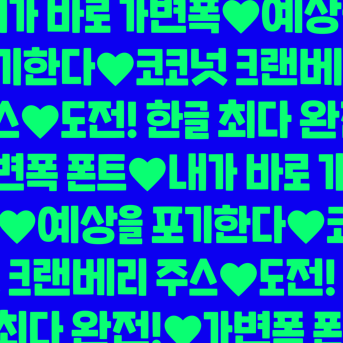
심지어는 같은 글자끼리 만날 때에도 최대한 다른 폭이 섞여있는 것처럼 보이도록 하기 위해, 같은 글자를 두 글자씩 제작해서 대체 글립*으로 지정해 주었습니다. 이는 ‘[씩씩]하게’, ‘바[나나]’처럼 같은 글자가 반복될 때 또 다른 폭의 글자가 나타나도록 만든 것입니다. 현재 약 200쌍이 넘는 대체 글립 조합이 호요요에 들어있습니다.
「호요요」를 사용해 타이핑해 보셨나요? 다음 글자가 예측할 수없이 줄었다 늘었다 폭이 바뀌는 모습을 즐겨보세요. 이는 가독성을 향상해 준다거나 하는 기능적인 요소가 아니지만, 별다른 장치 없이도 전달하고자 하는 내용에 재미를 충분히 더할 수 있죠.
*대체 글립은 일부 프로그램에서 작동하지 않을 수 있으며 Adobe 프로그램에서는 ‘문맥 대체(Contextual alternates)’ 혹은 ‘OpenType’기능이 활성화되어 있는지 확인하세요.
통통한 획
'완전 불규칙한 가변폭'이라는 독특한 특징을 가지고 있기 때문에 전체적인 구조는 단순하게 만들었어요. 뼈대를 직선으로, 복잡하지 않게 쭉쭉 뻗은 획으로, 글자 칸 안에 꽉꽉 채워 주었습니다. 하지만 멀리서 봤을 때는 쭉쭉 뻗은 직선 획을 조금 더 가까이에서 보면 테두리가 볼록한 곡선으로 이루어져 있는 모습을 발견할 수 있어요. 이러한 특징은 「호요요」를 더 통통하고 부드럽게 보이도록 해 주고, 말랑말랑한 분위기를 연출할 수 있게 해 줍니다.
라틴 알파벳과 부호
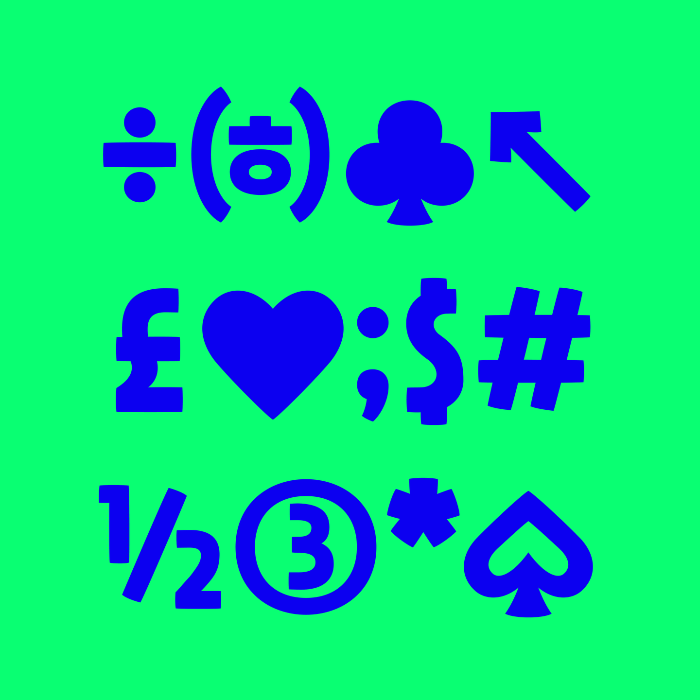
한글에서 보여지는 재미를 라틴에서도 느낄 수 있도록, M, W과 같은 글자는 아주 넓게, 반대로 F와 T같은 글자는 매우 좁게 만들었습니다. 그리고 과감한 디자인의 g도 포인트입니다. 게다가 'BELL'과 같은 단어를 입력해 보면 한글처럼 라틴 알파벳에서도 대체 글립이 나타납니다. 「호요요」의 분위기를 똑 닮은 문장부호와 특수문자도 잊지 말고 사용해 보세요.
네이밍 배경
틀과 형식을 깨는 폰트인만큼 이름도 이전에 없던 형식의 파격적인 이름을 만들어 주고 싶었습니다. 그러나 ‘호요요’는 디자이너가 파일 이름에 임시로 써 놓았던 이름입니다. 어쩌다 이런 이름을 짓게 되었을까요? 옆에서 일하던 다른 디자이너가 ‘호요요….’ 하고 한숨을 쉬어 「호요요」가 되었다는 소문도 전해져 오고 있습니다. (진짜일까요?)
비록 즉흥적으로, 특별한 뜻 없이 지은 이름이지만 ‘호요요’ 보다 「호요요」에게 잘 어울리는 이름은 없다는 의견이 많아 그대로 사용하게 되었습니다. 소리 내 읽어보면 발음도 쉽고 재미있습니다. 한숨을 ‘호요요….’ 하고 내쉬어 보세요.

그리고 「호요요」 확장! (컬러폰트, 모바일 폰트, 웨이트 확장)
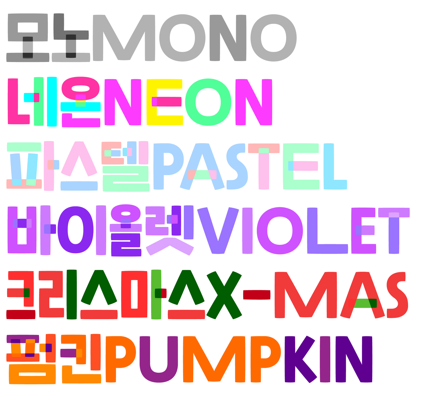
「호요요」는 2018년 겨울 출시 이후 많은 사랑을 받아 다양한 형식으로 확장되고 있습니다. 가장 먼저 컬러 폰트* 형식으로 출시되었죠. 한 글자 안에서 자소마다 다른 색상으로, 그리고 획이 겹치는 부분에 또 다른 색상을 무작위로 넣어준 것이 특징입니다. 여섯 가지 색상 조합으로, 직접 효과를 주지 않아도 독특한 분위기를 낼 수 있죠. 마치 조각보나 패치워크 같기도 해서 「호요요」의 오밀조밀한 획이 더욱 돋보이도록 해줍니다.
*컬러 폰트는 글자의 모양뿐 아니라 색상 데이터가 포함되어 있어 별도의 수정 없이도 컬러나 질감이 적용된 모습으로 출력됩니다.
그리고 모바일 폰트 형식으로도 확장되어 스마트폰 안에서, 메신저 안에서도 사용할 수 있게 되었습니다. 어떤 대화를 나눠도 「호요요」로 읽을 수 있게끔 11,172자의 모든 현대 한글 음절을 만들었습니다. 현재는 다양한 두께의 「호요요」가 필요하다는 의견에 따라 웨이트 확장을 진행 중입니다.
마무리
「호요요」는 전에 없던 특징들을 선보이며 출시한 만큼, 반응에 대한 기대와 걱정을 모두 가지고 있었는데요. 다행스럽게도(?) 지금은 다양한 곳에서 무사히 사용되고 있는 「호요요」를 발견할 수 있어요. 게다가 한 폰트 안에서 글자 폭을 불규칙하고 다양하게 만드는 것이 하나의 스타일로 자리 잡아 더 다양한 한글 폰트들이 세상에 나올 수 있도록 물꼬를 트는 역할까지 톡톡히 해냈답니다!
작성자: 산돌 상품기획팀 박부미