폰트 디자이너 장수영
*본 아티클은 2014년에 작성된 내용을 재구성하여 작성되었습니다.
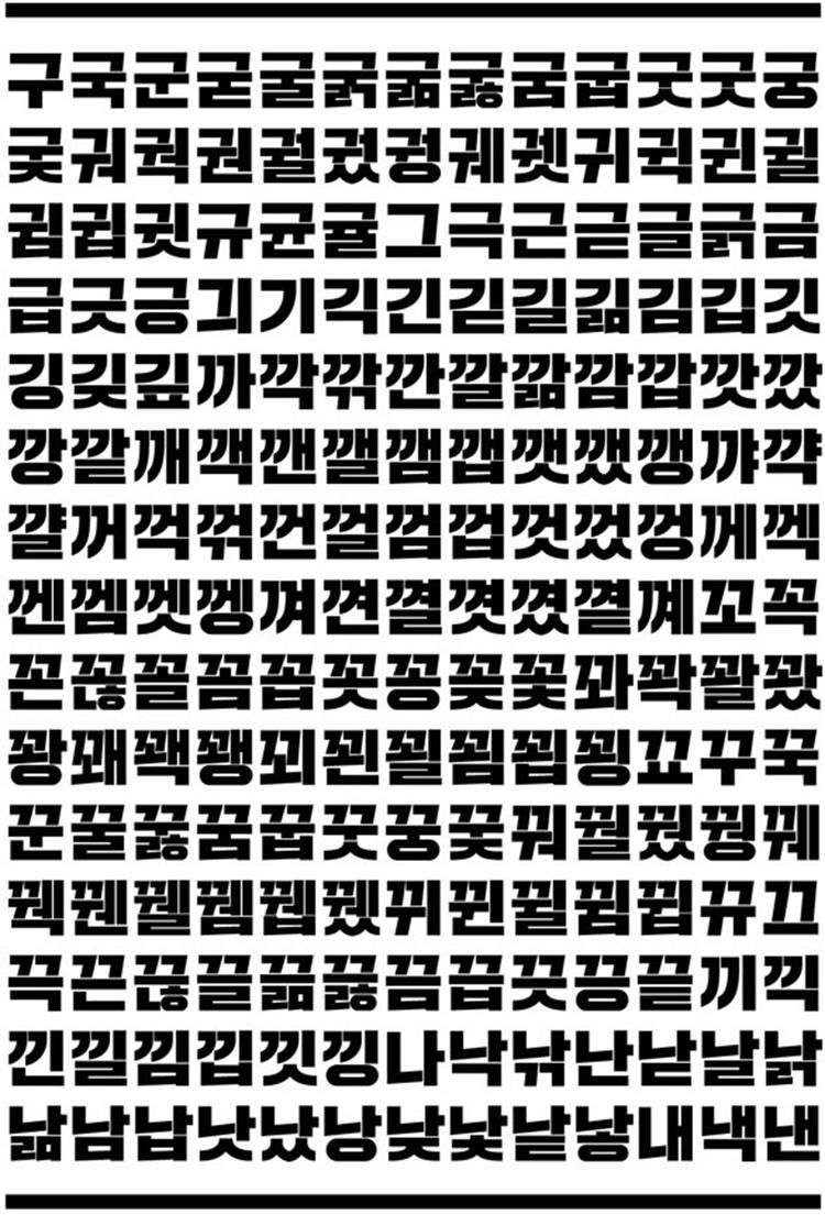
폰트를 가만히 들여다보고 있으면 폰트 디자이너의 에너지나 성향, 감정이 느껴질 때가 있습니다. 하지만 「Sandoll 격동고딕」만큼 폰트와 디자이너가 하나처럼 느껴지는 경우는 찾아보기 어려울 것 같습니다. 누구나 지나가다한 번쯤은 만나봤을 법한 바로 그 폰트. 「격동고딕」의 디자이너 장수영님과 짧은 호흡의 인터뷰를 나누었습니다.
거, 일도 바쁜데 인터뷰도 빠르게 해보자고요.

Q. 「격동고딕」이 공중파를 비롯해 팬시 상품 등으로 활발하게 사용되고 있는데요. 디자이너로서 기분은 어떤지 궁금합니다.
A. 아직 부족하다고 생각해요. 더 활발해져야 합니다!
Q. 주변에 「격동고딕」을 아는 지인도 많을 것 같아요. 주변 반응들은 어떤가요?
A. 「격동고딕」이 제작된지 3년이나 지났습니다. 처음에는 “멋지다“던 반응들이 “언제 출시되냐“를 거쳐, “나오긴 하냐“로 바뀌었어요. 내부 사정으로 인해 출시가 다소 늦은 감이 있었는데, 지금이라도 출시되어서 다행인 것 같아요.
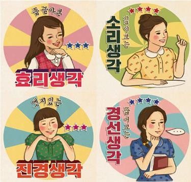
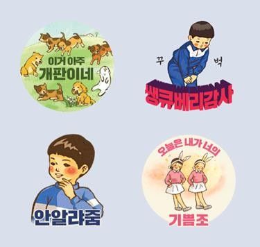
Q. 「격동고딕」을 사용한 카카오톡 스티콘 ‘바른생활 시리즈’는 꾸준히 최다 판매를 유지하고 있습니다. 혹시 본인의 폰트로 만들어진 스티콘을 사용하고 계신가요?
A. 회사에서 판매 1위 기념으로 직원들에게 스티콘을 배포했었는데요. 저는 휴대폰이 고장나는 바람에 막상 몇 번 사용해보지 못했습니다. 개인적으로 이모티콘을 좋아하지 않는 성격이라 있어도 자주 사용하지는 않았을 것 같아요.

Q. 「격동고딕」을 제작하면서 중요하게 생각한 점은 무엇인가요?
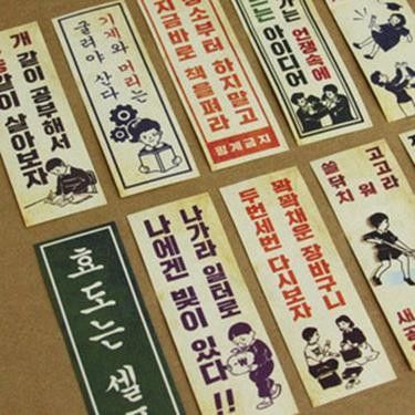
A. 현대적인 재해석과 진지함. 이렇게 2가지 방향으로 작업을 진행했습니다. 결국에는 현재 사용되어야 하기 때문이며, 당시의 정치적 상황이 모티브가 된 폰트이기 때문입니다. 형태적인 재미나 감성을 자극하는 인상보다는 묵직하고 무던한 인상을 담아내고 싶었습니다.
Q. 「격동고딕」 제작과정 중 기억에 남는 에피소드가 있었나요?
A. 회사에서 ‘살았던’ 기억밖에 없습니다. (웃음) 회사와 학교를 병행했던 시기였는데요. 졸업전시 준비까지 동시에 하느라 회사에서 정말로 먹고 잤습니다. 덕분에 인턴기간 내내 꾀죄죄함을 유지하고 다녔어요.
Q. 격동고딕이 처음 만들어진 것은 3년 전인데요. 그때와 비교했을 때 폰트에 변화가 있을까요?
A. 글자의 구조 자체가 크게 변화하지는 않았습니다. 굵기나 비례 등이 조금씩, 형태적으로는 곡선이 가장 많이 수정되었습니다. 얼마전 1년만에 「격동고딕」의 원도 파일을 열어봤는데, 당시에는 ‘이 정도면 괜찮네’라고 생각했던 곡선들이 너무 이상했어요. 곡선의 맺음 부분이 수직으로 끊어지는 컨셉이라서 조금 어려운 설계이기는 했지만, ‘내가 이랬었나?' 싶을 정도로 괴상했거든요. 하지만 '그만큼 내가 늘었구나’라는 마음으로 기쁘게 수정했습니다.

Q. 「격동고딕」을 폰트의 배경이된 70, 80년대 물가에 맞춰 판매하고 싶은 바람이 있다고 들었습니다.
A. 작업은 혼자 했지만 선배들의 도움도 받았고, 폰트 소유권은 회사에 있기 때문에 그 부분은 체념했습니다. 지금은 비싸게 많이 팔려서 인센티브나 많이 받았으면 좋겠어요.
Q. 「격동고딕」의 가장 큰 매력은 무엇이라고 생각하나요?
A. 사용자 입장에서는 눈에 띄는 제목용 폰트에 대한 요구가 오래전부터 있어왔습니다. 현재 개인 디자이너나 폰트 파운드리에서 출시되는 폰트들만 봐도 캐릭터 있는 폰트들이 많습니다. 「격동고딕」 역시 그러한 요구에 의해 만들어졌고, 그에 편승한 면이 있다고 생각합니다.
Q. 「격동고딕」을 사용자들이 어떻게 써주면 좋을까요?
A. 폰트를 어떻게 사용할지는 사용자들의 마음이라고 생각합니다. 감자를 사서 튀길 수도 있고, 볶을 수도 있고, 삶을 수도 있고, 카레에 넣을 수도 있는 것처럼. 어떤 식으로 뭘 해먹을지는 당사자들의 마음 아닐까요? 다만 그들의 요리가 훨신 맛있어질 수 있는 곳에서 원하는 맛이 날 수 있도록 쓰였으면 좋겠습니다.
Q. 3년 전 졸업작품 인터뷰 댓글을 보면 폰트의 인기를 예감한 분들이 보입니다. 「격동고딕」을 아끼는 분들에게 전하고 싶은 말이 있을까요?
A. 그 당시 인터뷰에 댓글을 다신 분들이 기억하실지 모르겠네요. 여하튼 우여곡절 끝에 드디어 출시하게 되었습니다. 개인적으로 연락을 주신 분들, 회사를 통해 연락해주신 분들 모두 기다려주셔서 감사합니다. 『Sandoll 격동 시리즈』인 「Sandoll 격동굴림」도 곧 출시되니 많은 관심 부탁드립니다.
Q. 요즘은 어떻게 지내시나요?
A. 일이 말 그대로 일이 돼 버린 지 4년째에 접어들면서 몸도 마음도 썩어가고 있습니다. 일 안에서, 작업 안에서, 술 안에서, 글자 자체의 즐거움을 찾으려 발버둥치고 있습니다.
Q. 어떻게 폰트 디자인을 시작하게 되었는가?
A. 어릴 때 삶의 모토는 ‘재미’였습니다. ‘재미가 있냐, 없냐’가 의사결정의 기준이었어요. 그런데 나이를 먹으면서 재미로만 세상을 살아갈 수 없다는 것을 깨닫고, 먹고 살기 위해 재미들을 하나씩 접었습니다. 그리고 몇 안 남은 재미가 지금 내가 하고 있는 이 일이라고 생각합니다. 평생의 업만큼은 재미없이 하고 싶지 않았어요. 그림이 좋아서 시각디자인과를 갔고, 거기서 배운 것들 안에서 내가 제일 잘 할 수 있고, 재밌는 직업을 택했습니다. 그렇게 시작했고 여기까지 온 것 같습니다. (사실 얼마 오지는 않았지만)


Q. 새로운 것으로 인해 소멸되거나 퇴보한 아날로그적 느낌을 좋아한다고 언급한 적이 있으신데요.
제가 선천적인 기계치입니다. 그래서 디지털과는 거리가 멀어요. 책으로 보면 술술 읽히는 것도 E-book으로는 몇 줄만 읽어도 멀미가 납니다. 아직도 가끔 음반을 사러 레코드샵을 가기도 해요.
Q. 산돌(당시 산돌커뮤니케이션)에는 어떻게 입사하게 되었나요?
A. 대학생 때는 막연하게 폰트 디자인을 해야겠다고 마음 먹고 필묵 아트센터에서 한글 디자인 수업을 받았습니다. 그때 강사님이 산돌 수석 디자이너셨던 이호(현 닥터폰트 대표)님이셨어요. 내가 마음에 드셨는지 수업이 끝나고 몇 개월 뒤, 산돌에서 인턴을 뽑는다고 연락이 와서 지원했고, 그 연으로 산돌에 다니고 있습니다.
Q. 폰트 디자이너로서 앞으로의 각오가 궁금합니다.
A. 죽기 전에 우리나라 역사에 남을 만한 본문용 폰트를 한 번 만들어보고 싶어요. 아마 폰트를 디자인하는 사람이라면 모두가 꿈꾸는 목표가 아닐까 싶습니다.

Q. 폰트를 만들면서 반드시 지키는 원칙이 있다면 무엇인가요?
‘한글 타이포그라피의 한 획을 그으리라'라는 거창한 각오로 작업을 시작하지만, 하나의 폰트가 만들어졌을 때 절대 깨지지 말아야 할 원칙은 ‘오탈자’입니다. 글자는 ‘시각적인 예술’이기 이전에 ‘기능하는 정보’입니다. 때문에 ‘가’라는 글자가 ‘가’로 읽히지 않는다면, 아무리 아름다운 디자인을 해도 글자로서 가치가 없습니다. 그래서 조판 테스트나 검수를 볼 때가 제일 긴장됩니다.
그런데 사실 얼마 전에 실수를 하나 했어요. 내가 담당이었을 일을 이어 받은 선배님이 발견해서 알려주셨습니다. 그래서 이제부터 그냥 긴장이 아니라 '극도로’ 긴장하기로 했습니다.
Q. 폰트 제작의 가장 큰 매력은 무엇이라고 생각하시나요?
폰트가 갖는 지속성이 좋습니다. 쉽게 만들어지지 않고 쉽게 사라지지도 않습니다. 묵직하고 진정성 있는 느낌이 들어요. 개인적으로는 상업미술 안에서 그나마 본질에 대해 생각해볼 수 있는 작업이라고 생각합니다.
Q. 좋아하는 폰트 디자이너나 롤모델이 있다면 소개해주세요.
헤르만 자프, 메튜 카터, 에릭 슈피커만 등 환갑이 넘도록 글자 가지고 씨름하시는 모든 디자이너들을 존경합니다. 개인적으로 롤모델로 삼은 사람은 없는데요. 새로운 유형의 디자이너가 되고 싶다고 생각합니다.
작성지: 산돌 타입기획팀