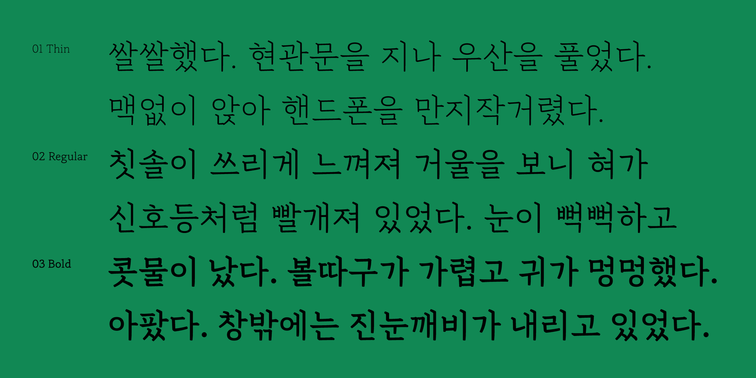
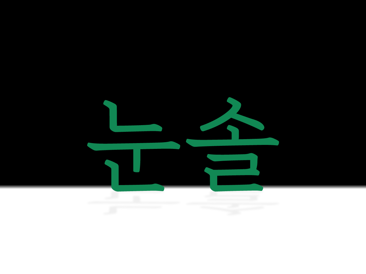
4년만에 웨이트 확장으로 돌아온 「Sandoll 눈솔」
지난 21년 1월, 상품기획팀은 폰트 플랫폼 산돌구름을 통해, 산돌 폰트를 사용하는 유저를 대상으로 설문조사*를 진행했습니다. 산돌구름의 이용 경험, 산돌 폰트 사용성 조사 등 다양한 문항이 포함된 설문조사로, 306분이 참여해주셔서 유의미한 데이터를 얻어낼 수 있었죠. 여러 문항 중에서 ‘기존에 출시된 산돌의 폰트 중 확장 업데이트가 이뤄지면 좋을 것 같은 폰트를 골라주세요.’라는 질문이 있었는데요. 한글 확장, 굵기 확장, 스타일 확장 등, 기존 폰트의 사용성을 높이기 위한 확장 업데이트를 고려하고 있었던 터라 직접 유저분들의 의견을 듣고 싶어 넣었던 항목 중 하나였습니다. 「Sandoll 눈솔」은 그중에서도 다섯 번째의 높은 순위**로 득표되어 사용자들의 수요를 파악할 수 있었습니다. 「Sandoll 격동 시리즈」와 「Sandoll 정체」, 「Sandoll 호요요」는 확장 업데이트가 이미 계획된 상황이었기 때문에 다음 순번인 「눈솔」의 확장 업데이트를 결심하는 계기가 되었습니다.
*「Sandoll 시티산스」 베타테스트 설문조사(2021)
**1위부터 순서대로 「격동굴림」(31.7%), 「정체」(18%), 「격동명조」(16%), 「호요요」(15.7%), 「눈솔」(7.5%)…
사실 「눈솔」은 이미 기획 단계에서부터 3종으로 설계가 되어 있었던 패밀리입니다. 출시 당시 여건이 되지 않아 Bold만 먼저 상용화가 되었던 아쉬움이 남아 있었던 폰트였죠. 그간 한 종임에도 불구하고 ‘03 Bold’로 배포되고 있었던 이유**도 Thin과 Regular가 기획 단계에 함께 있었기 때문이었어요. 따라서 「눈솔」 확장 프로젝트는 철저히 원작자의 기획 의도를 바탕으로 진행하기로 하였습니다. 오늘은 비어있던 퍼즐을 비로소 완성한 기념으로 원작자인 김진희 디자이너와 「눈솔」에 관한 이야기를 나눠보도록 하겠습니다.
*「Sandoll 눈솔」 굵기 확장 출시 전, 2023년 1월 기준
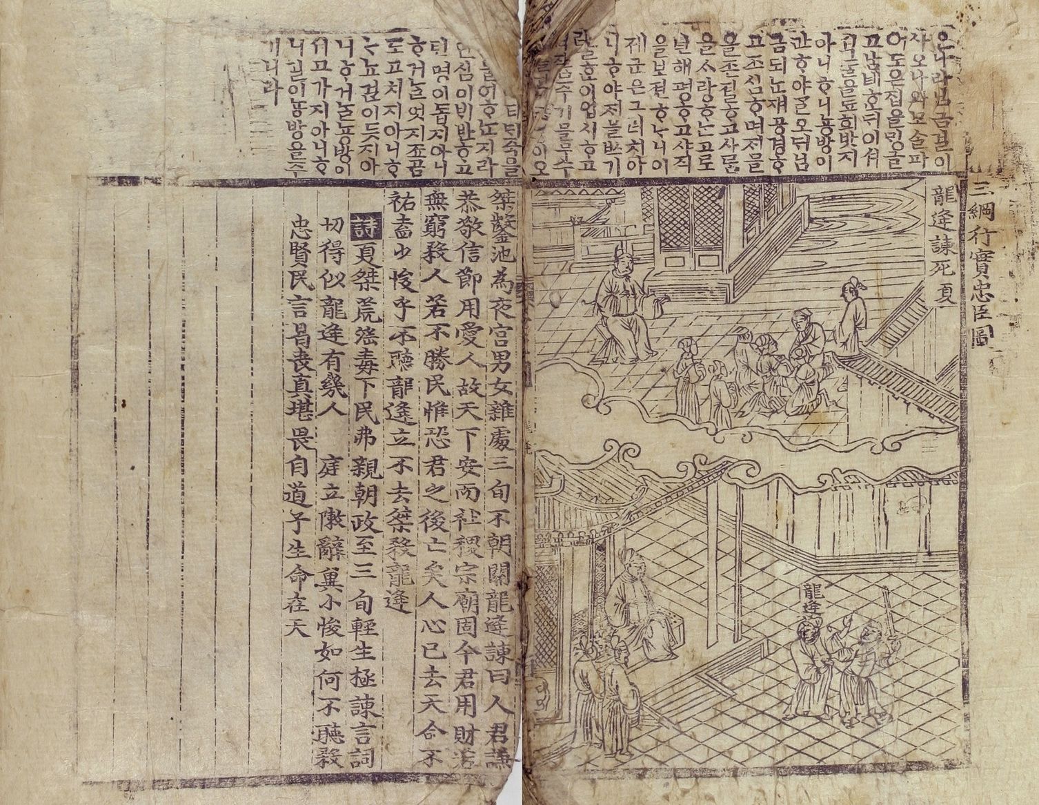 『삼강행실도언해』
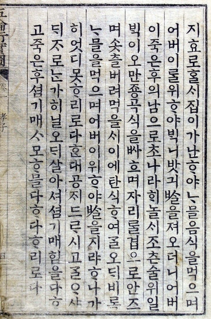 『오륜행실도』 필사본
Q. 확장 프로젝트를 시작하기 전, 먼저 산돌 내부에 남아있던 「눈솔」 기획서를 살펴보게 되었는데요. 「눈솔」이 『오륜행실도』 언해본을 기반으로 제작되었다는 것을 확인할 수 있었습니다. 원도를 현대적으로 재해석하는 과정에서 겪은 경험을 설명해줄 수 있나요?
A. 균일성을 가장 기본적인 조건으로 생각하고 작업했습니다. 기필과 수필의 형태를 통일시키고, 획과 모듈, 그리고 글줄 흐름을 균일하게 정리하고, 붓의 농담을 없애 획의 굵기를 균일하게 맞췄습니다. 또한 기존 원도에서는 섞임모임꼴의 곁줄기가 이음줄기 위에 위치한 모습을 확인할 수 있는데, 이러한 부분이 현대에선 조금 어색해 보일 수 있기 때문에 이음줄기 밑으로 내려 자연스러운 인상이 들 수 있도록 했습니다.
원도에서 확인할 수 있는 미세한 특징들도 ‘활자’라는 매체 특성상 과해 보일 수 있기 때문에 재해석한 부분들이 있는데요. 예를 들면 기둥과 받침 닿자가 붙어있는 형태입니다. 기존 원도에서는 쓰기 방식의 자연스러운 흐름에 따라 기둥의 끝과 받침 닿자가 붙어 있거나 그 사이가 가깝습니다. 초반에는 「눈솔」도 기둥 끝과 받침 닿자가 붙은 형태로 작업하였으나, 가로모임꼴만 그 느낌이 도드라져 보여서 떨어뜨린 형태에서 최대한 가깝게 보일 수 있도록 수정 작업을 진행했습니다. 또한 정원으로 그려진 원도의 자소 'ㅇ, ㅎ'도 다르게 재해석한 부분 중 하나인데요. 정원의 형태가 민글자에서는 괜찮아 보일 수 있지만 복잡한 낱글자에 반영된다면 크기 대비가 생겨 전체적으로 균일한 「눈솔」의 특징을 해칠 것 같다고 판단해 조금 눌러주었습니다.

Q. 『오륜행실도』처럼 단단하면서도 균일한 획이 인상적입니다. 판면의 인상에 많은 영향을 주는 것 같아 보입니다.
A. 「눈솔」은 명조 계열 중에서도 비교적 세로모임꼴의 폭이 넓게 설정되어 있고, 받침 닿자도 품이 넓습니다. 그로 인해 흰 공간이 촘촘해져 더 단단해 보이는 특징이 있습니다. 또한 부리나 이음줄기를 꼿꼿하게 펴서 견고해보일 수 있도록 했습니다. 이러한 특징들이 모여 단단하고 견고한, 편안한 인상을 만들어내는 것 같습니다.
Q. 이름의 유래와 주변의 반응이 궁금합니다.
A. 이전에 이름을 붙일 때에는 이름 안에 스토리를 담고자 했던 경향이 있었는데, 「눈솔」은 그보다는 직관적으로 이름을 짓고 싶었습니다. 그래서 당시 같은 팀원인 분들과 폰트를 보며 이름 짓는 작업을 했는데요. 단단하고 직선적인 획의 인상을 보고 소나무가 떠올랐고, 「눈솔」이 출시되는 1월의 계절감을 따서 「눈솔」이라는 이름을 붙여주었습니다.
Q. 그렇다면 「눈솔」은 사람으로 치자면 어떤 성격이나 외모를 한 사람일까요?
A. 마음이 넉넉하고 수수한 사람. 자기 소신이 뚜렷하지만, 그것으로 남에게 상처주지 않는 사람. 이런 성격의 나이대가 어느정도 있는 사람이지 않을까 상상합니다.
Q. 「눈솔」과 함께 섞어 쓰면 좋을 폰트를 추천해주세요.
A. 비슷한 슬랩세리프 계열*에 굵기 차이가 적어 눈솔과 비슷한 인상이 드는 「Sandoll 아침」을 추천합니다. 같은 위계에서 다른 인상을 표현하고 싶거나 약간의 강조가 필요할 때 섞어 쓰면 좋을 것 같아요. 눈솔보다 얇은 획을 가진 「Sandoll 광화문」과도 잘 어울릴 것 같습니다.
*라틴 폰트 계열의 하나로, 세리프 부분이 크고 굵직한 것을 말한다. 폰트의 생김이 궁금하다면 링크의 아티클로 확인해보세요.
Q. 「눈솔」은 산돌 내부에서도 어떠한 기점이 되는 폰트인 것 같습니다. KR1-2 스펙에서 AK-9 스펙으로, 2,350자에서 2,780자로, 패스에서 컴포넌트로. 「눈솔」을 제작하면서 있었던 해프닝을 소개해 주신다면?
A. 말씀하신대로 「눈솔」은 두가지 측면에서 기점이 되는 폰트입니다.
첫번째로, 「눈솔」은 기존에 사용하던 AK 1-2스펙*에서 새로 만들어진 AK 9 스펙*을 사용한 첫번째 산돌구름 폰트에요. AK 1-2와 AK 9 스펙의 차이는 여러가지가 있지만 대표적으론 한글 기본 글립의 구성을 2,350자에서 2,780자로 늘어나면서 기존에 표기하지 못했던 단어를 표기할 수 있게 되었습니다. 예를들어 '똠양꿍'과 같은 단어를 기존의 스펙에선 사용하지 못했지만, 업데이트 된 규격에선 사용할 수 있게 된 점이 두드러진 변화입니다.
두번째로, 스마트 컴포넌트를 활용하여 만들어진 산돌구름의 첫번째 폰트에요. 이전까지 산돌에서는 폰트랩이라는 프로그램에서 한글자 한글자 패스로 그려 글자를 제작했었는데, 제작 효율성을 높이기 위해 비슷한 계열은 동일한 요소를 활용하는 스마트 컴포넌트를 이용해 제작했습니다. 다만 이 부분에서 몇가지 해프닝이 있었는데, 글자를 300자 정도 파생했을 때 제작 방식을 스마트 컴포넌트를 활용하는 것으로 변경한 것이다보니, 배움과 활용이 동시에 이뤄져 여러 시행착오를 겪기도 했습니다.
한가지 해프닝을 더 이야기한다면, 출시 전에 큰 수정을 거쳤던 점인데요. 디자이너마다 방식은 다르겠지만 「눈솔」은 최종 작업에서 교정쇄 인쇄를 맡겨 지면으로 최종 확인을 했습니다. 그런데 생각했던 인상과 너무 달라 출시 한 달 전쯤에 대대적인 수정을 거치게 되었는데요. 굵기 부분에서 가장 많은 수정이 이루어졌습니다. 명조치고는 살짝 굵은 느낌의 획, 쌍닿자들과 ‘ㅎ'에서 뭉치는 부분들, ‘ㅅ’과 'ㅆ’의 넓은 삐침이 인쇄물에서 너무 도드라져 보여 전체적인 보정 과정을 거치게 되었었죠.
*AK란 Adobe Korea의 약자로써 한글 폰트를 만들 때 사용하는 국제 표준 가이드라인을 뜻합니다. AK 1-2는 기존에 사용되던 스펙으로, 이를 보완하고 중요도에 따라 기준을 다시 세워 2018년에 새로이 발표한 새로운 한글 표준 규격이 AK-9입니다.
Q. 「눈솔」이 출시된지도 벌써 4년이 지났습니다. 그간 많은 사용 사례들이 쌓였는데, 기억에 남거나 ‘이렇게 쓰면 더할 나위 없겠다’ 하는 사용 사례가 있었을까요.
A. 백설에서 나오는 리얼 청 종류(매실청, 오미자청, 레몬청)에 사용된 「눈솔」을 봤을 때 가장 재미있었어요. 일반 명조를 쓰기에는 너무 얇고 진지해서 그것을 대체할 다른 명조를 찾다 보니 「눈솔」을 사용하시지 않았을까 추측하면서 보는 재미도 있었고요. 특히 위에서 「눈솔」은 광화문과 잘 어울릴 것 같다고 언급했었는데, 마침 함께 사용해주셔서 뿌듯했습니다.
 『CJ 백설 리얼 오미자청』 (이미지 출처:ssg.com)
Q. 그간 「눈솔」이 사용된 사용 사례들을 보면서 ‘얼른 다른 굵기도 추가되면 좋겠다’라는 생각이 자주 들었습니다. 무엇보다도 본문에 사용된 모습을 보고 싶었거든요. 「눈솔」 굵기 확장에 대한 원작자의 소감이 듣고 싶습니다.
A. 사실 기획할 때부터 가장 먼저 제작하고 싶었던 웨이트는 Thin이었어요. '눈솔'(눈이 쌓인 소나무)이라는 이름에 가장 어울린다고 생각하기도 했고, 얇은 웨이트일수록 직선적인 인상이 더 도드라진다고 생각해서요. 여러 가지 여건으로 직접 제작하지는 못했지만, 완성된 모습을 보곤 "역시 나의 생각이 틀리지 않았다!"라며 행복했고, 동시에 "아주 힘들었겠다"라는 생각도 들었어요. 굵기가 얇을수록 글자의 조형에 더 주목할 수밖에 없거든요. 굵은 웨이트에서는 덜 드러났던 아쉬운 조형들이, 얇은 웨이트에서는 두드러지다 보니 그사이를 조율하며 디자인하기 어려웠겠다고 생각했어요.
Q. 마지막으로 「눈솔」을 좋아해주시는 분들에게 한마디 해주세요!
A. 폰트를 고르는 것에도 취향이 반영되잖아요. 그래서 제가 제작한 폰트를 좋아하시거나 사용하시는 분들은 저와 비슷한 취미나 취향을 가진 사람들이 아닐까하고 늘 생각합니다. 좋아하는 주요 포인트는 사람마다 조금씩 다르겠지만요. 눈솔을 좋아해 주셔서 감사하고, 많은 곳에서 다양하게 그리고 무엇보다 오래오래 의미 있는 곳에 사용해주시면 감사하겠습니다.
「눈솔」은 산돌 브랜드사를 이용하는 유저 둘 중 하나는 꼭 사용하고 있을 정도로 조용히 강한 폰트입니다. 화려하진 않지만 묵묵하고 단단한 인상을 가진 「눈솔」. 더 넓은 사용성을 위해 확장된 웨이트들과 함께하는 「눈솔」의 새로워진 앞날이 기대됩니다.
작성자: 산돌 상품기획팀 김슬기