만나서 반갑습니다! 「SD 노벰버」
티포텍과의 새로운 협업, 「SD 노벰버」
산돌은 다년간 티포텍(Typotheque)과의 여러 협업 프로젝트를 진행해오며 완성도 있는 다국어 폰트 패밀리를 출시해왔습니다. 첫 협업 프로젝트였던 「Sandoll 그레타산스」*와 작년 4월에 출시된 「Sandoll 라바」는 출시된 이후로 사용자들의 많은 사랑을 받아온 폰트였어요. 이러한 글로벌 협업 프로젝트의 강점은 각 언어권의 글자를 각국의 전문가들이 다루기 때문에 완성도 높은 하나의 패밀리로 설계된다는 점입니다.
*「Sandoll 그레타산스」 아티클 (링크)
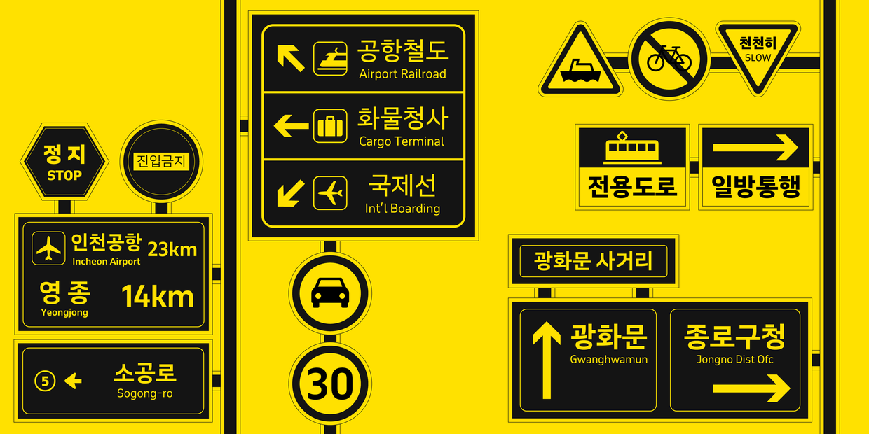
「November」는 티포텍에서 개발한 실용적이고 가독성이 높은 폰트 패밀리입니다. 도로 표지판이나 정보 전달 시스템을 위해 설계되어, 긴 텍스트에 사용하기 적합하고 작은 크기의 본문에도 사용하기 좋은 강점을 지니고 있죠. 이러한 목적 때문에 픽토그램과 같은 여러 정보성 딩뱃 글립들이 포함되어 있어요.

티포텍의 「November」 (링크)
본격적인 협업 프로젝트를 시작하기 전, 티포텍의 디렉터 피터 빌락(Peter Biľak)과 「November」의 여러 가지 확장 가능성을 논의했습니다. 그 이유는 「November」는 마치 원석처럼 여러 스타일로 확장될 수 있는 가능성을 품고 있는 패밀리이기 때문이었어요.
「November」에서 획을 굴린 라운디드 버전의 「October」, 「November」의 가로 폭을 줄인 「November Compressed」와 「November Condensed」 등 다양한 스타일에 기본적으로 굵기 9종이 제공되니 모든 종 수를 가늠하면 정말 슈퍼 패밀리라고 부를 수 있을 정도의 대가족*임이 분명했습니다.
*폰트 패밀리는 하나의 폰트를 기준으로 다양한 변형이 있는 폰트 모음을 뜻합니다. 패밀리마다 구성은 조금씩 다르지만 얇은 웨이트의 라이트, 중간 웨이트의 레귤러, 굵은 웨이트의 볼드가 대표적입니다. 패밀리를 구성하는 폰트들은 전체를 관통하는 큰 컨셉은 유지한 채로 각각의 스타일을 가지고 있다는 맥락에서 폰트 패밀리를 지칭할 때 가족이라는 표현을 사용하고는 합니다.
물론 모든 스타일을 한글에 적용하기는 어렵겠지만, 이러한 매력적인 가능성들을 품은 채로 가장 기본이 되는 「November」의 한글 버전인 「SD 노벰버」의 작업을 시작하게 되었습니다.
다국어 프로젝트를 다루는 일
라틴 문자에 한글을 맞추는 일은 고려해야 할 점이 참 많습니다. 단순히 디자인을 일관적으로 맞추는 것을 떠나 한글의 물리적인 위치, 크기, 공간 등 패밀리의 성격에 따라서도 달라질 수 있는 부분들이 많거든요. 전혀 다른 나라에서 온 문자들은 각국의 역사적, 문화적 맥락을 품고 있어요. 때문에 「November」와 같은 인상으로 보일 수 있도록 하면서, 한국에서 통용되는 맥락에서 벗어나지 않도록 하는 것이 가장 중요한 지점이었습니다.
본격적인 작업을 시작하기 전, 「November」에 관한 모든 정보를 수집해서 분석하고 티포텍의 피터 빌락과 티포텍의 여러 협업 디자이너들과 함께 킥오프 미팅을 진행했습니다. 미팅에서 「November」 한글 보다 먼저 작업을 진행 중이던 「November」 가나, 「November」 한자를 직접 작업한 디자이너에게 다양한 내용을 공유 받을 수 있었어요.
흔히 CJK문자라고 불리는 동아시아 3개국(중국, 일본, 한국)의 문자는 다른 점도 많지만, 관계가 밀접하여 비슷한 맥락도 많습니다. 때문에 이 미팅을 통해 자국 문자의 맥락을 반영한 방식, 시각적 특징을 반영한 방식 등 「November」 한글 작업 방향성에 대한 여러 힌트를 얻을 수 있었어요.

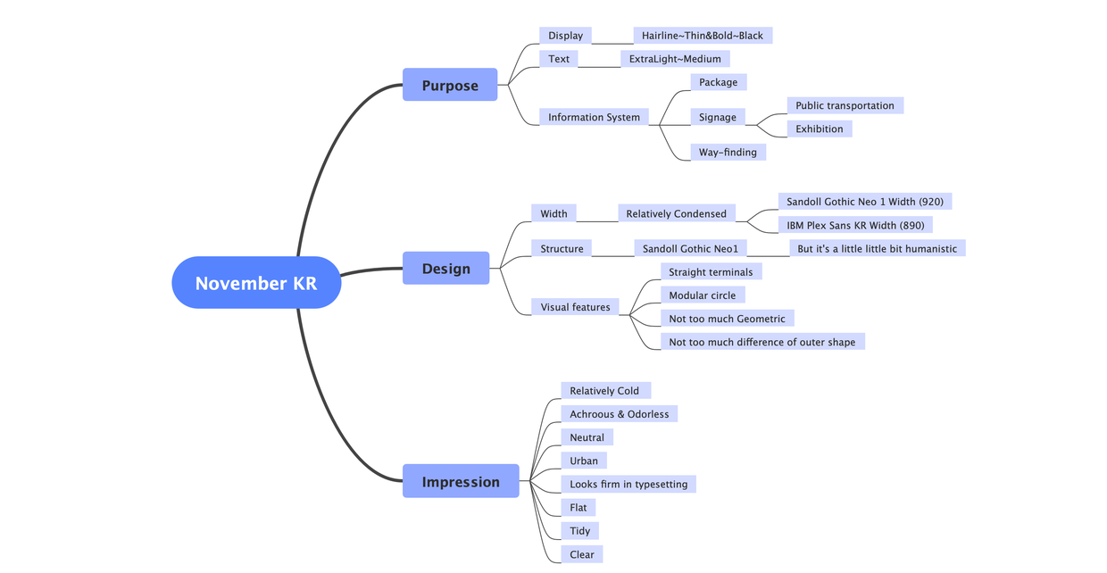
킥오프 미팅에서 얻은 힌트들과 「November」 자료 분석을 토대로 용도(purpose), 시각적 범위(design), 인상(impression)이라는 세 개의 큰 주제를 설정해 「SD 노벰버」의 방향성을 확인하는 워크숍을 진행했습니다.
용도에선 「노벰버」가 실제로 사용될 매체와 환경에 대해 고민해 보고, 굵기별 적절한 용도를 설정했어요. 또한 한국에서 주로 사용되는 산세리프 폰트들을 찾아 한글의 너비감, 구조, 자소의 위치와 크기감 등 통용되는 특징들을 파악했습니다. 기민한 사용자들이 너무 놀라지 않을 정도의 시각적 범위를 지정하고, 「November」의 형태를 분석해 실제로 「노벰버」에 적용할 시각적 특징들을 찾아냈어요. 또한 한글 시안이 「November」와 비슷한 인상을 갖고 있는지 점검하기 위해 「November」에서 느껴지는 인상들을 추출했습니다.
이와 같이 주제별로 적절한 방향성을 설정하여 「November」의 시각적 특징들을 반영한 「노벰버」의 한글 시안 작업을 시작했습니다.
「SD 노벰버」 제안서 중 일부 이미지 - 키워드 추출
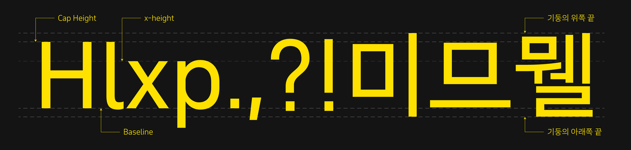
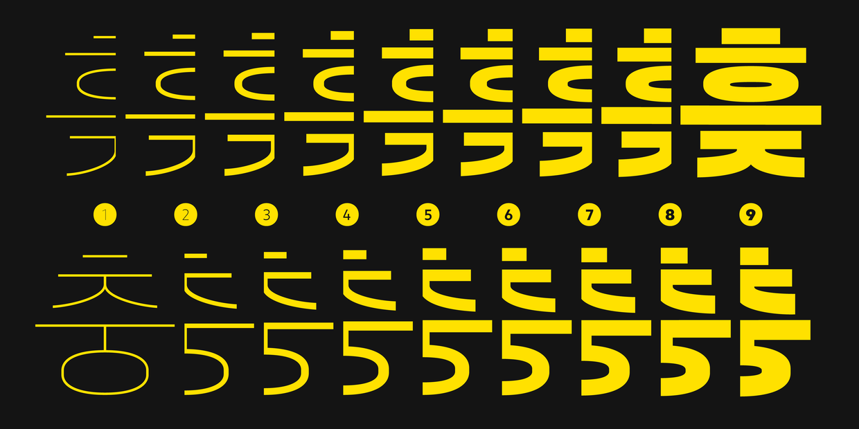
산돌에서 발견한 「November」의 두드러지는 시각적 특징은 ① 수직·수평의 획 끝 디자인, ② 트랙 형태의 'O' 디자인, ③ 비교적 좁은 너비감, 크게 이 세 가지였는데요. 라틴의 디자인적 특징을 한글에 100% 반영하는 것은 서로 다른 문자의 맥락으로 인해 불가능에 가까운 일입니다. 하지만 이를 적절히 반영하는 것이 바로 폰트 디자이너의 몫이죠.
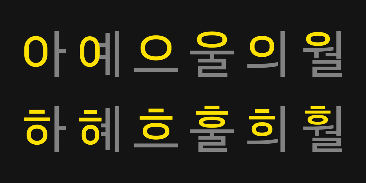
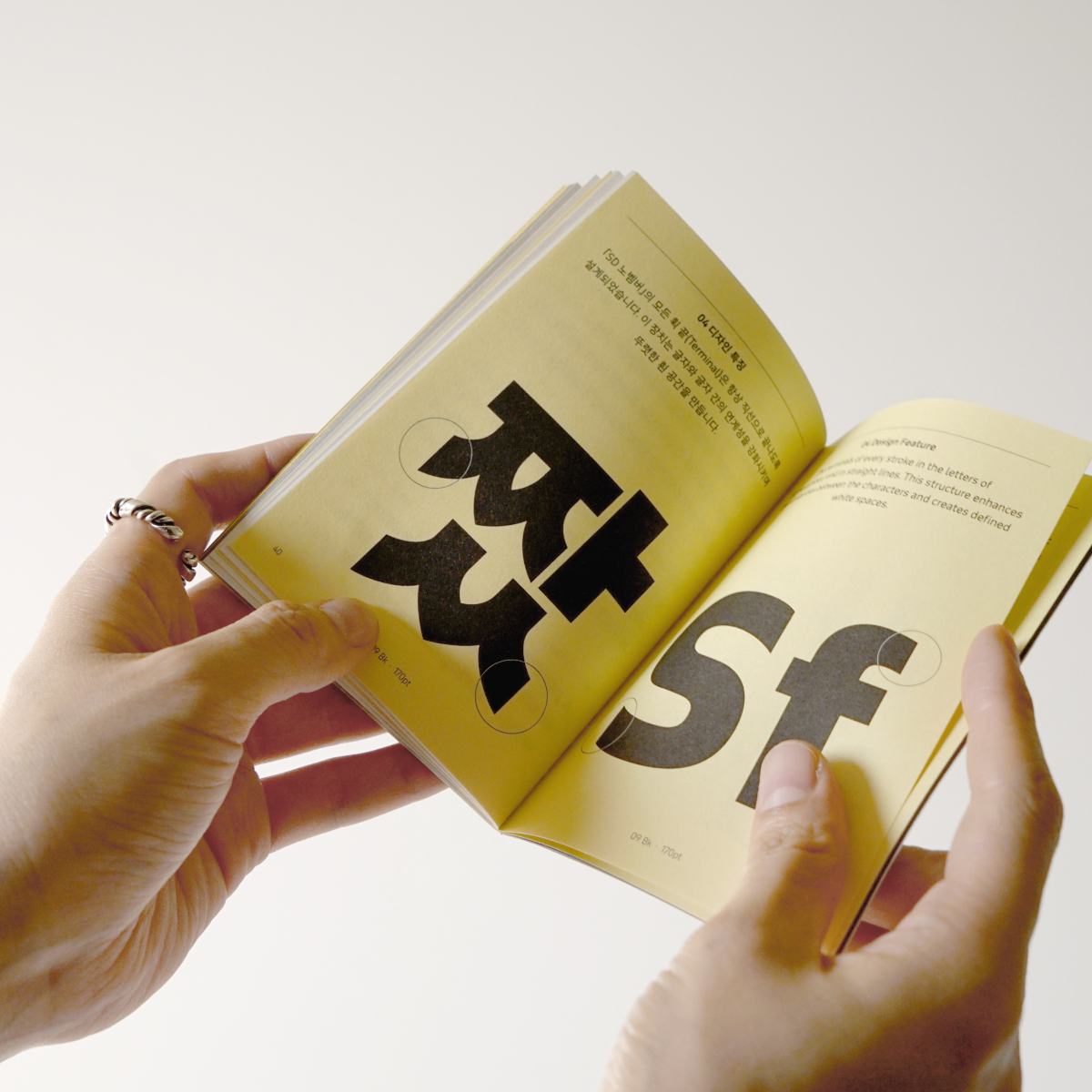
① 수직·수평의 획 끝 디자인
「November」는 터미널(Terminal), 즉 모든 획 끝이 수직·수평으로 잘리는 시각적 특징을 가지고 있습니다. 이로 인해 모든 속공간이 열린 형태가 되며, 글자 여백(Sidebearing)이 깨끗해져 어떠한 매체나 크기로 사용하더라도 높은 가독성을 유지하는 데 영향을 줍니다.
이러한 특징은 라틴에선 충분히 통용되고 있는 디자인이지만 한글에서는 일반적이지 않은 특징인데요. 보통 ‘ㅅ, ㅈ, ㅊ’과 같은 삐침류는 획의 흐름에 따라 사선으로 마무리되는 것이 자연스럽기 때문이에요. 하지만 최대한 이를 반영하기 위해 여러 시안 테스트를 거쳤고, 삐침류를 좌우 대칭의 갈래 방식으로 디자인하여 획 끝이 수직으로 끝나도 어색하지 않도록 설계하였습니다. 이 획 끝 디자인은 기계적인 인상을 만들어내지만, 곡선 부분을 부드럽게 다듬어 그러한 인상이 과해지지는 않도록 했어요. 본문이라는 용도에도 적절히 스며들어야 했기 때문이죠.
사실 이러한 터미널 표현은 라틴에는 가독성에 긍정적인 효과가 있지만, 한글에서는 단순히 시각적 특징으로 반영됩니다. 때문에 「노벰버」는 가독성을 위해 낱글자 안에서의 획을 최대한 깔끔하게 붙이거나 떨어뜨리는 등의 공간 조절과 굵기 조절을 통해 보완했습니다.

「SD 노벰버」 제안서 중 일부 이미지 - 디자인 시안
② 트랙 형태의 'O' 디자인
또 다른 시각적 특징인 트랙 형태의 ‘O'를 한글에 반영하는 부분도 비슷한 어려움을 겪었습니다. 라틴 ‘O’에 비해 한글의 ‘ㅇ’과 ‘ㅎ’은 가로로 좁아진다던가, 세로로 좁아지는 등의 변수 폭이 크기 때문인데요. 이 부분은 정말 패스와 점을 섬세하게 다루는 방법밖엔 없어서 많은 시간을 들여 보정했습니다. 높이가 줄어들수록 세로획의 직선 표현이 두드러지지 않도록 조정하는 것이 관건이었습니다.
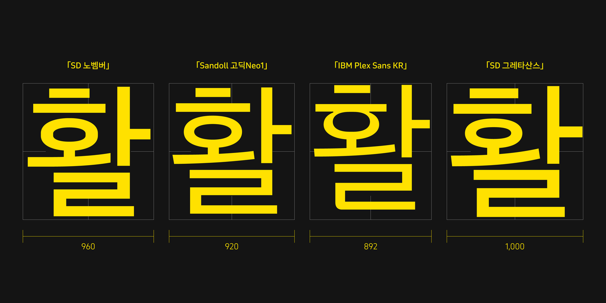
③ 비교적 좁은 너비감
마지막으론 너비감입니다. 한국에서 주로 사용되는 고딕류 레퍼런스들과 비교했을 때 「November」는 일관적인 너비감을 갖고, 균일하고 촘촘해 보이는 인상이 듭니다. 때문에 「노벰버」의 한글 너비 설정도 이와 같은 느낌을 살리고자 했어요. 추후 앞서 언급했던 「November Compressed」와 「November Condensed」로 확장되는 것까지 고려해 최대 너비가 너무 좁아지지 않도록 적절한 범위 안에서 한글의 너비를 설정했습니다.
추가로 「노벰버」를 제작하면서 고민되었던 포인트 중 하나는 ‘한글과 라틴, 그리고 라틴에 맞춰진 문장부호를 어떻게 조정할 것인가’에 관한 부분이었습니다. 「노벰버」는 산돌에서 세 번째로 진행하는 다국어 협업 프로젝트였기 때문에 앞선 프로젝트인 「Sandoll 그레타산스」와 「Sandoll 라바」를 레퍼런스로 참고할 수 있었어요.
한글과 라틴은 각각 따르는 기준선이 다릅니다. 특히 라틴의 경우 그 기준선이 한글에 비해 확고합니다. 라틴의 문장부호도 베이스라인(Baseline)을 기준으로 엑스 하이트(x-height), 캡 하이트(Cap Height)에 맞춰 자로 잰 듯 정렬되어 있죠. 극단적 정렬 덕후라면 반색할지도 모르겠습니다.
그에 반해서 한글의 문장부호는 라틴과는 다르게 눈에 확연히 보이는 기준선이 존재하지 않습니다. 폰트마다 다르기도 하고 비슷하기도 한 문장부호의 위치. 현대 한글에서 사용되고 있는 대부분의 문장부호의 기원이 한글 태생이 아니기 때문일까요? 기준선에서 벗어나 비교적 자유로워졌기 때문에 폰트 디자이너는 깊은 고민에 빠집니다.
라틴과 한글의 기준선 차이
「그레타산스」와 「라바」는 기존 라틴의 문장부호에서 한글에 알맞도록 형태 자체를 변형했습니다. 게다가 「라바」는 한글과 함께 많이 쓰이는 문장부호를 따로 디자인하여 어도비 프로그램에서 사용할 수 있는 Locl기능*을 추가하기도 한 폰트입니다.
*Localized Forms (링크)

하지만 「노벰버」는 여러 확장 가능성을 가지고 있었고, 범용성을 고려하여 최대한 부가적인 기능을 삭제하고자 했습니다. 때문에 한글과 자주 쓰는 문장부호의 경우는 한글에 맞게 길이감과 위치를 재조정하였고, 라틴과 숫자와 많이 사용되는 문장부호들은 최대한 그대로 사용했어요. 한글의 위치를 캡 하이트에 맞춰서 작업했기 때문에 이러한 방식이 어색하지 않을 수 있었습니다. 다국어 프로젝트는 디자이너가 어떤 부분을 고려하는가에 따라, 길이 여러 갈래로 나누어지게 되는, 정답이 없는 재미난 프로젝트라고 생각이 들어요.
농부와 요리사 같은 사이
농작물을 잘 가꿔내는 것은 농부가, 그 농작물을 하나의 멋진 요리로 만드는 것은 요리사의 역할입니다. 이와 같이 폰트 디자이너와 여러 분야의 디자이너 간의 관계는 뗄 수 없는 양방향적인 사이입니다. 아마 대부분의 폰트 디자이너는 폰트 출시 후 첫 사용 사례를 발견하는 순간을 기억하고 있을지도 모릅니다. 그만큼 실제로 사용된 사례를 수집하는 일은 폰트 디자이너에게 폰트를 만드는 일만큼 중요합니다. 때로는 예상치 못한 환경에서 색다르게 쓰인 사용 사례를 보고 인사이트를 얻는 경우도 있습니다.
때문에 산돌에서는 폰트 출시 전 클로즈 베타테스트를 진행해 현업에서 활발하게 활동하는 다양한 분야의 디자이너분들에게 신규 폰트의 사용 테스트를 요청드려 왔습니다. 「노벰버」 또한 출시 전부터 클로즈 베타테스트를 거쳐 폰트에 대한 사용 후기를 얻고, 가능하다면 실제 사용 사례를 미리 수집하여 출시와 함께 노출하고자 했는데요. 여러 베타테스터 분들이 참여해 주신 결과, 「노벰버」가 실제로 사용되는 환경을 미리 파악할 수 있었고, 출시와 더불어 아래와 같은 폰트 활용 방식을 가이드처럼 보여줄 수 있게 되었습니다.


만나서 반갑습니다! 「SD 노벰버」
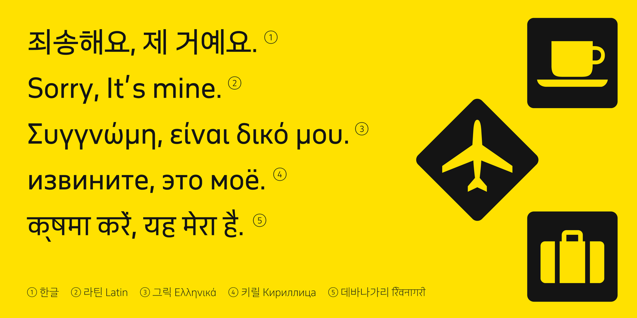
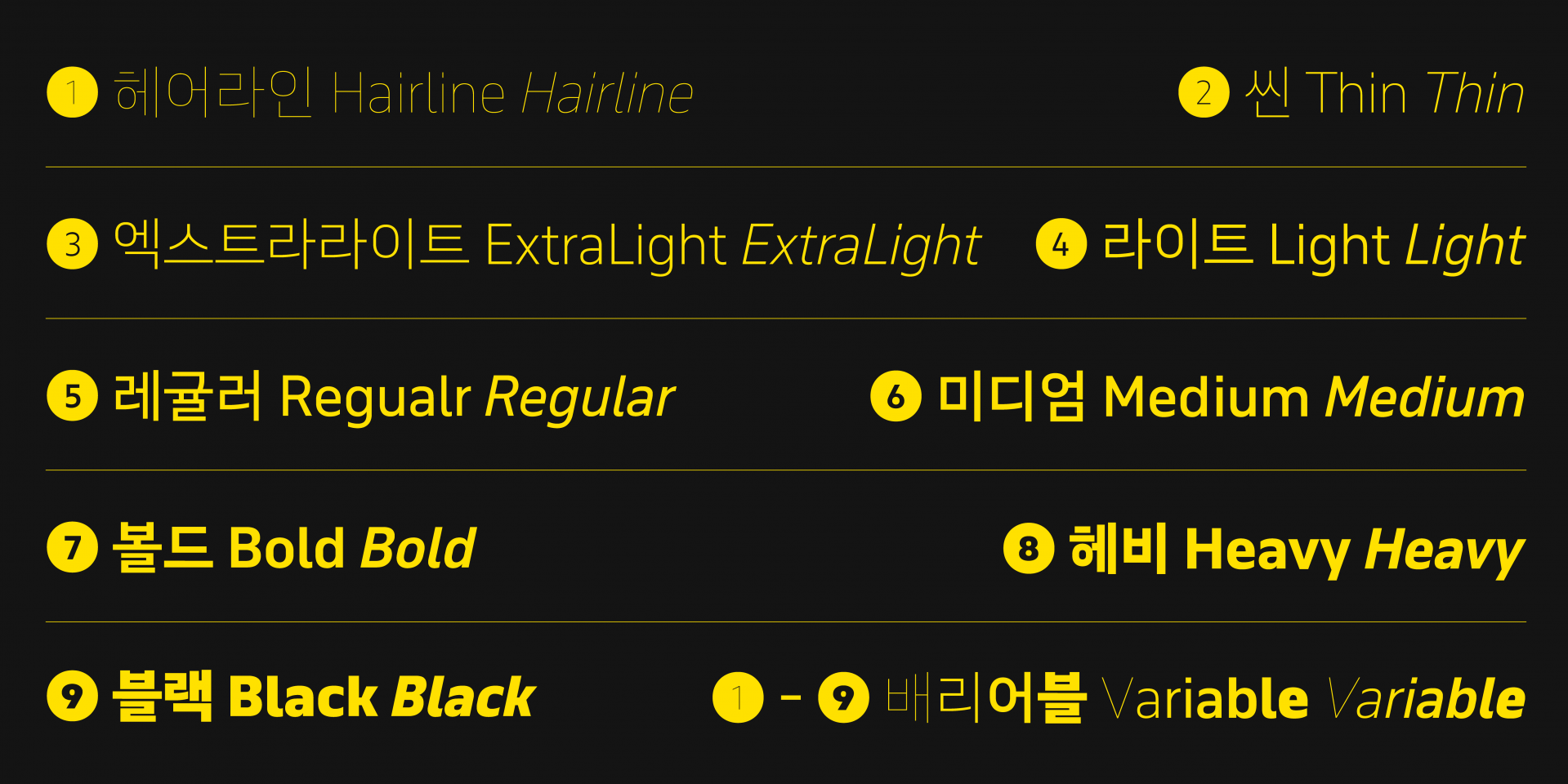
「노벰버」는 한글, 라틴과 라틴 확장, 그릭과 그릭 확장, 키릴과 키릴 확장, 그리고 산돌 최초로 데바나가리 문자를 포함하여 270곳 이상의 언어권을 지원합니다. 또한 이탤릭과 산돌 최초의 배리어블 폰트까지 포함하여 총 20종으로 출시되는 그야말로 강력한 사용성을 지니고 있는 폰트 패밀리입니다.
무미건조하게 정보들을 읊어놨지만, 다르게 말하자면 「노벰버」는 세계 270곳 이상에서 현지인들과 유창하게 대화할 수 있는 20명의 다재다능한 대가족이라고 말할 수 있어요. 앞으로 이 가족이 얼마나 더 늘어나게 될지 많은 기대와 관심 가져주시길 바라며, 만나서 반가웠습니다! 다음에 또 봬요!
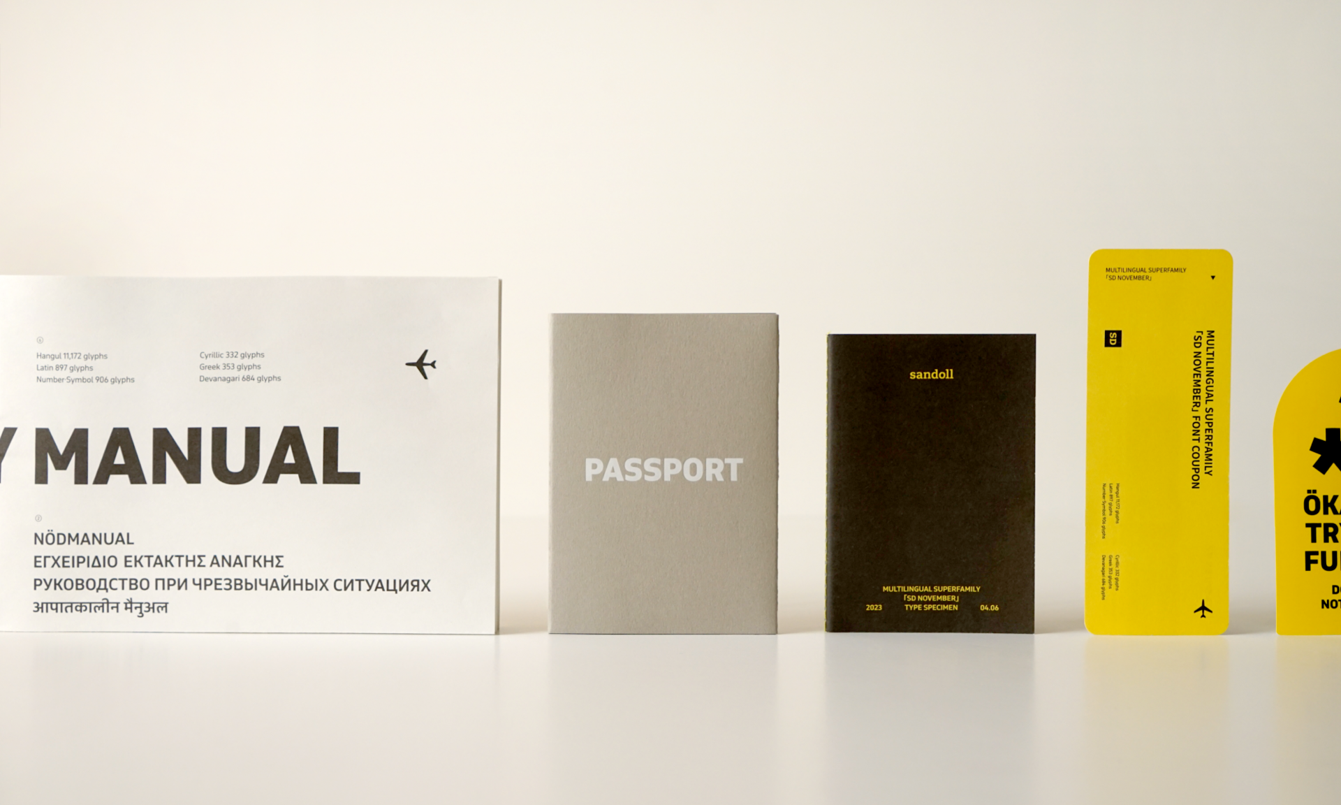
다국어가 필요한 모두에게 「SD 노벰버」 타입키트!
「SD 노벰버」 출시를 기념하며 노벰버의 다채로운 매력을 직접 경험할 수 있는 견본집과 굿즈를 포함한 타입키트를 제작했습니다. 아래의 신청 버튼을 통해서 「SD 노벰버」 타입키트*를 신청하실 수 있습니다.
*선착순 물량 소진 이후 접수자는 추첨을 통해 발송해드릴 예정입니다.
*타입키트 구성: 「SD 노벰버」 견본집 + 포스터 + 여권케이스 + 러기지 스티커 + 「SD 노벰버」 1개월 폰트 쿠폰
「SD 노벰버」 타입키트 신청

작성자: 산돌 상품기획팀 김슬기