조금 더 재미난 꽉찬 네모꼴의 산스를 찾는다면 여기를 보시라-!
하늘 아래 똑같은 꽉 찬 네모꼴은 없다..!
산돌에서는 매년 설문을 통해 유저들의 이야기에 귀 기울이고자 노력하고 있습니다. 많은 항목에도 불구하고 정성스럽게 참여해 주신 유저분들의 의견들을 읽어내리며 인사이트와 감동을 얻고는 하는데요. 제가 속한 상품기획팀은 이러한 데이터들을 폰트로 풀어내는 팀입니다. 폰트를 통해 유저들의 니즈와 흐름을 예측하고, 반응하며 제안하기 위해 노력하고 있어요. 때문에 늘 대중들이 어떤 폰트를 선호하고 필요로 하는지에 대해 아주 관심이 많답니다. 최근에는 서점 혹은 전시 장소들을 직접 방문해 보고 다양한 폰트들이 어떻게 쓰이고 있는지, 현장조사도 진행하고 있어요. 어딘가에서 다서 여섯 명이 모여 소곤소곤 폰트 이야기만을 하고 있다면 그건 산돌의 상품기획팀일 확률이 제법 높습니다!
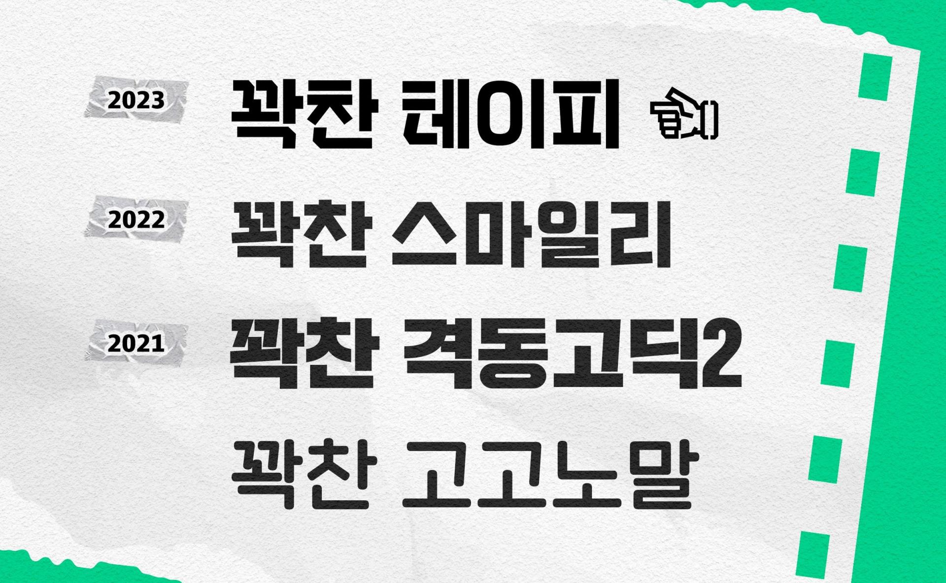
「SD 테이피」 는 이렇게 수집된 설문 결과들을 분석하여 기획한 폰트입니다. 2014년 「Sandoll 격동고딕」을 시작으로 오늘날에 이르기까지 수많은 꽉 찬 모듈의 고딕들이 등장했는데요. 그럼에도 불구하고 설문조사 내 스타일별 가장 원하는 폰트로 꽉 찬 모듈의 고딕 1위에 올랐습니다. 때문에 산돌에서는 최근 몇 년 동안 매년 새로운 얼굴의 꽉 찬 네모꼴을 1종 이상 제작했어요. 뿐만 아니라 “두꺼운 획부터 얇은 획까지 하나의 패밀리로 통일된 디자인이 가능한 폰트가 필요하다!”, “컨셉이 명확하고 특색 있는 디스플레이 폰트를 원한다!” 등과 같은 구체적인 의견들도 충족시킬 수 있는 폰트라고 생각합니다.
그래서 「SD 테이피」는요
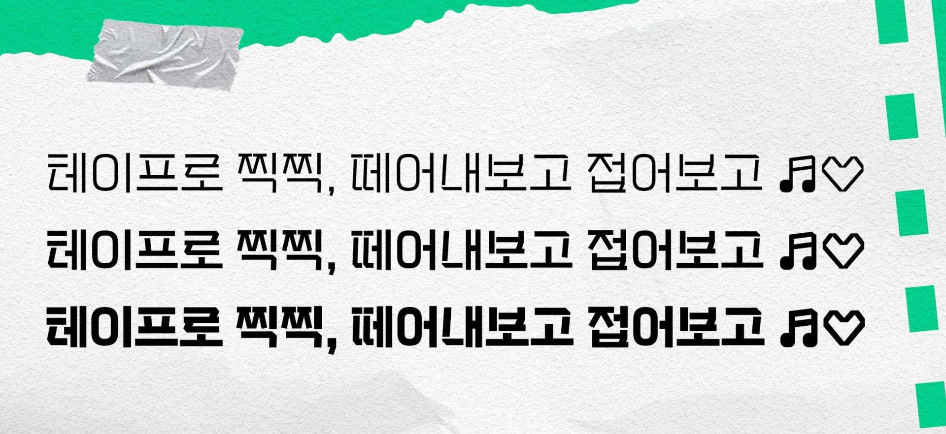
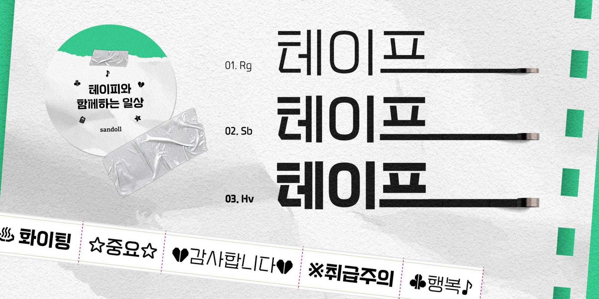
「SD 테이피」는 기존에 산돌 라이브러리에 있는 꽉 찬 네모꼴의 폰트들에과 비교한다면 좀 더 그래픽적인 폰트입니다. 사용성을 높이기 위해 한글 풀스펙*과 라틴 확장으로 기획되었고, Regular, SemiBold, Heavy 3종의 웨이트로 제작되었습니다. 「SD 테이피」는 이름에서 바로 알 수 있듯이 테이프로 만든 글자를 모티프로 하여 제작된 ‘활자’입니다.
*다양화된 현대 음절을 모두 표현할 수 있는 11,172자로의 확장
이미 테이프를 모티프로한 폰트들이 꽤 많았기 때문에 ‘테이프를 활용해 꽉 찬 네모꼴을 만든다면?' '테이프로 더 재밌게 제작할 수 있을까?’라는 경쾌한 물음을 던지며 폰트를 제작했습니다. 앞서 활자에 강조를 둔 것도 비슷한 이유인데요. 테이프로 만든 글자들은 비정형적일 수 있지만 활자로 만든다면 어느 정도의 편안한 가독성과 균질함을 가져야 한다고 생각했어요. 모든 자소들을 테이프로 만들 수 있는 형태가 아니라, 모티프를 바탕으로 정리하고 디자인하는 방향으로 폰트를 제작했죠. 트랙 형태의 스퀘어리쉬한 이응꼴을 보시면 바로 이해가 되실 거예요!
우당탕탕 (제작기)
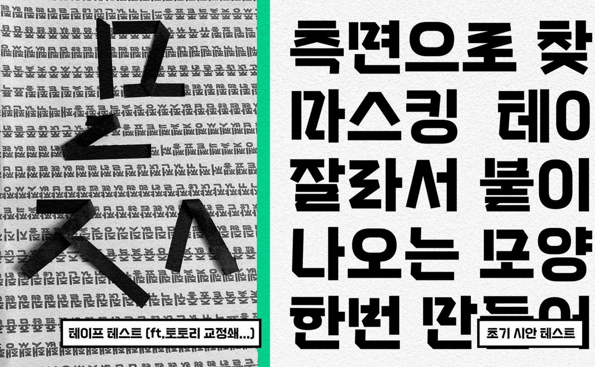
「SD 테이피」 는 테이프의 꺾임과 끊어짐 등의 특징들이 눈에 띄는 폰트에요. 앞서 이야기한 것처럼 테이프로 만든 글자라기 보다, 만들 '수' 있는 글자들을 폰트로 풀어낸 룩입니다. 어느 각도로 시작하여 맺어질 것인지, 어느 지점에서 떼어지고 붙어지고 그리고 꺾일 것인지에 따라 표현 방법은 무궁무진했어요. 그것을 보기 좋은 방향으로 다듬고 조절하는 작업들이 재밌어면서도 매번 고민에 깊었어요.
사실 초기의 씨글자 시안은 지금보다 그래픽적인 요소들이 많았어요. 조판하여 글줄로 보니 서로 부딪히는 요소들이 있어서, 최종적으로는 몇 가지의 특징적인 자소 외에는 덜어내는 방향으로 디자인이 수정되었습니다. 이 단계에서 꽤 우여곡절이 많았는데요. 공간이 넉넉한 민글자에서는 특징을 더 살려주고 싶고, 복잡한 구조로 갈수록 디자인 요소를 덜고 싶다 보니 민글자와 받침글자 사이의 통일성이 못내 아쉬워 여러번의 디자인 테스트가 필요했습니다. 이 과정에서 직접 마스킹 테이프로 자소를 만들어보며, 이 모양을 활자로 어떻게 풀어낼지에 대해 힌트를 얻어보기도 했습니다.
이렇게 써주시면 좋겠어요.
테이프를 찍찍 떼어가며, 접어가며 만든 글자 같은 「SD 테이피」는 특유의 떨어지고 꺾인 자소 디자인이 매력적이에요. 큰 초성의 무게감도 재밌고요. 반대로 말하면 그만큼 복잡한 디자인이라고 할 수도 있을 것 같습니다. 큰 포인트로 쓰시면 디자인 디테일이 더 잘 보이니, 그만큼 더 매력으로 쓰일 것이라고 생각해요. 제작할 때도 18pt 이상으로 쓰일 것을 염두에 두고 조판 테스트를 진행했었어요. 가급적.. 아니... 절대절대(오타아님) 크게 사용하시기를 권장합니다(!) 캐주얼한 인상으로 다양한 곳에서 가볍게, 재밌게 활용하기 좋은 「SD 테이피」 많이 사랑해 주세요~!!
추신. 기획 초기부터 생각했던 마스킹테이프가 굿즈로 제작될 예정이예요. 산돌구름 인스타그램을 통해 진행될 이벤트(링크)에도 많은 관심 부탁드립니다. (하트)
작성자: 산돌 상품기획팀 서희원