폰트로 표현하는 신념과 가치
여러분은 최근 일상의 다양한 영역에서 많이 사용되는 ‘가치소비’라는 말을 들어보셨나요? ‘본인의 가치 판단을 토대로 물건 및 서비스를 구매하는 소비 방식’을 뜻하는 가치소비는 여러 가지 형태로 나타나요. 자신의 정치적, 사회적 신념을 소비로 드러내는 ‘미닝아웃’*, 친환경 제품을 구매하는 ‘그린슈머’ 등 국내에서는 ‘착한소비’라고 이야기되는 소비 방식들 또한 모두 대표적인 가치소비의 사례에요.
가치소비가 최근 주요 소비 트렌드로 자리 잡은 건 소비자와 생산자 모두 단순히 경제적 가치만을 고려하는 것이 아니라, 조금이라도 가치가 있는 방향을 제시하고 또 선택하기 때문이라 생각해요. 그동안 경제적 가치만을 쫓아오며 야기한 수많은 문제들에 대한 자성이기도 할 거예요.
*미닝아웃(Meaning Out): 신념을 나타내는 ‘Meaning’과 벽장에서 나온다는 뜻의 ‘Coming Out’이 합쳐진 용어이다.
우리가 일상에서 접하는 수많은 폰트들 중에도 이렇게 다양한 사회적 가치를 담아 제작된 폰트들이 있어요. 폰트는 창작자를 통해 다시 창작물로 재생산되기 때문에 더 빠르고 넓게 확산되고, 우리 일상 전반에서 사용되어 더욱 깊게 자리할 수 있어요. 사회적 메시지를 전달하는 데 굉장히 유지하고 강력한 수단이 될 수 있죠.
환경을 생각하는 어쩌면 가장 작은 실천, 에코폰트
다양한 매체의 발전으로 비중이 줄었다고는 하지만 여전히 인쇄 매체의 비중은 무시할 수 없어요. 매일매일 프린트되는 수많은 종이를 채우는 건 빼곡히 인쇄된 글자들이죠. 네덜란드의 ‘에코폰트(Ecofont)’는 잉크를 아끼기 위해 글자들에 작디작은 구멍을 뚫는 폰트 디자인을 처음으로 시도했어요. 잉크는 독성이 매우 높고 카트리지는 폐기되면 완전한 분해까지 엄청난 시간(최대 450년)이 필요하다고 해요. ‘에코폰트(링크)’는 글자에 구멍을 뚫는 방식을 통해 약 50%의 잉크 절감 효과를 낸다고 해요.(Buyerslab 연구 결과 링크)* 2009년에는 ‘에코폰트'와 ‘스프란코(링크)’가 개발한 「Spranq eco sans」를 시작으로 해외의 여러 파운드리와 협업해 기존 폰트에 구멍을 뚫어 판매하기도 했어요. 현재는 어떤 폰트든 프린트 과정에서 자동으로 구멍을 뚫어주는 솔루션 소프트웨어를 판매하고 있어요.
*Buyers Laboratory Inc : 이미징 산업에 대한 정보를 제공하는 회사로 프린터, 복합기, 팩스, 스캐너, 디지털 이미징 소프트웨어 등의 장치를 테스트하고 결과를 제공한다.
우리나라에도 이와 같은 시도들이 있어요. 2009년 이용제 디자이너는 「아끼는 글자」(링크)*를 통해 한글에서 에코폰트의 가능성을 보여줬고, 2012년 ‘네이버’는 ‘에코폰트(Ecofont)’와 협력해 나눔 글꼴에 구멍을 뚫어 「나눔 에코폰트」(링크)**를 개발했어요.
*기존에 출시된 아리따 돋움에서 뼈대에 체크 무늬의 빈공간을 두어 에코폰트 형태로 제작한 폰트이다. 본문용 크기인 8 ~ 12pt로 프린트할 경우 빈 공간이 보이지 않으며, 아리따 돋움과 비교해 15% 정도 더 많은 양을 출력할 수 있다. 폰트로 출시되지는 않아 실제 사용할 수는 없다.
**2012년 네이버에서 에코폰트(Ecofont)의 기술 제휴로 제작한 폰트로 기존에 출시된 나눔명조와 나눔고딕에 작게 구멍을 뚫어 잉크를 절약할 수 있도록 만든 폰트다. 나눔명조, 나눔고딕과 비교해 35% 정도 (나눔명조 에코 레귤러 26 ~ 27%, 나눔고딕 에코 레귤러 34 ~ 35%) 잉크를 아낄 수 있다. 권장하는 크기는 7 ~ 11pt이다.
 「Spranq eco sans」와 「나눔명조 에코」
하지만 디자이너들은 단순히 의미만을 쫓을 수는 없어요. 디자이너들은 자신의 신념을 폰트에 담으면서도 소비자가 더 많은 곳에 활용할 수 있도록, 그리고 시각적으로도 매력적인 폰트를 만들기 위해 노력해요. 최근에는 단순히 구멍을 뚫는 것이 아니라 글자의 요소를 활용하여 보다 심미성을 고려한 시도들이 나타나고 있어요. 2015년 영국의 문구 소매업체 ‘라이먼(링크)’에서 출시한 「Ryman Eco」(링크)는 지속 가능성을 고려한 친환경 폰트에요. 모노타입의 타입 디렉터 ‘댄 래티컨(Dan Rhatigan)’과 런던의 광고 에이전시 ‘그레이 런던(Grey London)’이 함께 디자인했어요. 환경을 고려하면서도 미적인 형태를 가질 수 있도록 만들어졌어요. 이와 비슷하게 한글의 특징을 활용한 에코폰트는 배성우(링크) 디자이너의 ‘물푸레'가 있어요. 아직 출시되지 않았지만 ‘물푸레’는 한글이 가지는 특징을 잘 활용하여 잉크를 절약할 수 있는 방법을 제시해요.
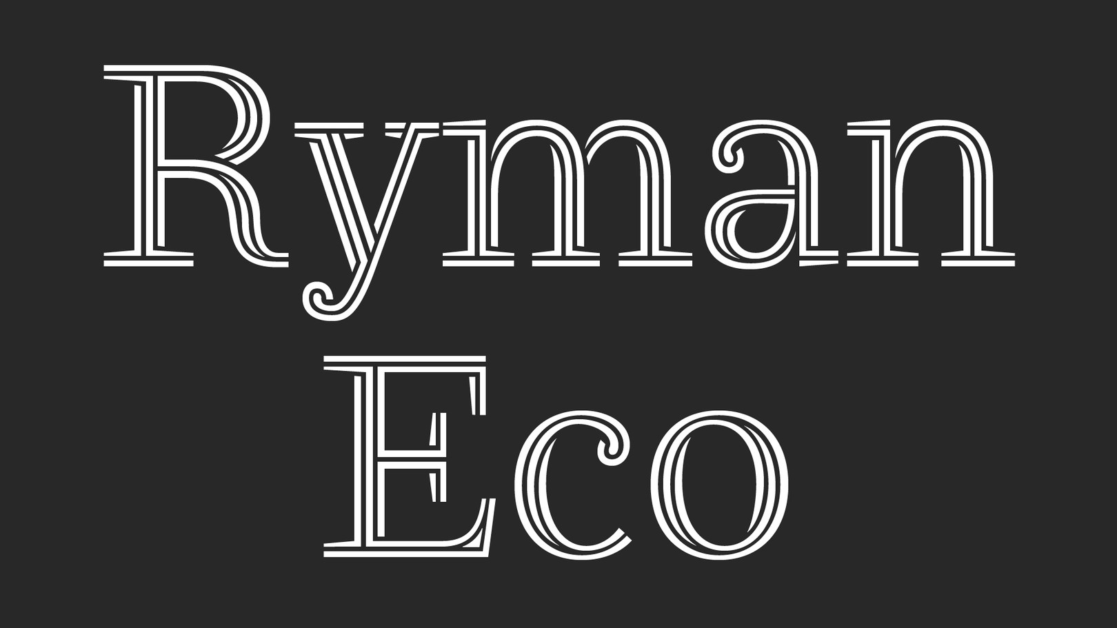 「Ryman Eco」
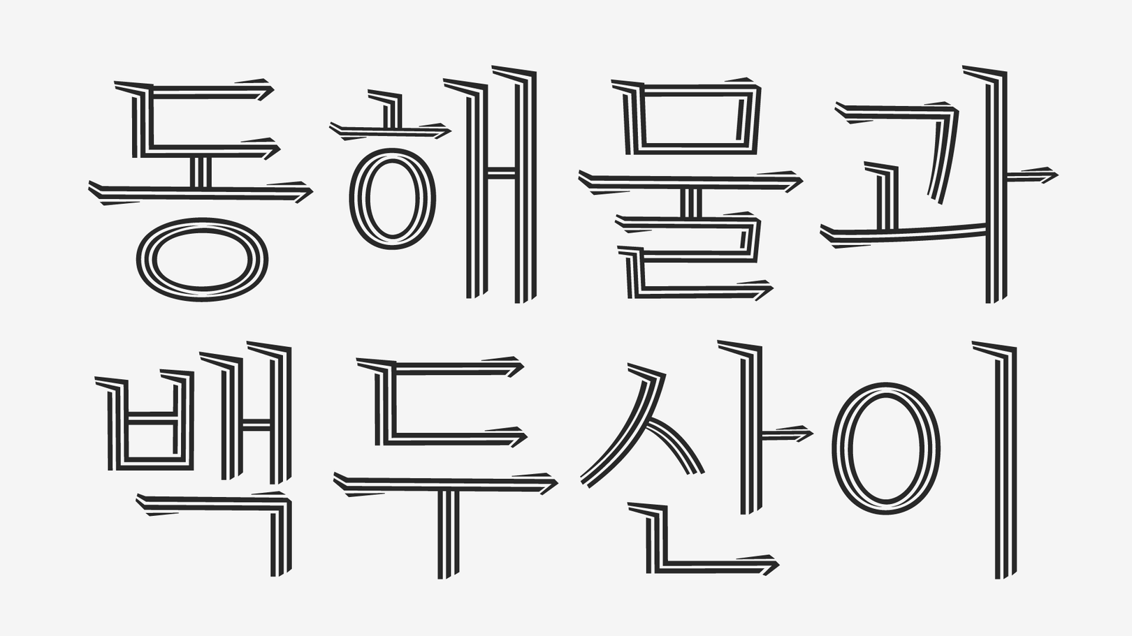 「물푸레」
「물푸레」
Type to act. (행동하려면 입력하세요.)
앞서 말한 폰트들이 환경 보호를 개인의 차원에서 직접적으로 실천하는 방식이라면, 더 많은 사람들에게 환경 문제에 대한 경각심을 주기 위해 만들어진 폰트도 있어요. 북유럽에서 가장 큰 신문사인 헬싱키 사노맛(링크)은 지구온난화로 인한 기후 위기를 사람들에게 알리기 위해 기후위기 폰트 「Climate Crisis Font」(링크)를 개발했어요. 최근 많은 폰트에서 활용되고 있는 베리어블 폰트* 기술을 통해 기후 변화로 점차 줄어드는 유빙의 형태를 글자에 담아 사람들에게 직관적으로 보여줘요. 1979년부터 2050년까지 시간(연도)을 축**으로 시간이 지날수록 글자가 녹아내려 물에 잠기듯 형태가 변해요. 2050년의 글자 면적은 IPCC(링크)***에서 예측한 데이터를 기반으로 1979년 해빙의 범위에서 30% 줄어든 정도의 비율이에요.
*베리어블 폰트(Variable Font): 베리어블 폰트는 글자 그대로 ‘변할 수 있는 폰트'라는 뜻이다. 두께, 폭, 기울기 등 폰트에서 변할 수 있는 다양한 특성을 정해진 값이 아닌 연속적으로 보일 수 있도록 제작하는 기술이다.
**축(axis): 베리어블 폰트에서 폰트가 가지는 어떤 하나의 특성이다.
***IPCC(Intergovernmental Panel on Climate Change, 기후 변화에 관한 정부간 협의체): 세계 기상기구(WMO)와 국제 연합 환경 계획(UNEP)에 의해 1988년 설립된 조직으로, 인간 활동에 대한 기후 변화의 위험을 평가한다.
기후 위기에 대한 경각심을 국내에도 잘 알리기 위해 타입 디자인 스튜디오 ‘노타입’(링크)*에서 「Climate Crisis Font」의 한글 버전, 「기후위기-한글」을 제작해 무료를 배포했어요. 일반적으로 한글 폰트가 제대로 기능하려면 최소 2,350자에서 2,780자를 제작해야 하기 때문에 라틴 폰트에 비해 제작에 어려움이 많아요. 그럼에도 「Climate Crisis Font」의 특징을 한글에 잘 녹여내어 지난해 무료로 배포된 이후 여러 분야에서 활용되고 있어요. “행동하려면 입력하라(Type to act)”는 이들의 구호처럼 기후 위기를 막기 위한 행동에 함께하고 싶은 분들이라면 이 폰트를 타이핑함으로써 전 지구적인 행동에 동참해 보는 것은 어떨까요?
*노타입: 2018년 노은유가 설립한 타입 디자인 스튜디오이다. 한글과 타이포그래피에 대한 심도 깊은 연구와 실험을 기반으로 하여 글꼴을 만든다.
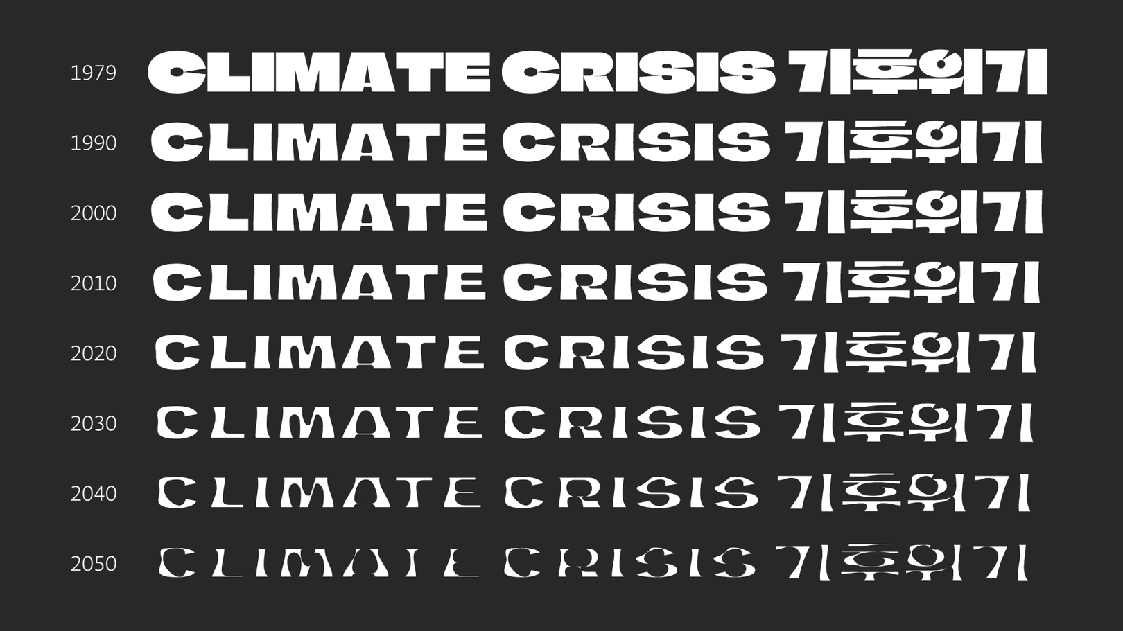 시간(연도)이 흐름에 따라 감소하는 유빙을 표현한 「Climate Crisis Font」와 「기후위기-한글」
환경과 더불어 꾸준하게 사회적으로 중요한 이슈가 되는 건 인권 문제죠. 인종차별, 노동자, 성소수자 등 과거부터 이어져온 수많은 형태의 인권 문제를 해결하기 위한 노력과 희생이 있었음에도 여전히 사회 곳곳에서 문제가 발생하고 있고, 이를 위한 운동이 지속되고 있어요. 여러 사회적, 정치적 운동에서 그에 부합하는 구호를 짧은 문장의 메시지 형태로 전달하는 방식이 많기 때문에 현수막, 깃발, 플래카드 등 다양한 디자인 작업물과 함께 폰트도 시각적으로 굉장히 중요한 역할을 하고 있어요.
누군가의 목소리가 되는 폰트
여러분은 때로 과격하거나 혹은 부드러운 목소리를 가진 듯한 폰트를 본 적 있지 않나요? 폰트를 그릴 때 '이야기를 어떤 어조로 말하고 있는 목소리인가'를 상상하며 그릴 때가 많기 때문이에요. 이렇게 누군가의 목소리가 되어줬던 대표적인 폰트가 바로 「Gilbert」(링크)에요. 2017년 세상을 떠난 LGBTQ+ 활동가 길버트 베이커(Gilbert Baker)를 기리기 위해 Newfest(링크), NYC Pride(링크), Fontself(링크)가 협력하여 만든 폰트에요. 길버트 베이커는 성소수자를 위한 운동에서 상징이 된 무지개 깃발을 만든 사람이에요. 이를 모티브로 제작된 「Gilbert」는 다양한 정체성을 상징하는 무지개 컬러를 활용해 서로 다른 컬러를 가진 획의 조합으로 이루어져 있어요.
2021년 국내에서는 이 프로젝트를 후원한 474명의 공동제작자, 비온뒤무지개재단*, 책임개발자인 숲(배성우), 제람(강영훈)이 협력해 「Gilbert」의 한글 버전인 「길벗체」(링크)를 제작했어요. 길벗은 활동가 Gilbert Baker의 이름을 뜻함과 동시에 ‘다양성을 존중하는 사회를 향한 여정(길)을 함께하는 벗'의 의미도 담고 있다고 해요. 「길벗체」는 현재 무료로 배포 중이며 보다 구체적인 설명은 「길벗체」 해례본(링크)에서 볼 수 있어요.
*비온뒤무지개재단: 2014년 성소수자 인권 증진을 위해 설립된 재단으로 다양한 활동을 하고 있다.
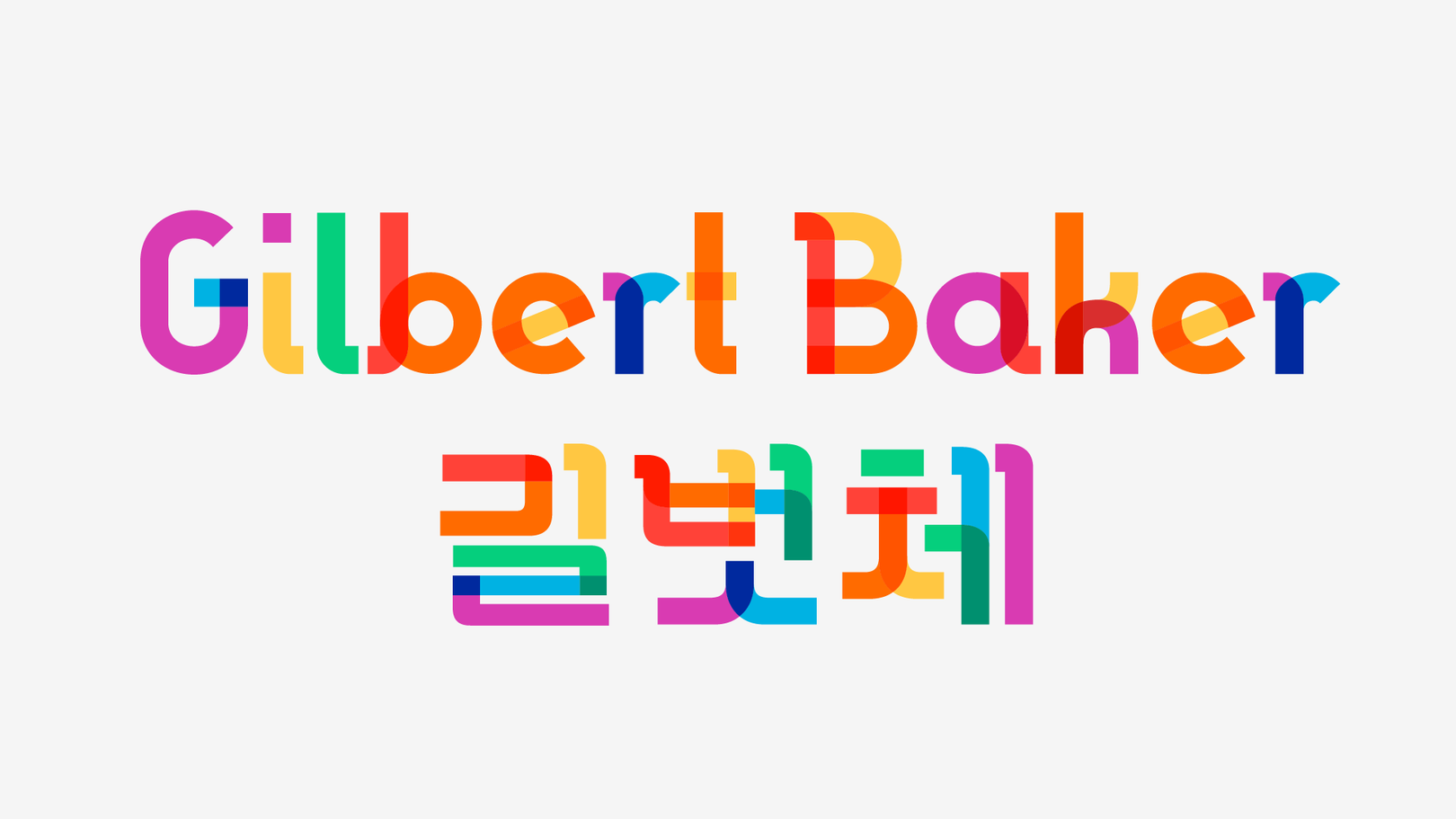 「Gilbert」와 「길벗체」
몇 년 전 세계적으로 이슈가 되었던 구호 “Black Lives Matter(흑인의 목숨도 소중하다)”*를 기억하시나요? 국내에서도 많은 일반인과 유명인들이 SNS를 통해 해당 구호를 태그 하며 이슈가 되었어요. 뉴스를 포함한 각종 매체를 통해 ‘Black Lives Matter’가 적힌 다양한 형태의 벽화, 그라피티, 플래카드들이 모습을 보였어요. 이 운동에 동참하기 위해 아트디렉터이자 UX 디자이너인 돈 리(Don Lee)는 어느 날 아침 등장한 백악관을 향하는 길바닥에 새겨진 벽화(murals)를 모티브로 폰트를 만들었어요. 운동에 반대하는 사람들에 의한 벽화의 훼손을 막아 달라고 요구하기 위해 제작했다고 해요. 이후 뉴욕, 오클랜드 등에서 등장한 다양한 형태의 벽화도 폰트로 제작해 이 운동에 동참하는 사람들이 널리 쓸 수 있도록 별도의 페이지(링크)를 통해 무료로 배포되고 있어요.
*Black Lives Matter(블랙 라이브스 매터, BLM): 2013년 결성된 흑인 인권을 위한 사회 운동으로, 아프리카계 미국인에 대한 경찰의 잔인함에 따른 사고에 대항하는 것을 시작으로 현재는 다양한 흑인 인권 문제 영역에서 구호로 사용된다.
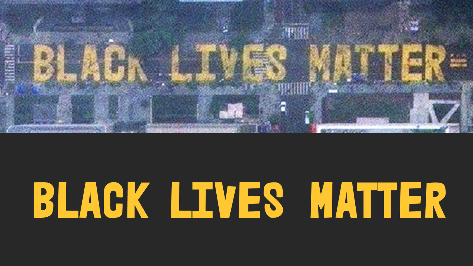 워싱턴에 새겨진 벽화를 본따 만든 「Black Lives Matter」 폰트
정치적인 이해관계에 따라 괴상한 모양으로 선거구가 바뀌는 현상인 ‘게리맨더링’을 알리기 위해 만들어진 폰트도 있어요. 선거 과정 개선을 위한 조직인 RepresentUs와 광고 에이전시 LeoBurnett이 협력하여 게리맨더링 문제를 사람들에게 더욱 명시적으로 알리고 비판할 수 있도록 「Ugly Gerry」(링크)라는 폰트를 만들었어요. 실제 미국의 선거구 형태를 그대로 본 따 알파벳과 부호를 그렸어요. 해당 폰트를 공개한 사이트를 통해 사람들이 이를 공유하고 의회에 편지를 보낼 수 있도록 했어요. 며칠 만에 수백 건의 기사가 쏟아지고 수억 건의 조회가 발생했고, 의회로 수천 건의 편지가 보내졌다고 해요. 이후 노스캐롤라이나는 게리맨더링 문제를 끝내기로 투표했고, 다른 주에서도 이와 유사한 법을 고려하고 했다고 해요.
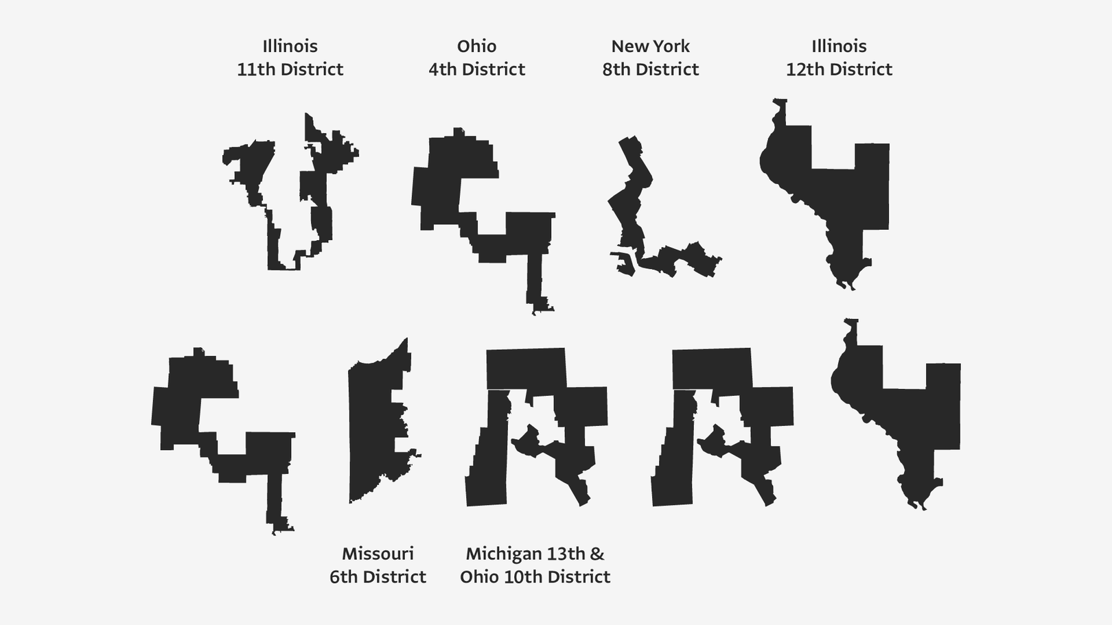 게리멘더링 문제를 적나라하게 보여주는 「Ugly Gerry」
우리에게 많이 알려진 위의 폰트들 외에도 Vocal Type Co.의 그래픽 디자이너 Tré Seals*가 워싱턴 행진**의 주요 활동가인 Bayard Rustin의 이름을 따서 제작한 폰트인 「Bayard」(링크), 흑인 인권 문제에 대한 분노와 심리적 불안정함을 담아 제작된 「Revolt」(링크)***, 베를린 장벽 붕괴 30주년을 맞아 위협받고 있는 자유에 대해 목소리를 낸 「Voice of the wall」(링크)****도 사회적 문제에 대한 자신의 신념을 폰트에 담은 좋은 사례에요.
*Tré Seals는 Bayard 이외에도 시민권, LGBTQ, 여성 참정권, 노조 결성권 등의 사회적 행동에서 영감을 받아 총 8개의 폰트를 제작했다.
**워싱턴 행진(March on Washington for Jobs and Freedom): 1963년 8월 28일 워싱턴 D.C.에서 열린 행진으로, 아프리카계 미국인들의 시민적, 경제적 권리를 옹호하는 행동이었다. 마틴 루터 킹 주니어의 인종 차별의 종식을 촉구하는 역사적인 “I have a dream” 연설로 잘 알려져 있다.
***영국의 일러스트레이터이자 강사인 Sam Rowe가 제작한 폰트로 누구나 무료로 다운받으면서 Black Lives Matter UK 및 National Bail Out에 기부할 수 있다.
****비영리 힙합 협회인 The Cultural Heirs와 광고 대행사 Heimat Berlin이 협력해 제작한 폰트로, 베를린 장벽에 낙서된 그래피티를 기반으로 제작했다.
 사회적 문제에 대한 자신의 신념을 폰트에 담은 다양한 사례들
때론 누군가의 눈이 되어주는 폰트
앞서 설명해 드린 사회적, 정치적 문제에 대한 자신의 신념을 드러낸 사례들 외에 사회를 구성하는 개인에 조금 더 집중해 직접적으로 그들의 문제를 해결하기 위한 사례도 있어요. 글을 읽고 보는 것에 문제를 겪고 있는 사람들을 위해 폰트 본연의 목적인 소통(Comunication)에 더 집중한 기능적으로 작동하는 폰트들이에요.
네덜란드의 디자이너 크리스틴 보어(Christian Boer)가 제작한 「Dyslexie font」가 대표적인 사례에요. ‘Dyslexie’는 우리말로 난독증을 뜻해요. 영미권 인구 중 15% 정도가 난독증을 앓고 있다고 해요. 한 학급이 30명 정도라고 한다면 4 ~ 5명의 학생은 난독증을 가지고 있을 정도로 흔하죠. 크리스틴 보어는 이를 해결하기 위해서 우리가 보기에는 조금 우스꽝스러운 형태로 글자를 그렸어요. 난독증이 있는 사람들에게 글자는 가운데가 사라져 보이기도 하고, 상하좌우로 반전되어 보이거나 소용돌이치듯 회전하는 것처럼 보이기 때문에 기존의 타입 디자인 규칙들과는 전혀 다르게 디자인했어요. 대소문자의 크기를 확실히 구분하고, 형태를 조금씩 다르게 하거나 각도를 주고 간격을 넓게 하는 등 일반적이지 않은 형태로 그려졌어요. 크리스틴 보어가 직접 운영하는 웹페이지(링크)에서 폰트와 문서 작성 솔루션을 구매할 수 있어요. 실제로 글자를 배우기 시작한 난독증 학생들의 학습에 많은 도움을 주고 있다고해요.
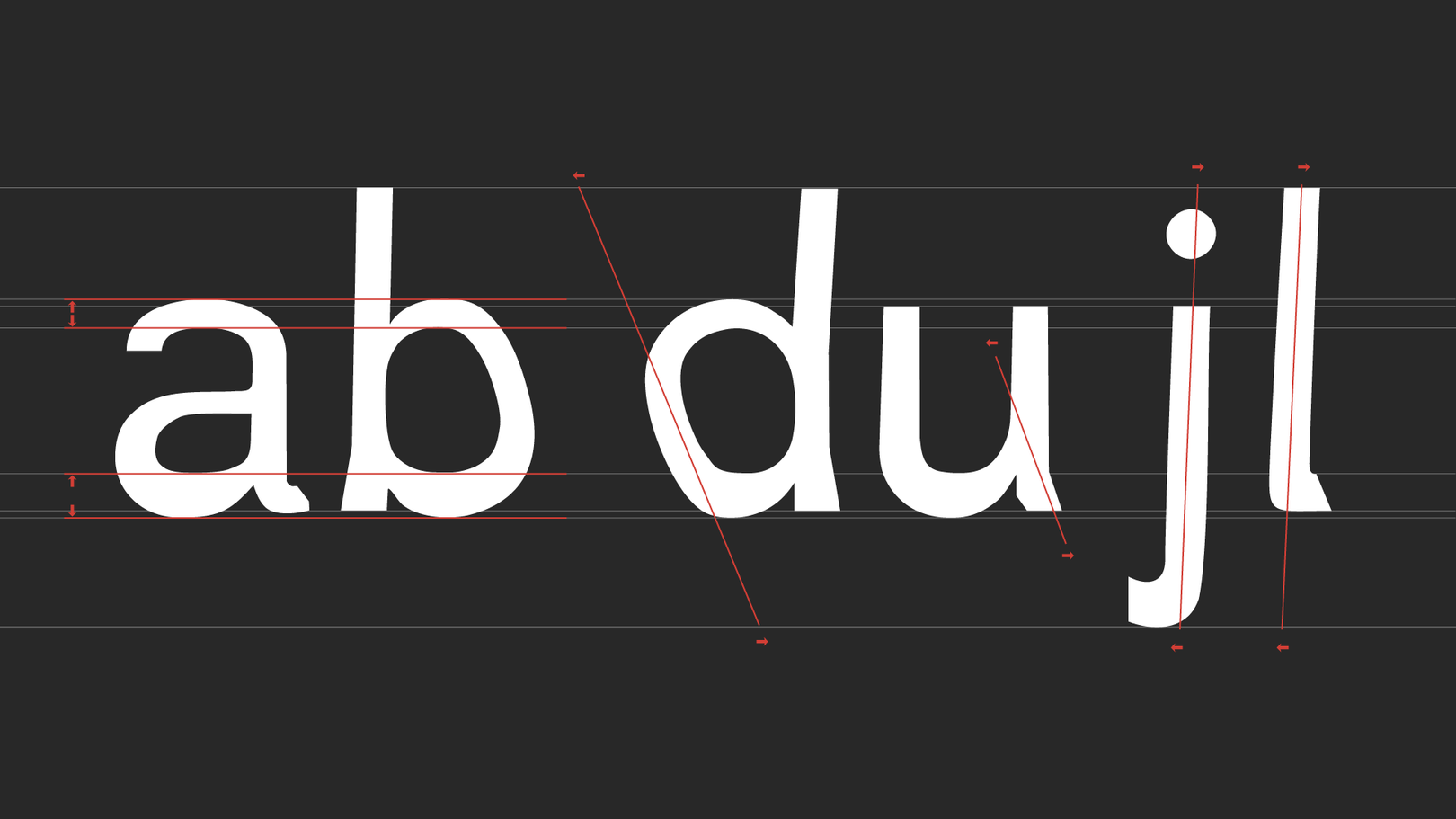 일반적인 타이포그래피 규칙을 벗어난 「Dyslexie font」
신념을 넘어 기능을 통해 우리에게 도움을 주는 폰트의 국내 사례로는 레어폰트(김주연 디자이너)의 「점자」(링크)가 있어요. 국립국어원에서 발간한 한국 점자 규정을 준수해 점자 폰트 「Rare점자」를 제작했고, 이 점자를 비시각장애인도 읽을 수 있도록 「Rare점자한글01」로 개발해 두 폰트를 겹쳐 사용할 경우 시각장애인과 비시각장애인 모두 의미를 알 수 있도록 했어요. 한글뿐만 아니라 영문, 숫자, 문장부호와 자주 사용하는 약자도 글리프로 구성되어 있어요. 단순히 장애인만을 위한 것이 아니라 장애인과 비장애인의 소통을 돕는 역할이라니, 멋있지 않나요?
 「Rare점자」와 「Rare점자한글01」를 겹쳐 쓴 모습
폰트에 가치와 신념을 담는다는 것
생각은 그 사람이 사용하는 말에 지배를 받는다는 이야기를 좋아해요. 자신의 생각을 어떤 말과 목소리, 말투로 말하는지에 따라 상대에게 내용이 달리 전달되고 이는 곧 자신의 생각이 되죠. 쓰기도 이와 같아서 우리가 쓰는 텍스트를 어떤 폰트로 보여주는지에 따라 그 내용을 보충할 수도, 약화시킬 수도 있어요. 많은 디자이너들이 (많은 일반인들도) 지금 이 순간에도 어떤 폰트를 고를지 계속 고심하는 이유죠.
대부분의 폰트는 그것의 모습으로 선택을 받아요. 사실 사용자의 입장에서 보기에 아름다우면 장땡이죠. 하지만 어떤 폰트들은 그것에 담긴 가치와 신념으로 선택받기도 해요. 우리가 환경 문제에 애써 고심하는 기업의 제품을 고르는 것처럼요. 채 몇 MB(MegaByte) 되지 않는 작은 디지털 파일로 많은 양의 잉크를 아끼고, 지구 온난화에 대한 경각심을 주고, 다른 사람의 정체성과 인권을 지지하고, 때론 나라의 법도 바꾸고, 누군가의 눈이 될 수도 있는 건 폰트가 그만큼 가치와 신념을 담기 좋은 수단이기 때문이겠죠. 각자 지향하는 가치와 신념을 담은 폰트가 더욱 많아져 그것을 통해 서로를 잘 이해하고 소통할 수 있기를 기대해요. 그것이 우리가 지향하는 아름다움일 수 있겠다 생각해요.
참고자료
빙하 사라지는 현실 담은 ‘기후위기 글꼴 한글’(링크), 뉴스펭귄
글꼴도 점점 사라진다? 기후 위기 심각성을 알리는 무료 폰트 ‘Climate Crisis’(링크), GS칼텍스 미디어허브
에코폰트, 국내에서는 어떻게 활용될까?(링크), 티스토리
에코폰트, 환경을 생각하는 착한 글자(링크), 티스토리
잉크를 ‘아끼는 글자’(링크), 계원디자인예술대학 이용제 교수
오색찬란 타이포그래피 ‘길버트’폰트를 아세요?(링크), 네이버블로그
길버트 폰트 & 길벗체, 서체로 소수자성 드러내기(링크), 월간 디자인
Type and Protest(링크), Communication Arts
I Have a Dream(링크), 위키백과
작성자: 산돌 타입랩팀 정태영