과자 패키지 관찰 일지
디자이너라면 다들 공감하실 거예요. 어디를 가도 관련 분야의 디자인을 자세히 들여다보고 있는 나를 종종 발견하지 않으세요? 폰트 디자이너라면 길거리에서 간판을, UX 디자이너라면 쇼핑몰을 둘러보다가 앱 구조를 뜯어보고, 인테리어 디자이너라면 카페에서 천장 마감을 먼저 살피죠. 저는 인쇄물에 관심이 많아서 패키지 디자인을 유심히 보게 되는데요. 오늘은 그중 과자 패키지에서 발견한 재밌는 포인트를 공유하고 싶어요.
관찰 포인트 1: 보기만 해도 맛있다
출시된 지 오래된 과자는 이미 우리에게 익숙하기 때문에 컬러나 특정 형태로 한눈에 구분이 가능하지만, 새로운 제품의 경우 고객들은 제품의 정보를 얻기 위해 글자를 먼저 읽어요. 이처럼 과자 패키지에서 중요한 역할을 하는 것이 글자인데요. 이를 떠올리며 편의점의 매대를 살펴보니 제품의 특성을 레터링로 잘 담아낸 제품들이 눈에 띄었어요. 간단하게 몇 가지를 나열해 볼게요.
맛
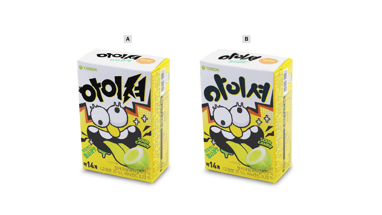
첫 번째로 미각의 시각화 케이스인데요. 번개의 형태와 머리가 쭈뼛 선듯한 모양으로 아이셔의 짜릿한 신맛을 표현한 것 같아요. A는 오리지널 아이셔 패키지이고 B는 마이구미의 상표를 참고해 적용해 본 패키지예요. 어떤가요? A와 B 중에 어떤 디자인이 더 침이 고이나요?
형태
꼬북칩의 상표를 잘 봐주세요. A, B, C 중에 어떤 것이 진짜 꼬북칩일까요?
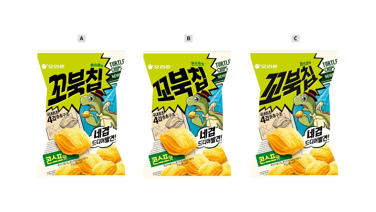
정답은 B 였습니다! 꼬북칩의 과자 모양에서 추리 가능한 정답이였어요. 가운데가 도톰한 과자 모양을 상표에도 적용한 제품의 형태적 특징을 담은 케이스예요. 꼬북칩의 과자는 거북이의 등껍질을 형상화했다고 하는데요. 거북이 등껍질 모양의 과자와 거북이 캐릭터, 그리고 이런 특징을 담은 레터링까지 더해져 제품 특성을 잘 나타낸 것 같아요.
원료
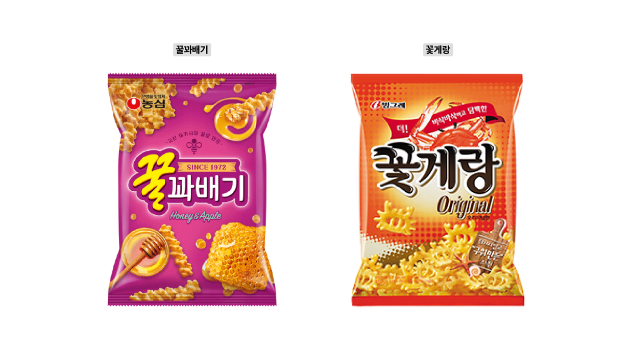
마지막으로 과자의 주요 재료를 상표 레터링로 표현한 케이스예요. 꿀꽈배기는 주르륵 흐르는 꿀의 성질을 ‘꿀' 자의 종성 ‘ㄹ’에 담아냈어요. 상표 외에도 패키지 좌상단을 제외한 모든 모서리에 꿀 표현을 배치했는데요. 상표 위의 귀여운 꿀벌 아이콘까지 상품의 주된 특성인 꿀을 최대한 강조하고 있어요.
예시를 하나 더 살펴볼까요? 꽃게랑은 원료인 꽃게의 요소를 상표에도 적용했네요. ‘꽃’ 자 초성 ‘ㄲ’의 시작획은 집게를, 종성 'ㅊ’의 시작획과 끝획에서 꽃게 눈을 형상화한 것 같아요. 상표 전체적으로 반질반질한 효과를 넣었는데 등껍질의 매끄러움을 표현한 게 아닐까 해요.
관찰 포인트 2: 세월 따라 왔어요
앞서 맛, 형태, 원료 3가지 관점에서 패키지를 살펴봤는데요. 제품의 특성을 조금이라도 더 잘 보여주기 위해 많은 브랜드가 레터링을 활용하고 있는 것을 확인할 수 있었어요. 이어서 재밌었던 두 번째 포인트를 말해볼게요. 시대가 변함에 따라 제과 시장에서도 제품의 포지션을 변경하는 일이 있는데 이 변화를 상표와 폰트에서 찾아봤어요.

1989년 출시 당시 카스타드의 패키지를 보면 고풍스러운 플레이트와 꽃장식 외에도 장식적인 상표가 눈에 띄어요. 레터링의 화려한 부리와 아래에 작게 들어간 스크립트 스타일 영문 폰트에도 프리미엄 포지션이 반영되어 있다는 것을 확인할 수 있어요.
2020년 변경된 카스타드에서는 전체적으로 친근함이 느껴지네요. 가장 눈에 띄는 변화는 동글동글한 느낌의 상표인데요. 이에 맞춰 서브 카피 폰트 또한 캐주얼한 스타일을 채택한 것 같아요. 기존의 카스타드는 홍차나 커피에 곁들여 먹는 고급 디저트의 인상이었다면, 지금의 카스타드는 우유와 같이 먹는 친숙한 간식의 포지션으로 변했다는 것이 느껴지시나요?
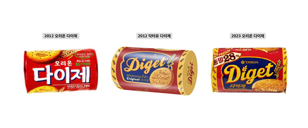
이번에는 기존의 오리온 다이제가 2012년 오리온의 자사 브랜드인 닥터유 다이제로 변경되면서 바뀐 패키지 디자인을 관찰해봤어요. 가장 눈에 띄는 변화는 제품명의 표기 방식이예요. 국문 위주의 친숙한 표기 방식에서 영문 위주의 디자인으로 변경됨에 따라 이전과는 다르게 이국적인 세련미가 담겼는데요. 직선적인 레터링에서 유려한 곡선 스크립트 스타일의 레터링으로 변경되면서 기존의 투박한 이미지를 탈피하려고 한 것 같아요. 밀의 표현도 사실적인 사진 이미지에서 일러스트레이션으로 변경해 캐주얼해 보여요.
이어서 현재의 다이제를 보면 닥터유 다이제에서 큰 변화는 없지만 왼쪽 상단의 라벨을 추가해 통밀을 강조하고 있음을 알 수 있는데요. 상표에도 통밀의 바삭하고 거친 느낌을 반영하기 위해 텍스쳐를 추가하고 각진 형태로 변경한 것으로 추측돼요. 이렇게 패키지에 적용된 레터링에서 각 시대에 따라 제품이 내세우고 싶은 메시지가 달라짐을 읽을 수 있어요.
관찰 포인트 3: 조상님이 되기까지
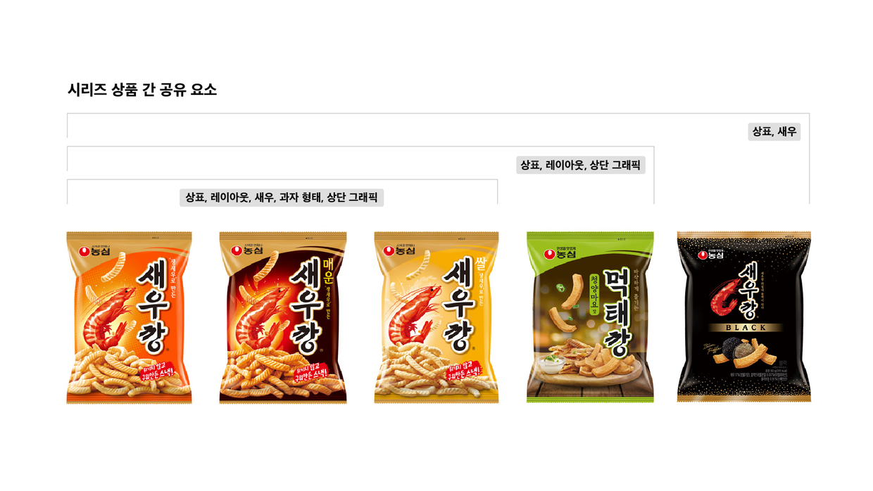
위의 케이스처럼 레터링을 적극적으로 활용해 변화하는 시대를 반영하는 과자가 있는가 하면 기존의 스타일을 확고하게 고수하는 과자도 있는데요. 대개 클래식 반열에 오른 과자들이 그 정통성을 유지하기 위한 경우예요.
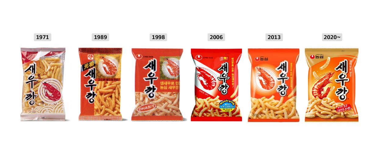
새우깡의 변천사를 보면 패키지가 여러 번 바뀌어도 반드시 유지되는 요소가 있어요. 컬러, 과자와 새우 이미지, 그리고 상표예요. 컬러는 빨간색부터 오렌지색까지 변화의 폭이 비교적 넓고, 과자와 새우 이미지는 매번 변경되었지만 상표의 레터링은 1989년 이후부터는 같은 인상이 유지된 채 현재까지 적용되고 있죠. 제품의 헤리티지를 보여주는 주요한 요소로 레터링이 활용되고 있음을 확인할 수 있어요.

고유함을 표현하는 방법
오늘은 우리를 둘러싼 일상에서 폰트와 레터링이 어떤 영향을 미치고 있는지, 특히 제과 시장에서의 역할에 대해 이야기 해봤어요. 제품 고유의 특성을 섬세하게 담아낼 수 있는 요소이자 상품인지에 중요한 역할을 하고 있음을 확인했는데요. 패키지에서 레터링이 가장 중요한 요소라고 할 수는 없지만, 많은 제품이 쏟아지는 시장에서 호기심을 유발하는 차별화 요소라고는 말할 수 있을 것 같아요.
기능과 미학을 고려해 수천 자가 만들어지는 폰트 디자인과는 달리, 단 서너 글자로 메시지를 상징화하는 제품 레터링을 살펴봤어요. 알게 모르게 지나쳤던 글자들을 새로운 관점에서 이해하는 계기가 되기를 바라며, 오늘의 관찰 일지는 여기까지예요. 다음 관찰 일지도 열심히 준비하고 있으니 기대해 주세요! 또 만나요~
작성자: 산돌 브랜드디자인팀 김여름