새로우나 이상한 것과 마주칠 때의 마음
1. 새로운 맛
저는 요리 서바이벌 프로그램을 보는 걸 좋아합니다. 보다보면 가끔 심사위원은 이런 평을 하죠. “지금껏 먹어보지 못했던 맛이에요.” 그리고 1초의 정적 후. “하지만 신선하고 혁신적입니다.” 혹은 ”무언가 잘못되었어요. 인생 최악의 음식입니다.”
짧은 심사평에 요리사의 희비는 엇갈립니다. 저는 이렇게 반복되는 장면에 늘 가지는 의문이 있죠. 그건 지금껏 한 번도 겪어보지 못한 것이 좋은지 나쁜지 어떻게 바로 판단할 수 있는지에 대한 것입니다. 서바이벌 프로그램 특성상 심사위원들은 시식 즉시 심사평을 하는 것이 당연하지요. 하지만 조금 가혹하게 느껴졌습니다. 그리고 자신에게 낯선 것은 부정적으로 받아들일 가능성이 더 크지 않을까요?
하지만 저도 가끔 그 심사위원처럼 말하곤 합니다. 어떤 폰트나 레터링을 처음 볼 때 말이죠. 그 순간엔 정말 이상하고 별로라고 생각합니다.하지만 시간이 조금 지난 뒤 다시 보면 진짜 새롭고 매력적으로 보입니다. 생전 처음 보는 스타일의 창작물을 볼 때 이런 일이 잦았던 것 같아요. 저에겐 이 프로젝트를 진행하며 접했던 이전 시대의 레터링이 그러했습니다.
2. 새로운 옛 것들
옛날 것은 새롭습니다. 이상하게 들릴지도 모르지만 ‘오래된 미래’ 같은 뜻이 아니라 진짜 새로워요. 우리는 해당 시대에서는 평범하다고 생각되었던 간판이나 광고 이미지를 새로운 감성으로 받아들입니다. 이전 문화를 향유하는 방식이 분명 그 때를 살았던 사람들과 다르죠. 하여 현시대 제작된 레트로 컨셉의 창작물에는 현재를 살아가는 제작자의 다양한 감상이 반영된다고 생각해요. 아래 이전 시대에서 온 낯선 형태의 글자들을 몇 개 보여드릴게요.
1) 초기 그로테스트
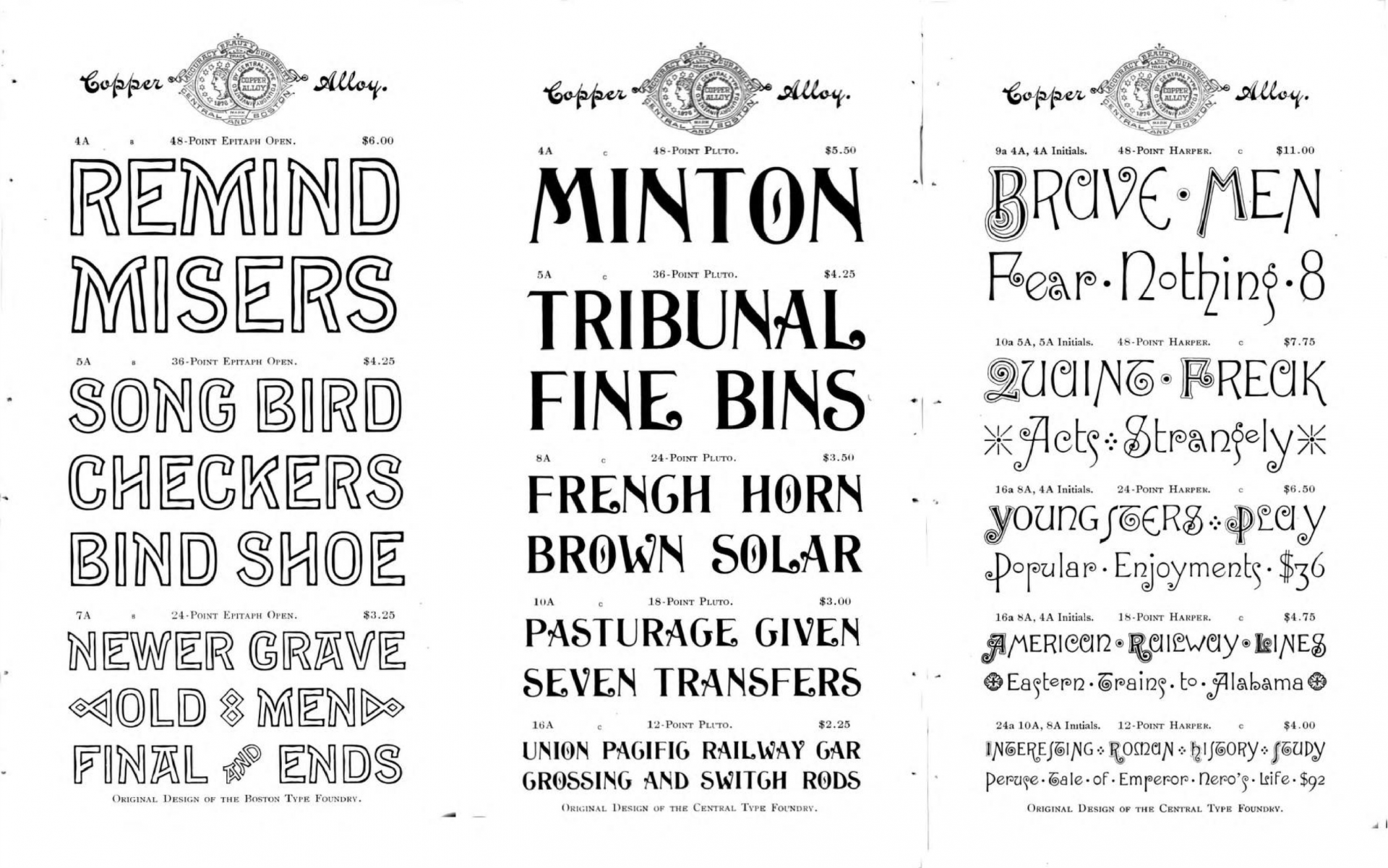
여기 아래 초기 그로테스크* 스타일의 산세리프 활자체는 현재 우리가 많이 사용하는 네오그로테스크** 스타일의 「Helvetica」와 많이 다르지요?
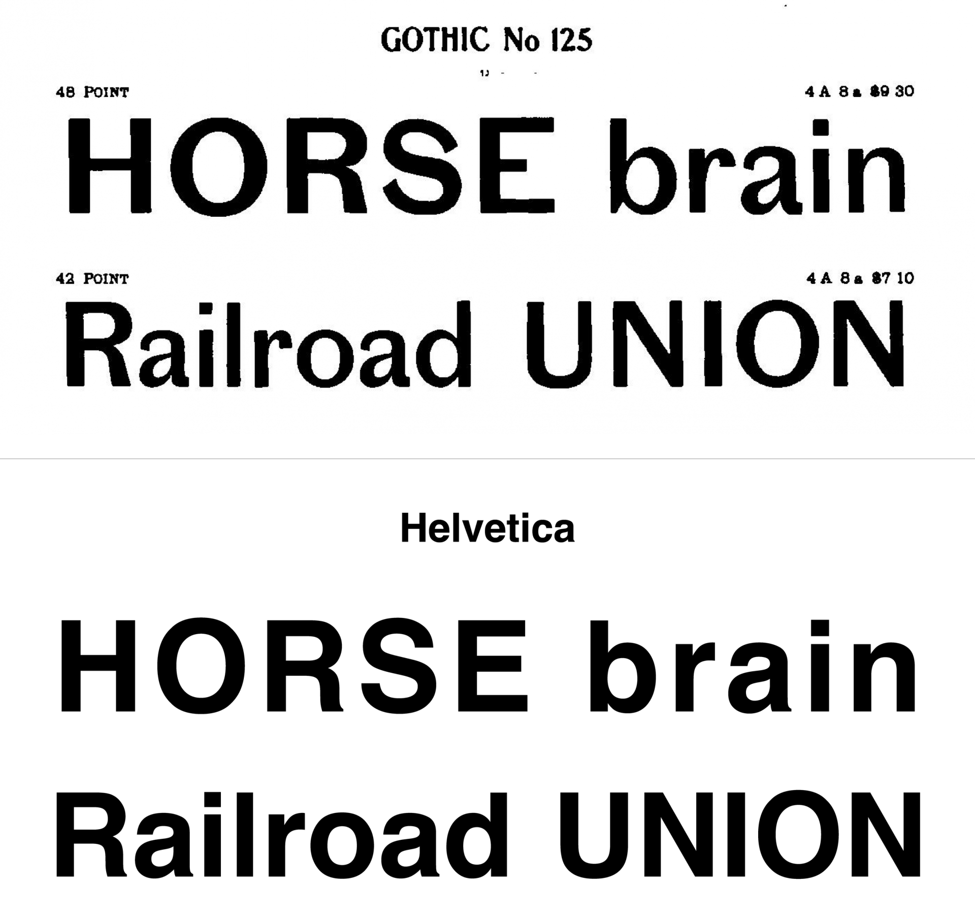
(위)1898, 「Gothic No 125」와 (아래)1957, 「Helvetica」
*그로테스크(Grotesque) : 19세기에 등장하여 사용된 초기의 산세리프 글자체들의 특성을 가지는 유형을 말한다. 세리프 중심에서 산세리프로 넘어오던 '과도기적 시기'라 특성이 남아 있다. 전형적 예로 그로테스크 MT(Grotesque MT), 프랭클린 고딕(Franklin Gothic)등이 있다.
**네오 그로테스크(Neo-Grotesque) : 20세기 중반 경 등장한, 형태가 정교한 산세리프 서체 군을 일컫는다. 초기 산세리프인 그로테스크 유형에 기반하여 발전한 헬베티카(Helvetica), 유니버스(Univers) 등이 그것이다.
참고문헌. 김현미, 로마자 글자체의 새로운 분류체계 모색 -복스-ATypI 분류법을 중심으로-, 2014, p.97
2) 신선하고 매력적인 1900년대 레터링
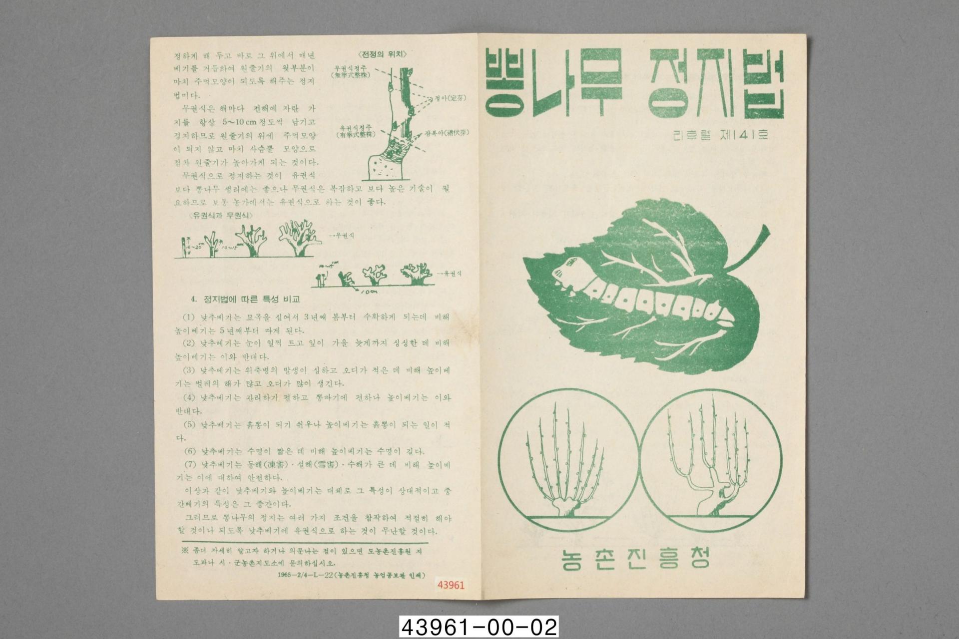
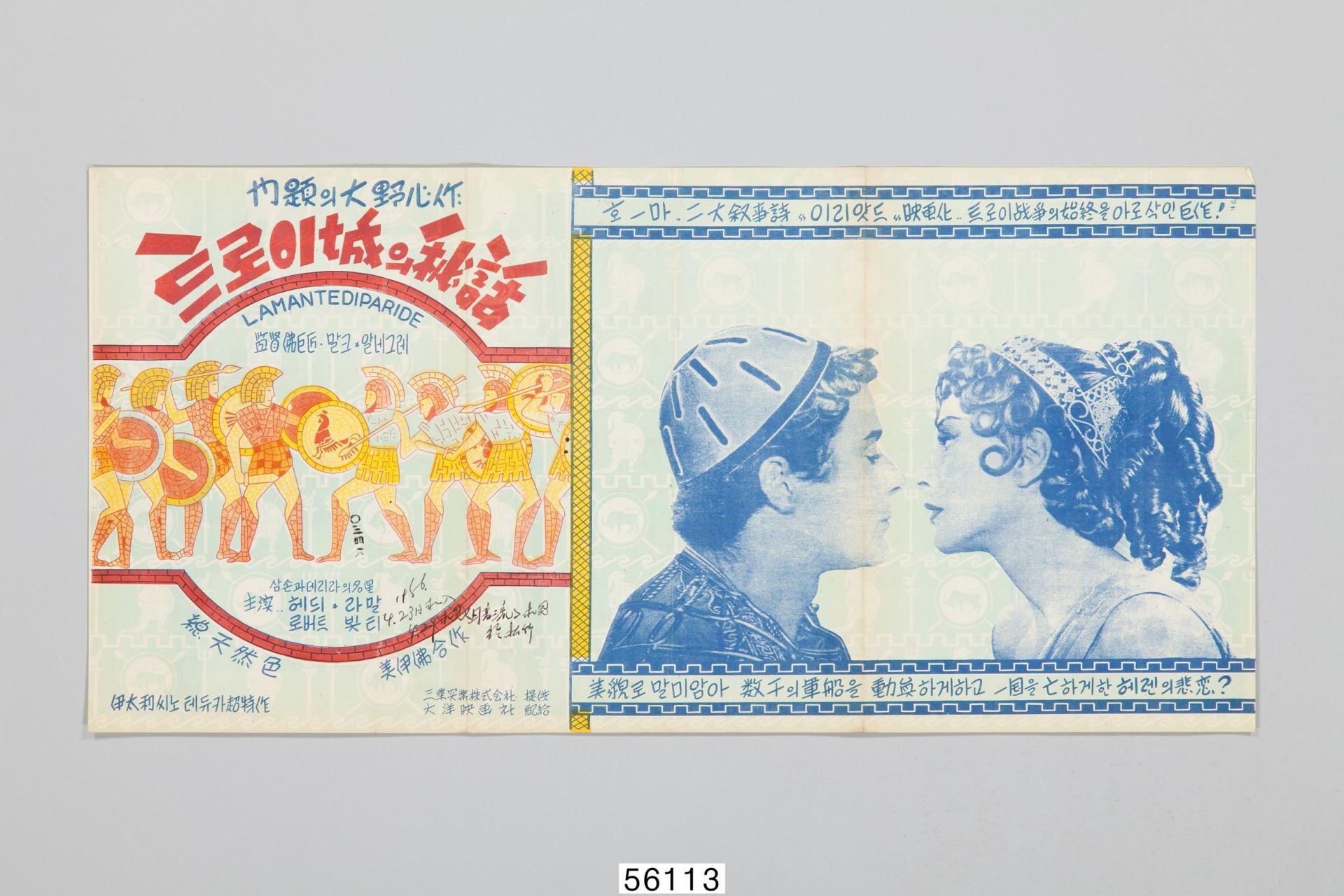
출처: ‘국립민속박물관’
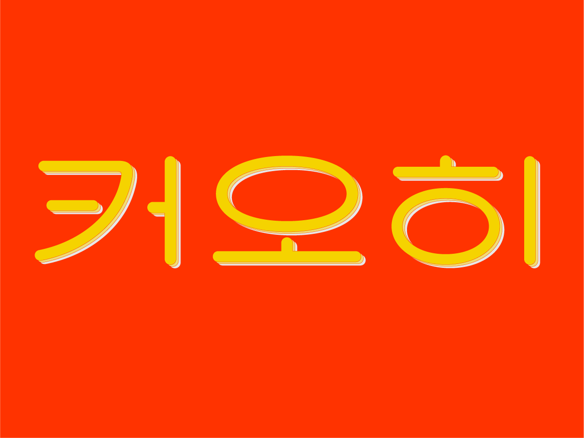
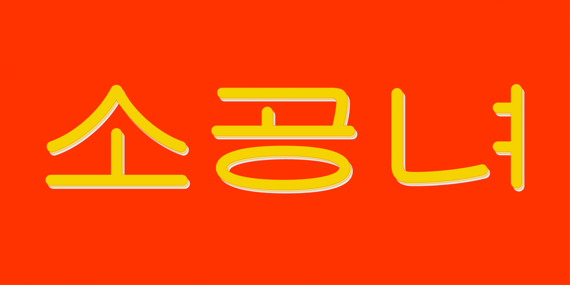
3. 레트로와 「SD 커오히」의 관계
아르데코, 퓨처리즘, 사이키델릭, Y2k 등 한 시대를 풍미한 다양한 스타일을 아시나요? 여전히 과거의 스타일을 그리워하고 즐기며 작업에 재현하려는 창작자들이 많답니다.
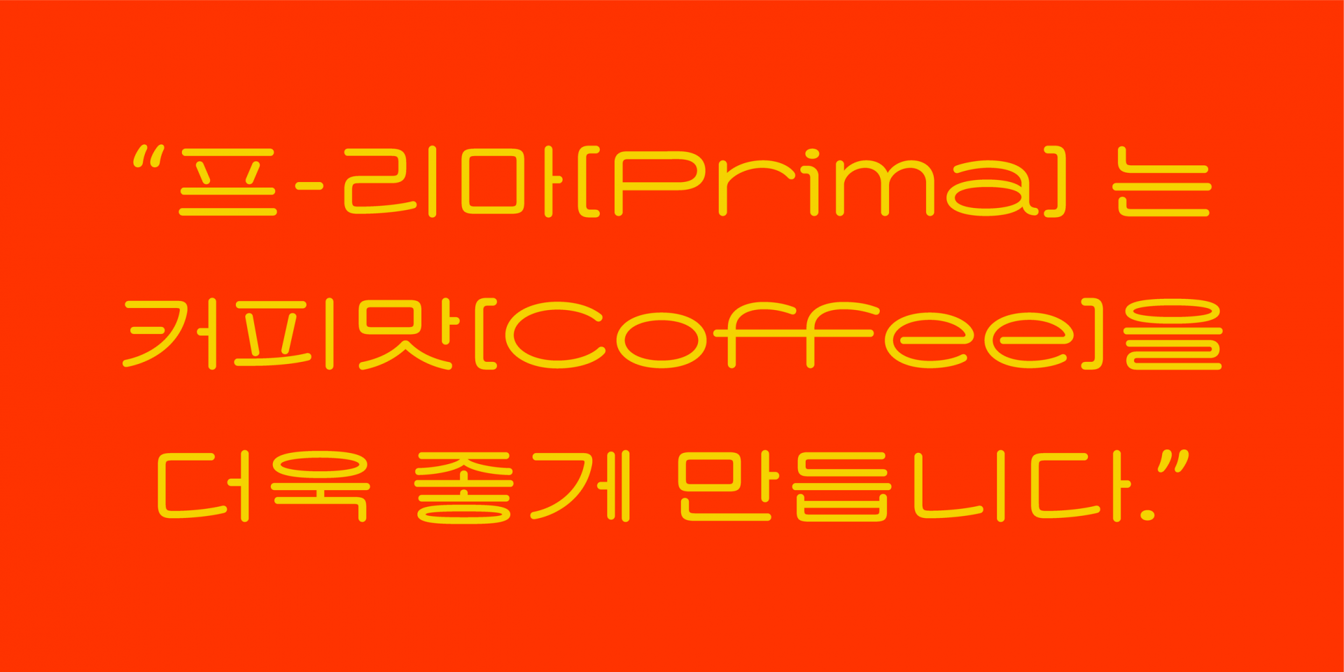
「커오히」도 이러한 작업의 유용한 재료가 되고 싶었어요. 또 산돌의 대표적인 베스트셀러 폰트를 말할 때 빠지면 서러운 「Sandoll 격동고딕」, 「Sandoll 청류」, 「Sandoll 로터리」의 레트로 컨셉을 잇고 싶었고요. 그러면서도 앞선 폰트와는 또다른 감성을 표현하는 것이 목표였습니다. 「커오히」라는 이름도 레트로 광고의 나레이션에서 영감을 얻었어요. 전체적으로 카피를 아련하고 느리게 끌며 말하는 것이 그 시대의 특징처럼 느껴졌거든요. ‘커피’를 천천히 늘여 부른 걸 소리 그대로 적었어요. 폰트 너비가 가로로 긴- 평체라는 점에서도 잘 어울립니다. 또 제작하며 커피를 좀 많이 마신 것도 그 이유가 되었을지도요.
「커오히」가 선택한 시대는 1950~1960년대 입니다. 「커오히」는 그 시대에 그려진 레터링 원도를 재해석해 만들어졌어요. 저는 보고선 ‘아, 향수가 느껴진다.’란 감상이 떠오르면 좋겠지만 특정 레터링을 떠올릴 정도로 원도의 형태를 100% 재현하지 않으려 했습니다. 해서 시안 단계서 모티브가 될 레터링 원도를 여러 개 선정했습니다. 그러고 나서 원도의 어떤 요소는 반영하고 어떤 요소는 버릴지 결정합니다.
선택의 기준은 “사용자가 이 폰트를 보고 ◌◌한 느낌을 받으면 좋겠다.”의 ‘◌◌’이지요. 흥미로운 요소를 이것저것 붙였다 떼봅니다. 어떤 요소는 강조하기도 하고 어떤 부분은 흔적만 남아있도록 축소합니다. 이렇게 제가 원하는 인상에 다가가도록 커스터마이징하는 것이지요. 이 과정을 거치면 어느 정도의 재해석이 이루어질지 자연스럽게 결정됩니다.
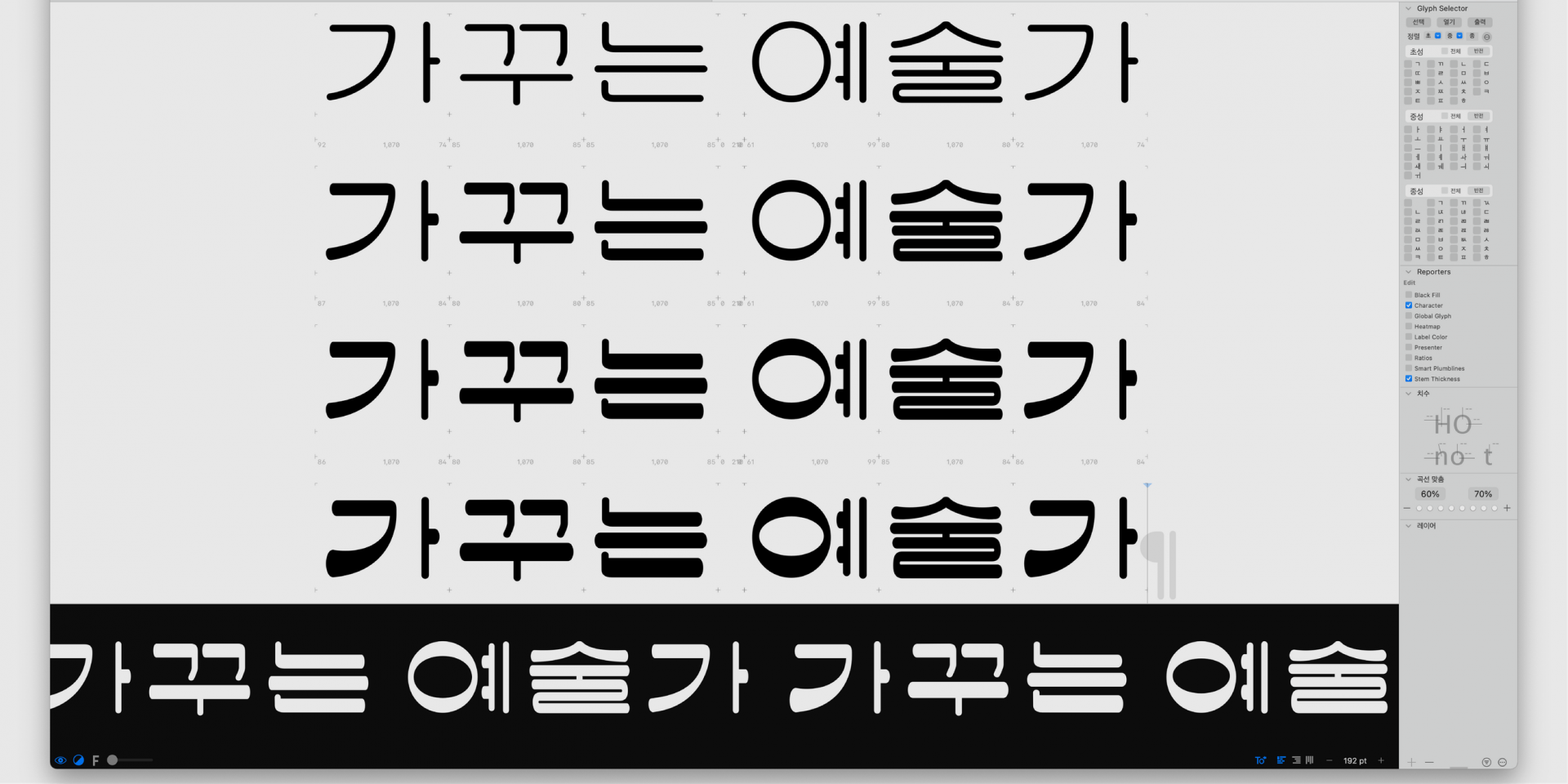
제가 주관적으로 느끼는 신·구의 혼합 배율은 다음과 같습니다.
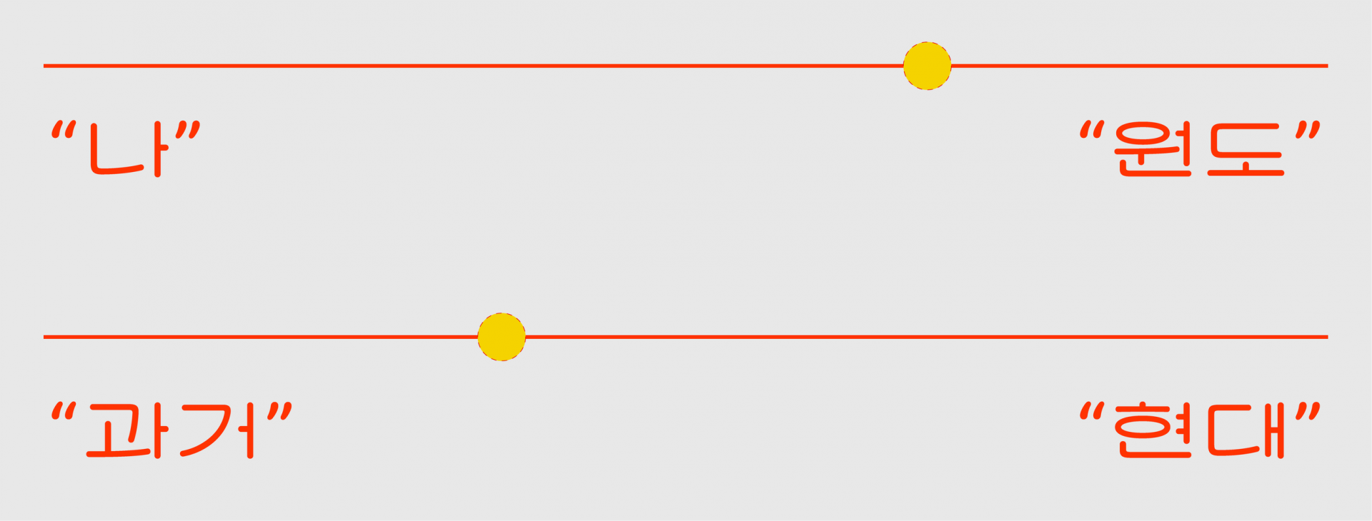
4. 「SD 커오히」의 ‘◌◌’
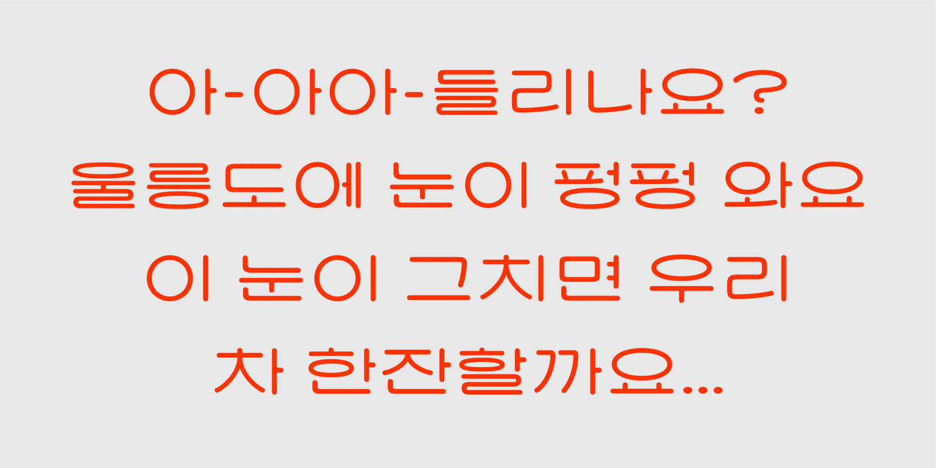
1950~1960년에 살다가 2023년으로 타임리프한 「커오히」를 떠올려 봅니다. 「커오히」가 이 세상을 대하는 태도는 어떨까요? 가끔 그런 망상을 해보곤 합니다. 사랑스럽고 행동거지가 귀여우며 생명이 있는 것에게 상냥했으면 좋겠습니다. 그러면서도 아직은 아이스케키, 슈퍼마켙 같은 요상한 단어를 사용하는 게 더 익숙하구요. 아래 ‘◌◌’을 잘 보여주기 위해 저와 원도가 서로 합을 맞춘 몇 부분을 소개합니다.
5. 나와 원도, 복원과 재해석
1) 모서리의 굴림
「커오히」는 획 끝과 모서리를 둥글게 굴린 라운드 스타일의 폰트입니다. 특히 글자의 모서리 부분 안·밖의 선 모두에 곡률을 적용했어요. 커오히와 같은 ‘라운드’스타일의 폰트인 「Sandoll 고고」를 보세요. 모서리 부분 바깥 획만 둥글고 안쪽은 직선입니다. 글자 내 생기는 좁고 복잡한 공간을 깔끔하게 보여줘요.
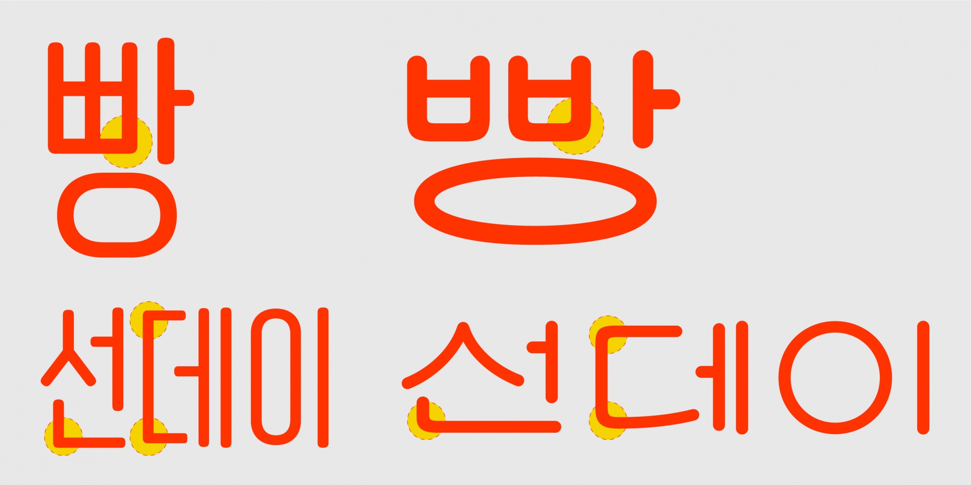
「Sandoll 고고 cond」와 「SD 커오히」
하지만 「커오히」는 안과 밖 모두에 라운드 처리를 했습니다. ‘빵’ 쌍비읍의 아주 작은 모서리에도 예외 없이요. 글자 내 곡선이 늘어날수록 판면에서 「커오히」의 부드럽고 친근한 인상이 강조돼 보였어요. 크게 휘어지는 곡선이 오래된 세탁소 창문에 붙은 시트지와 빵집 간판의 글자를 떠올리게 하지 않나요?
2) 짧은 곁줄기와 긴 짧은 기둥
늘 고민입니다. 한글 파생을 할 때 곁줄기와 짧은 기둥은 어느 정도의 길이가 적절할 지에 대한 것이요.
물론 이것은 폰트의 특성에 따라 달라집니다. 「커오히」는 글자의 가로 공간을 배분시 초-중성 사이 너른 공간과 그와 대비되는 짧은 곁줄기가 특징입니다. 보편적인 민부리 계열 폰트와 비교하면 곁줄기가 생기다가 만 것 처럼 짧아요.
어떤 글자인지 판별이 되는 범위에서 기준 크기로 보았을 때 최대한 짧게 보이도록 설정했어요.
왜냐구요? 그것이 제가 원도에서 발견한, 글자의 인상을 엄청 귀엽게 보이도록 만드는 요소 중 하나라고 판단하였기 때문입니다. 이 법칙이 그대로 세로모임에 적용될 시 ‘고’ 같은 낱자의 짧은 기둥도 짧아져야 합니다.
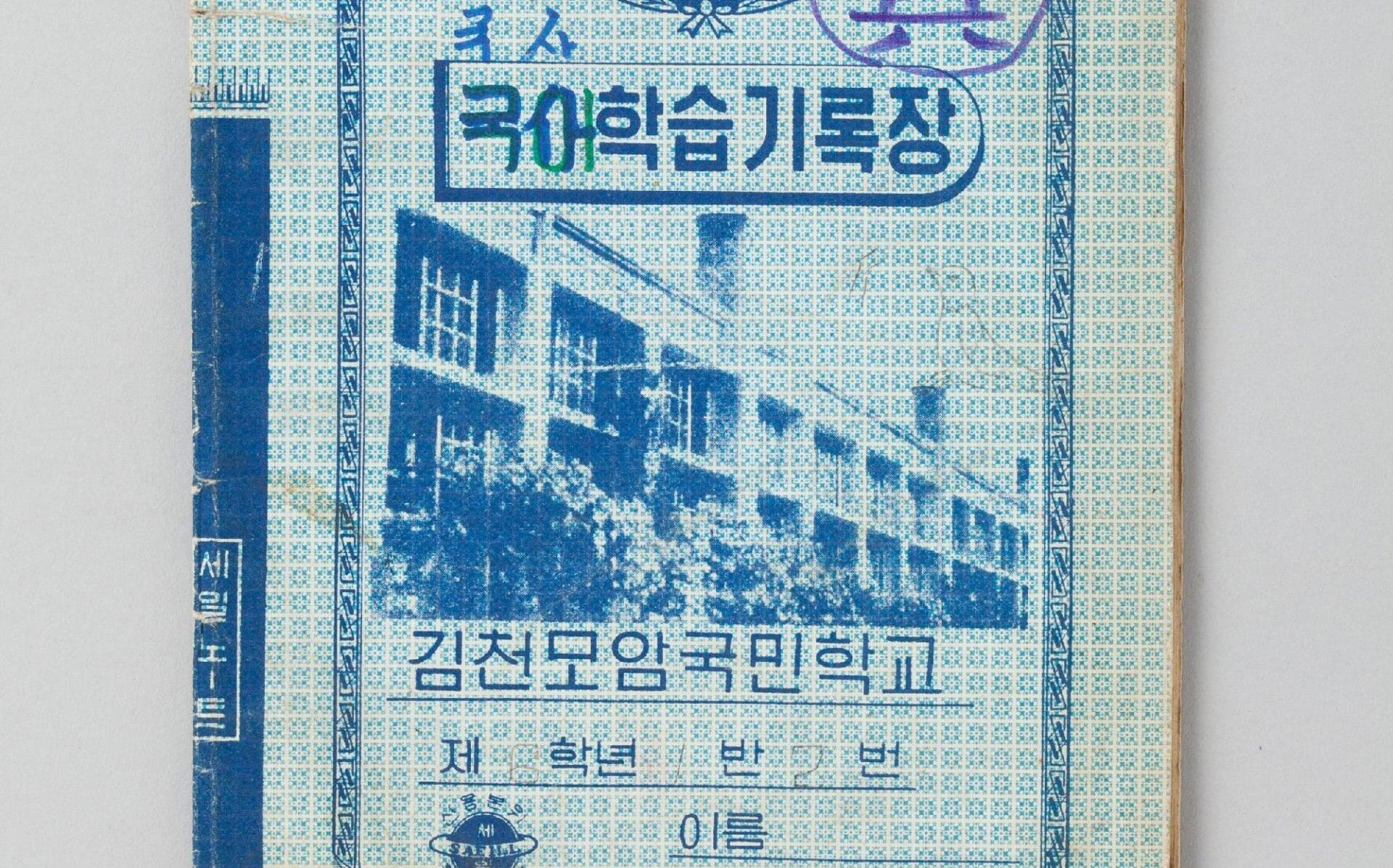 출처 : '국립민속박물관'
하지만 위 이미지처럼 이전시대 레터링에서 가로 공간을 널널하게 공간을 쓰더라도 이 법칙이 세로 공간 배분 시에는 이어지지 않습니다. 짧은 기둥과 초-중성의 거리감이 매우 가깝죠. 저는 이를 「커오히」의 또 다른 특징으로 삼았습니다.
가로 공간은 널널하게 세로 공간은 촘촘하게 하나의 글자 내 2가지 규칙이 사이좋게 공존합니다. 두 개의 기둥을 함께 보았을 때 대비감이 보이시나요? 이 간극도 목욕탕에서 냉탕과 온탕을 마구 오가는 어린 아이의 마음처럼 흥미롭지 않나요?
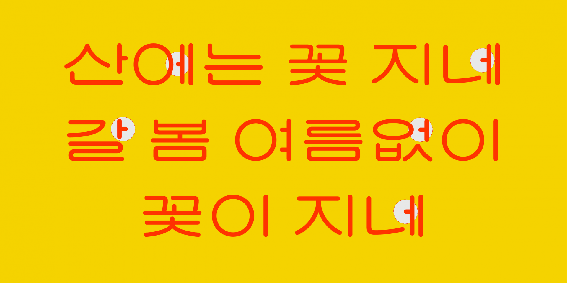
3) 뻥튀기 같은 'ㅇ'
제가 원도에서 가장 좋아한 요소입니다. 쌀뻥튀기처럼 입을 양껏 벌리고 있는 ‘ㅇ’이요.
문장을 조판해서 보면 시원시원한 정원의 ‘ㅇ’이 눈에 쏙쏙 들어옵니다. 약간 “날 좀 보소~!”하는 부담스러운 외침이 들리기도 합니다만, 「커오히」의 다른 특징과 어우러져 나쁘지 않은 느낌입니다. ‘ㅇ’은 가장 등장 빈도가 높은 닿자 중 하나입니다. 그래서 그런지 레터링 원도를 살피다 보면 다양한 모임꼴 내에서 ’ㅇ’ 곡률의 일관성이 특히 낮다는 느낌을 받아요. 어떤 레터링에서는 ‘ㅇ’의 양쪽 모서리가 뾰족해지며 가로와 세로획의 굵기가 반전되어 보이고, 전환도 자연스럽지 않지요. 두께가 각각 조금씩 다른 ’ㅇ’도 심심치 않게 보여요.
「커오히」도 이를 반영해 폰트 내 ㅇ의 규칙을 좀 더 역동적으로 가져가기로 했습니다. 큰 공간을 차지할 때는 보름달처럼 둥근 정원으로 작은 공간에서는 UFO 같이 납작한 타원으로 설정했어요. 이같은 규칙을 유지하면서도 모임꼴마다 자연스러운 원의 곡률을 만들려 노력했습니다.
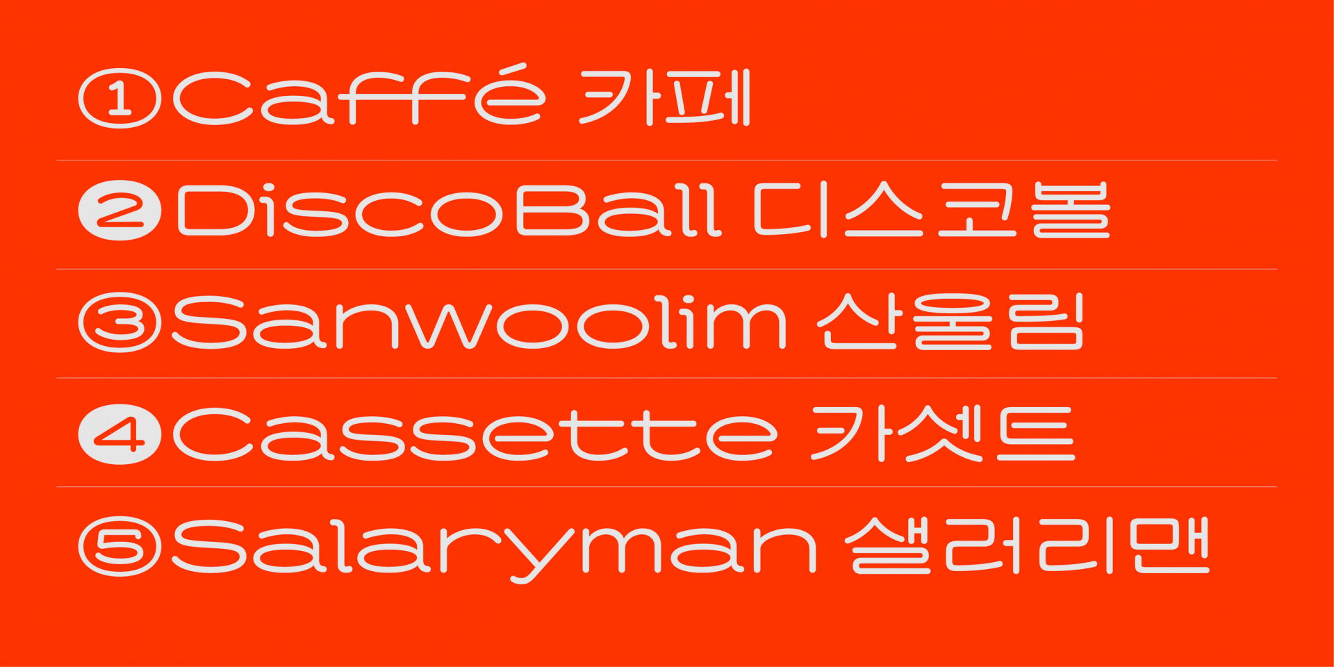
4) 원도에는 없는 영문
레터링 원도에는 한글만 있어 라틴을 디자인하기 위해서는 좀 더 상상력이 필요했습니다.
하나의 폰트 내에서 라틴과 한글을 섞어 짜는 방식은 디자인 방향성에 따라 달라집니다. 「커오히」는 라틴이 한글과 비교해 속공간이 커지더라도 한글의 물리적 너비감을 거의 나란히 맞춰 정렬시키는 방향성을 택했어요. 그 편이 한글의 레트로적인 인상을 살려주면서도 전체적으로 평체의 너비감을 일관적으로 유지할 수 있다고 생각하였거든요. i,j,l을 제외하고는 귀여운 모노스페이스 폰트처럼 n과 같은 너비감을 가지고 있습니다. i,j,l까지 넓은 비례를 유지할 경우 조판시 너무 일률적인 덩어리감이 지루하게 느껴져서 약간의 변칙적 요소로 활용한 것이지요.
이러한 특성으로 인해 「커오히」의 영문은 큰 크기로 한글과 함께 썼을 때 그 매력이 잘 드러난답니다.
5) 이상한 나라의 「SD 커오히」
수 번의 피드백과 작업 공유회에서 저는 「커오히」를 설명하기 위해 ‘못생겼다’라는 말을 많이 썼어요 ‘어수룩하다’ 라는 말도요. 물론 투실한 고양이가 하품을 하는 사진을 두고 “어유~쟤 진짜 못생겼다.” 라고 사랑을 가득 담아 말하는 것과 동일한 톤이였습니다. 그래도 그 표현 말고 이를 설명할 더 적절한 단어가 없었나 고민하는 것이 좋았겠습니다.
돌이켜 이런 표현을 쓰게 된 이유는 무엇이었을까요?
‘보통’이라는 범주에서 벗어난, 새로운 형태라고 느껴져서 자연스럽게 이런 어휘를 사용했던게 아닐까 싶어요. 또 그 시대에는 아직 한글 활자체에 대한 법칙이 널리 보편화되지 않았다고 생각합니다.
물론 한글 레터링에서는 일부러 디자인의 통일성을 지키지 않거나 극도의 획 대비를 주는 등, 규범을 벗어난 자유로운 표현이 가능합니다. 하지만 그 시대 레터링에서는 현대 한글 활자체에서 보편적으로 지켜져야 하는 법칙들을 무시한 무척이나 낯선 형태를 많이 발견하게 됩니다. 하지만 프로젝트를 시작하고 보니 그 시대에는 그것이 사용자들에게 무척이나 자연스러운 조형으로 보였겠죠. 그것을 지금의 시선으로 미완의, 어딘가 부족한, 조잡한 것으로 단언할 순 없단 생각이 듭니다.
짤뚱한 곁줄기와 높게 솟은 짧은 기둥들, 밀가루 반죽같은 ㅇ과 통일성이 부족한 ㄹ을 가진 「커오히」.
이도 누군가에겐 낯설지만 여전히 귀여운 폰트이길 바래봅니다.