사람의 손길이 느껴지는 인본적인 폰트
듄을 좋아하세요…
21년 겨울, 영화 듄이 한국에 개봉했습니다. 평소 SF 장르를 좋아하던 터라 스타워즈, 스타크래프트 등 여러 유명한 SF 세계관에 영감을 주었다는 작품을 보러 가지 않을 수 없었습니다. (티모시 샬라메의 팬이기도 했습니다!) n차 관람을 거치며 듄의 세계에 완전히 매료되었고, 후속작을 기다리기가 힘들어 자연스레 원작 소설을 먼저 읽어보게 되었습니다.
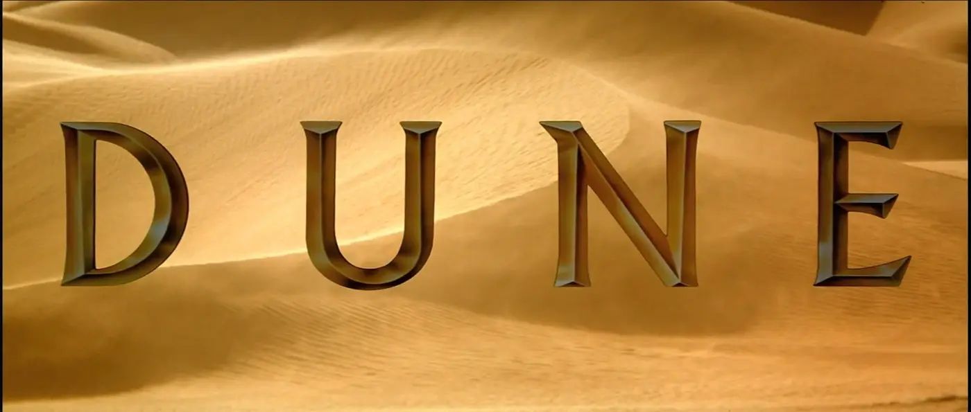 Dune(1984) Main Title / dune-1984-titles (링크)
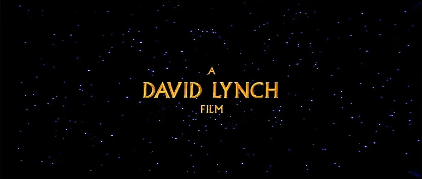 Dune(1984) Credit / dune-1984-titles (링크)
그러던 와중 운명처럼 84년에 개봉한 초창기 듄 영화 타이틀에서는 「Albertus」를, Ace Books에서 출판한 듄 페이퍼백 초판본에서는 「Lydian」을 발견하게 되었습니다. 듄의 과거 콘텐츠에서 찾은 두 개 폰트의 시대적인 인상과, 듄의 주된 배경이자 날카로운 모래바람이 부는 사막 행성인 ‘아라키스’ 같은 모습을 한글로 구현하고 싶다는 생각이 들었습니다.
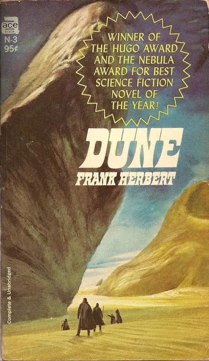
Dune by Frank Herbert (Ace Books, 1967) / dune-1984-titles (링크)
영감이 되어준 폰트들을 자세히 보겠습니다. 먼저 「Albertus」는 획의 디테일 표현이 일반적인 라틴 쓰기 도구인 브로드닙 펜이 아닌 끌Chisel의 표현 방식을 차용했다는 것을 확인할 수 있습니다. 그로 인해 B의 오른쪽 둥근 획이 만나는 부분과 L의 오른쪽 획 끝, r과 h, p의 접합부 등 날카롭게 표현되는 특징들이 이 폰트의 정체성처럼 느껴집니다. 또한 글자들, 특히 대문자의 너비 차이가 심하기 때문에 위에서 언급했던 시대적인 인상이 강화되는 느낌도 듭니다.
다음으로는 「Lydian」입니다. 「Lydian」은 캘리그래픽 방식을 따른 휴머니스트 산세리프 폰트입니다. 칼로 자른 것 같이 날카롭고 예리한 획 표현을 갖고 있습니다. Q의 테일, 한 번 끊었다 다시 이어 쓴 흔적이 보이는 B, 사선 축이 보이는 O계열 등에서 「Lydian」만의 고유한 매력이 드러납니다.
마지막은 커머셜타입Commercial Type의 「Robinson」입니다. 「Robinson」은 소개에도 나와 있듯 「Lydian」에서 영감을 받은 현대적인 산세리프 폰트입니다. 「Albertus」와 「Lydian」에 비해 일정한 너비감, 굵기감, 정제된 획 표현들로 인해 세 개의 폰트 패밀리 중 가장 현대적이며 깔끔한 인상을 갖고 있습니다.
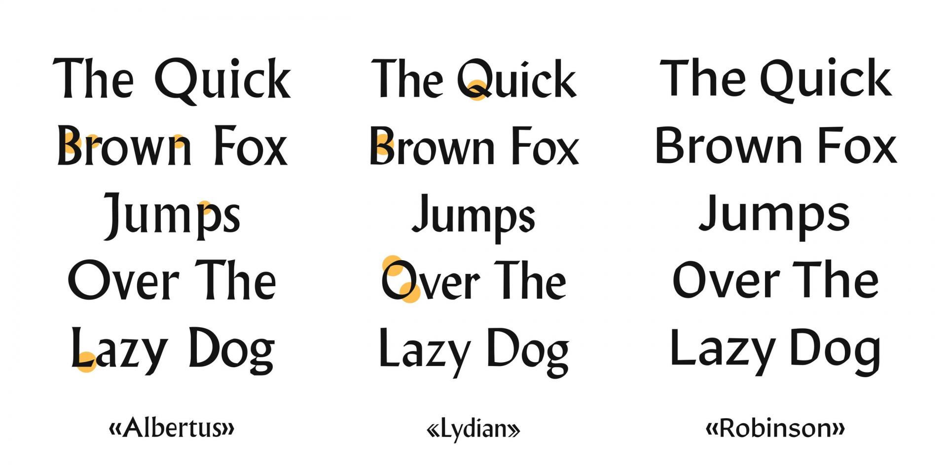
세 개의 폰트는 획 표현과 컨셉, 인상들이 모두 다릅니다. 하지만 한 가지의 공통점이 있습니다. 바로 사람의 손길이 여실히 묻어있는 인본적인 폰트라는 것입니다. 그 때문일까요? 보기에도 편안하고 자연스러운 인상이 듭니다. 재미있게도 듄의 세계관 안에서 기계문명을 타파하고 인간중심으로 돌아가자는 반(反)기계 운동이 전 우주에 걸쳐 크게 일어났다는 배경 설정을 가지고 있습니다. 이와 같은 맥락으로 사람이 만든 자연스러움이 「SD 페트라」에도 담겨 있기를 바랐습니다.
두 가지의 페트라페
다른 성격의 인상을 폰트 한 종에 담아내기란 어려운 일입니다. 때문에 레퍼런스가 되었던 「Albertus」와 「Lydian」의 날카로우며 힘있는 인상, 「Robinson」의 정제되고 차분한 인상을 Display와 Text 두 가지 용도로 나누어 적절히 담아보기로 했습니다.
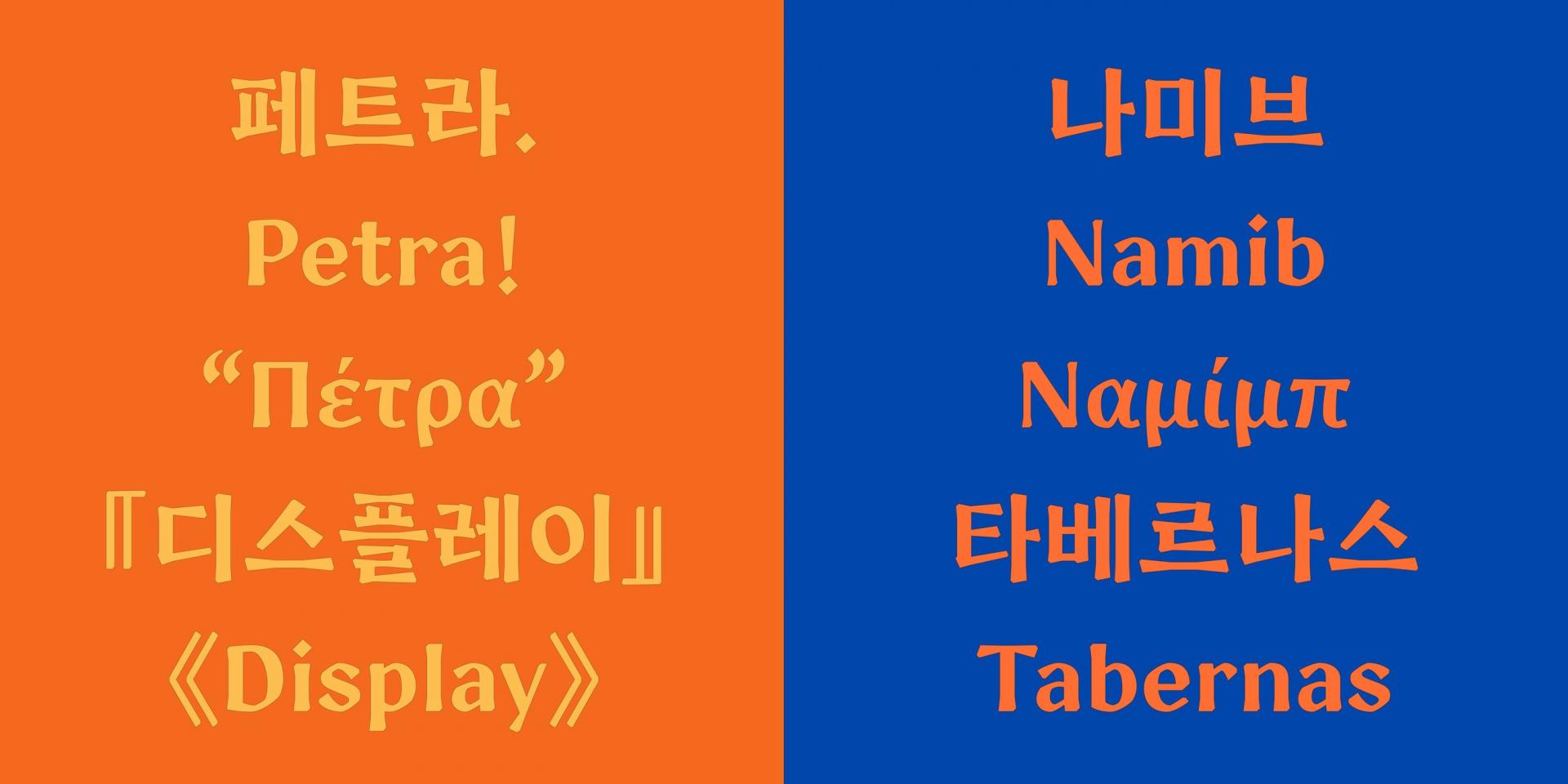
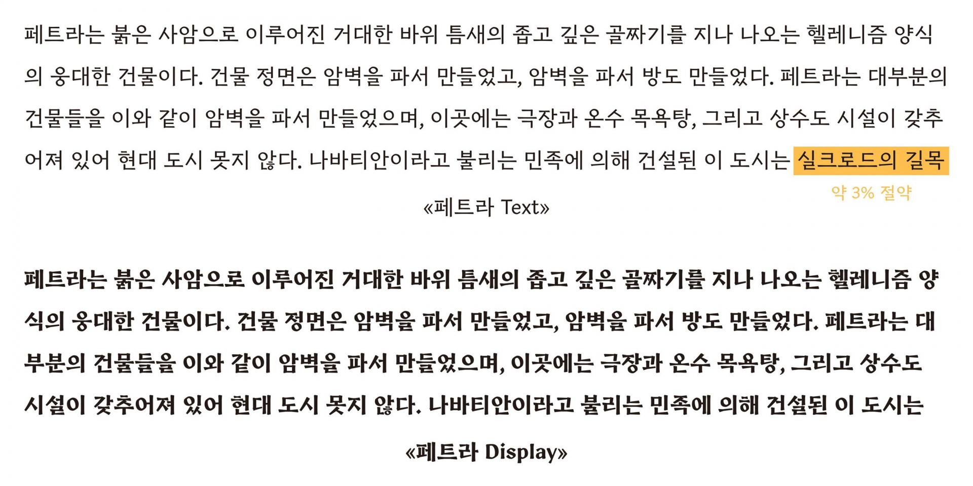
페트라 Text
「페트라」 Text는 긴 글줄로 사용되는 모습을 상상하며 만든 본문용 스타일입니다. 때문에 가로와 세로의 획 대비를 최대한 적게 하여 작은 크기로 썼을 때도 선명하게 보여 눈이 피로하지 않도록 했어요. 획의 질감 표현도 최대한 생략해 글을 읽어나가는 데 거슬리는 부분이 없도록 만들었습니다. 또한 자소의 크기를 작게 하여 시대적인 인상과 휴머니스틱한 인상이 더욱 느껴질 수 있도록 하였습니다. 자소와 기둥, 보 사이의 공간이 커진 덕분에 리듬감이 생겨 읽는 재미가 더해지기도 하고요.
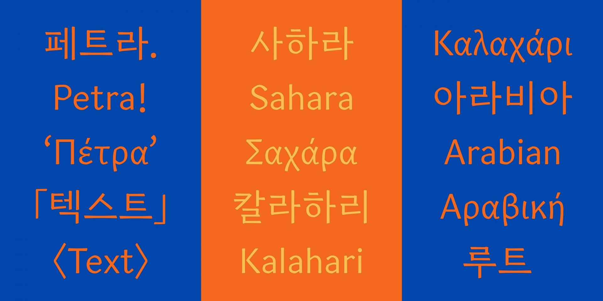
페트라 Display
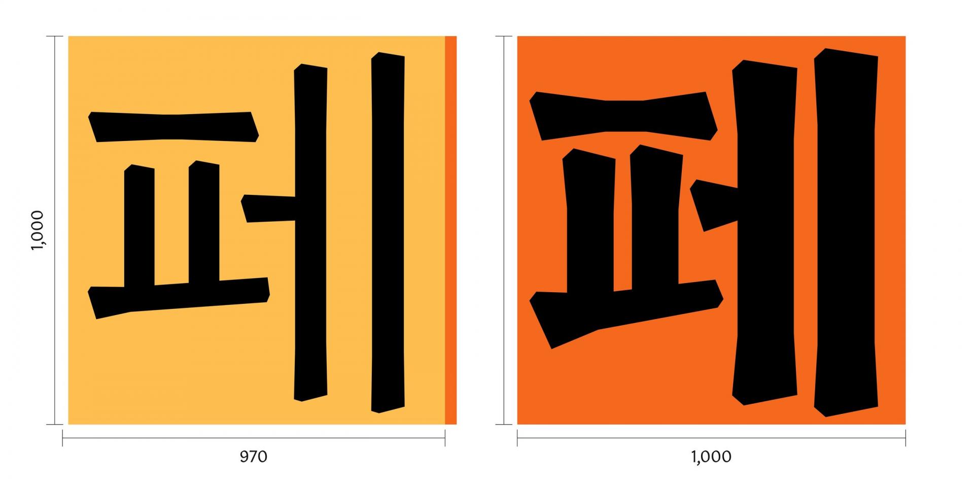
「페트라」 Display는 Text를 뼈대로 삼아 자소의 크기를 크게 하고, 획의 질감 표현을 최대화했습니다. 게다가 획 대비를 크게 주어 Display 용도에 적합할 수 있도록 하였습니다. 전각 크기에서도 Text와 Display의 차이점이 드러납니다. Text의 전각 크기는 970으로 보다 긴 텍스트를 담기에 경제적이고 효율적으로 쓰이도록 설정하였으나, Display는 두께로 인해 넓어진 너비와 큰 자소의 크기를 고려하여 Text보다 넓은 1,000으로 설정해 차이를 두었습니다.
페트라의 형태
「페트라」의 패밀리 소개를 간략하게 마쳤으니, 조금 더 디테일한 부분들을 소개해 보겠습니다.
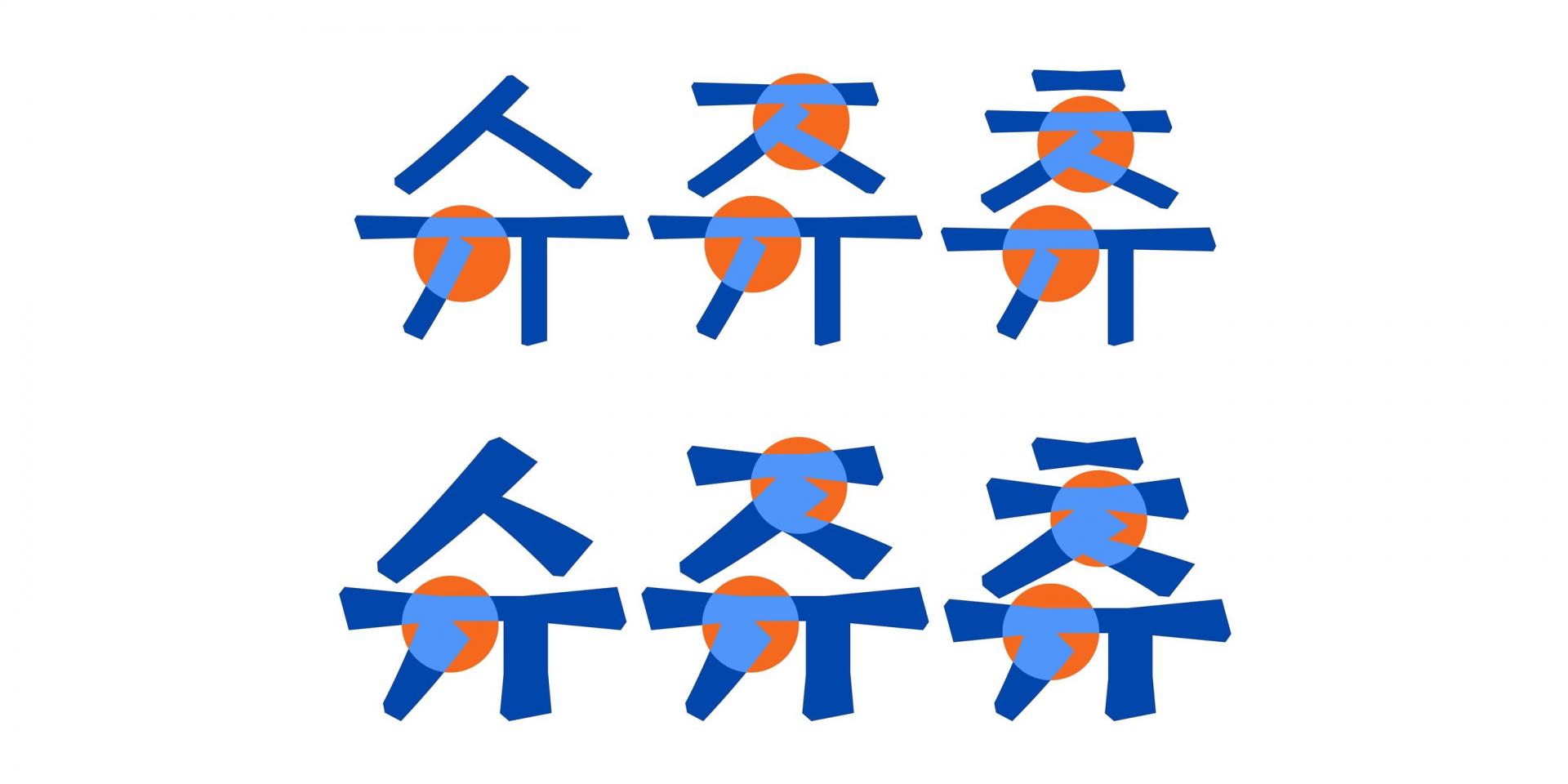
앞서 배경에서 언급한 것처럼 「페트라」에 사람이 쓴듯한 자연스러움을 반영하고 싶었습니다. 때문에 자소의 형태에 쓰기 방식이 느껴질 수 있도록 여러 테스트를 거쳤습니다. 먼저 삐침 계열인 ‘ㅅ, ㅈ, ㅊ’를 보면 갈래로 갈라져 내려가는 부분에 단차를 주어 쓰기 방향이 드러날 수 있도록 하였습니다. 세로모임 민글자의 중성 ‘ㅠ’ 또한 삐침 계열과 비슷한 맥락으로 제작되었습니다.
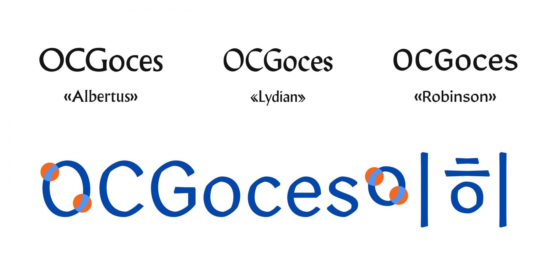
‘ㅇ, ㅎ’의 형태도 「페트라」만의 특징이 드러나는 부분입니다. 보통 한글 ‘ㅇ’ 계열의 축Axis은 수직으로 되어있으나 「페트라」에선 왼쪽으로 기운 사선 축의 형태를 띱니다. 브로드닙 펜의 쓰기 방식을 따른 라틴의 O에서 착안했기 때문입니다. 때문에 라틴 O계열을 비롯해 한글의 ㅇ, ㅎ 계열도 사선 축으로 디자인되어 휴머니스틱한 인상을 더하려 하였습니다.
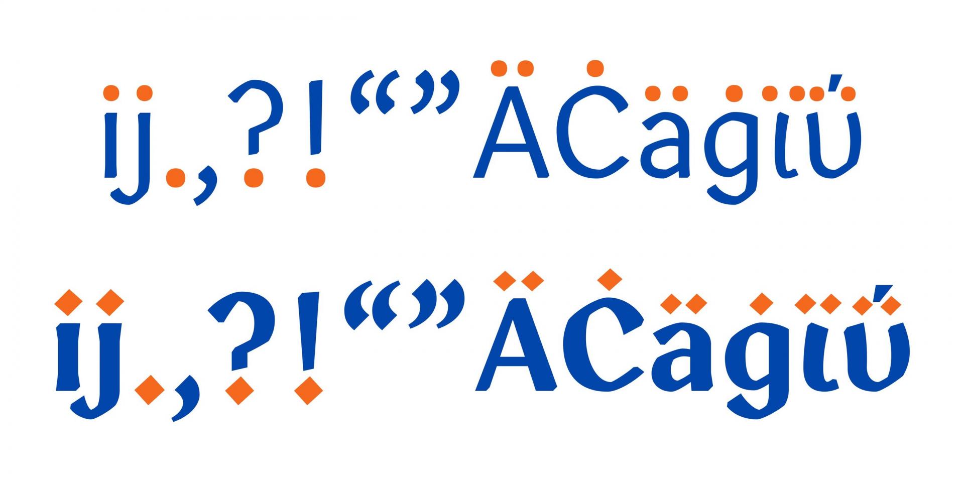
또 다른 「페트라」의 특징적인 디테일은 바로 점의 모양인데요. Display는 Text에 비해 더 날카롭고 각진 점이 어울린다고 판단해 형태 자체를 다르게 디자인하였습니다. 점의 모양에 따른 연계된 글립 모두 동일하게 적용됩니다.
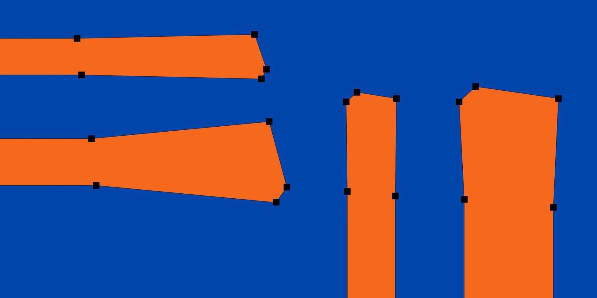
보다 더 디테일하게 들어가서 한글의 가장 기본이 되는 세로획과 가로획, 즉 기둥과 보의 형태를 살펴보겠습니다. Text에선 표현을 최소화했기 때문에 잘 느껴지진 않지만, 크게 확대해 보면 자잘한 획의 디테일들을 확인할 수 있습니다. 실제로 각 스타일에 맞는 형태를 구현하기 위해 점의 개수가 달라지는 부분도 있습니다. Text는 미세하게, Display는 큼직큼직하게 획 단차가 들어간 모습을 확인할 수 있습니다.
바위란 뜻의 페트라 Πέτρα
「페트라」는 기획 초반부터 돌에 새겨진 서사시를 상상하며 작업을 이어왔습니다. 때문에 주로 그리스 서사시를 시안 문구로 삼아 조판 테스트를 하곤 했습니다. ‘페트라Petra, Πέτρα’ 라는 이름 또한 그리스어에서 유래한 이름으로 ‘바위’란 뜻을 가지고 있기도 하고요. 이로 인해 자연스럽게 그릭 문자 세트를 개발해야겠다는 생각이 들었습니다. 그릭 문자는 라틴과 키릴 문자에 영향을 준, 역사와 근본이 깊은 문자입니다. 사실 그리스어를 읽는 방법은 모르더라도 그릭 문자는 과학과 수학 분야에서 사용되고 있기 때문에 생김새와 이름은 이미 익숙하신 분들이 많을 것 같습니다. ‘알파α’와 ‘파이π’같은 문자들처럼요. 하지만 디자인한다는 것은 다른 얘기이죠. 라틴과는 다른 그릭만의 형태적 고유성 때문에 쉽게 접근하기 어려운 부분이 많았습니다. 때문에 산돌의 다른 타입 디자이너들과 그릭 스터디를 진행해 그릭 문자를 공부해 본 후에 제작하기로 했습니다.
알아가면 알아갈수록 미궁 속으로 빠져드는 기분이 들었지만 대문자는 라틴과 일부를 공유하던 터라 비교적 어렵지 않게 제작할 수 있었습니다. 하지만 문제는 자유분방한 소문자 세트에 있었죠. 스터디에서 다른 폰트들을 분석해본 결과 라틴의 소문자에 비해 그릭의 소문자에 필기 방식의 인상 반영이 보다 더 강하게 드러나는 경향이 있었습니다. 게다가 「페트라」는 휴머니스트 산세리프 계열이기 때문에 「페트라」 그릭의 큰 방향성은 라틴보다 필기감의 인상이 더 강하게 구현된 모습을 상상하며 디자인하게 되었습니다.
나가며
「SD 페트라」는 듄에서 영감을 받았기 때문인지 판타지나 SF 장르물의 타이틀과 본문에 사용되면 잘 어울릴 것 같다는 생각이 듭니다. 구체적으로 상상해 보자면 장르물 출판사인 ‘엘릭시르’나 ‘황금가지’의 책들이 떠오르기도 하는데요. 제작자의 상상력은 여기까지이지만 사용자분들의 또 다른 생각들이 궁금해집니다.
무언가를 마무리한다는 것은 항상 어려운 일입니다. 이 아티클도 그렇고 「페트라」도 그렇습니다. 하지만 제작자의 손을 떠난 폰트는 생명을 얻어 새로운 세상으로 걸어 나갑니다. 살던 고향 행성을 떠나 새로운 행성으로 가는 듄의 주인공처럼요. 그 모험은 낯설고 두렵겠지만 새로운 시작과 도전일 것입니다. 듄에서 개인적으로 좋아하는 문장을 남기며 이만 글을 마치겠습니다.
작성자: 산돌 기획운영팀 김슬기