서울 지하철 노선도, 왜 바뀌었을까?
서울 지하철 노선도가 40년 만에 대대적으로 바뀌었습니다.
최근에는 지하철 호선별 단일노선도를 공개하기도 했죠.
이번 폰트매거진에서는 서울 지하철 노선도 변경에 담긴 디자인적 고민과 전략에 대해 알아보았습니다.

어떤 점이 달라졌을까요?
✔ 한눈에 보기 쉬운 노선 구조
✔ 신호등을 연상시키는 환승역 표기
✔ 서울 대표 명소를 담은 픽토그램
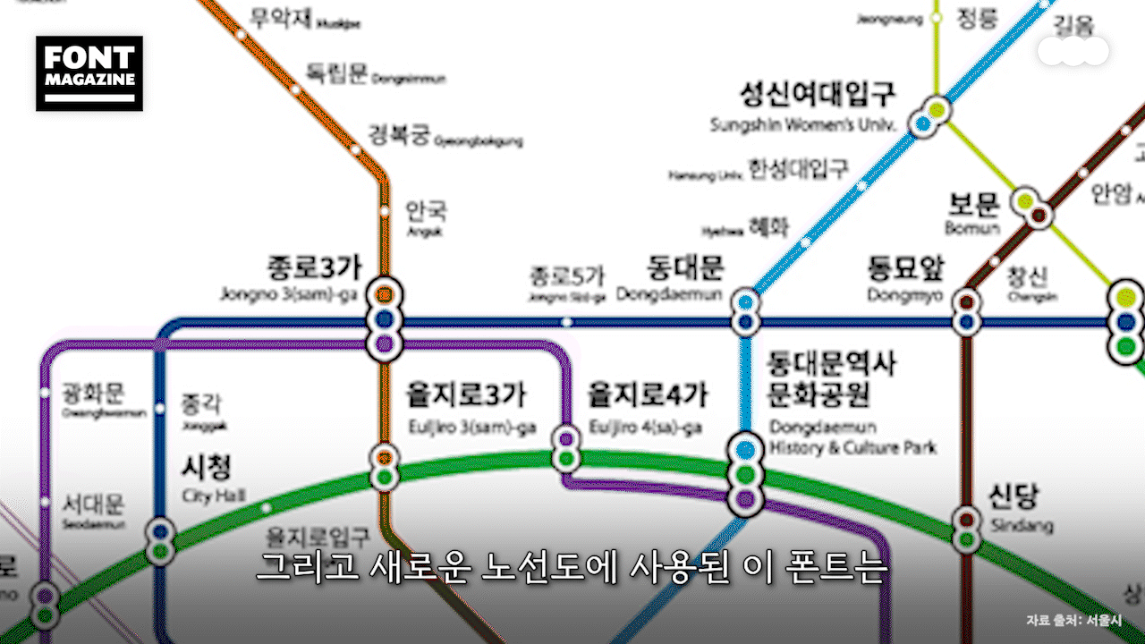
✔ 손글씨 감성의 새로운 서울시 전용 폰트 ‘서울알림체’ 적용

매일 무심코 지나치는 지하철 노선도.
그 속에는 정보 전달력과 사용자 경험을 함께 고려한 공공디자인의 전략이 숨어 있습니다.
지금 바로 서울 지하철 노선도에 담긴 디자인 이야기를 만나보세요!

영상 속 지하철 폰트, 산돌구름에서 무료로 사용해 보세요!
✔ 서울남산체 https://vo.la/eIxMfbD
✔ 서울알림체 https://vo.la/nsEPPS